
Your landing page’s weakest score is CTA.
How Aster ranks
CTA
42PoorCopy, size, verb, cost-feel — does the primary CTA earn the click?
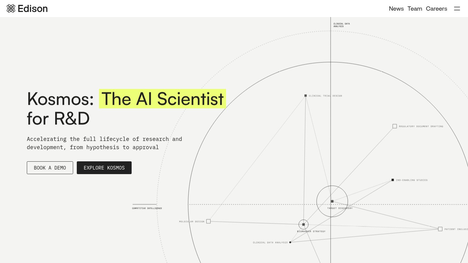
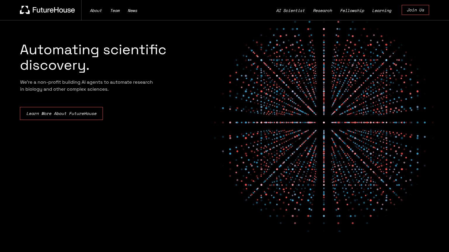
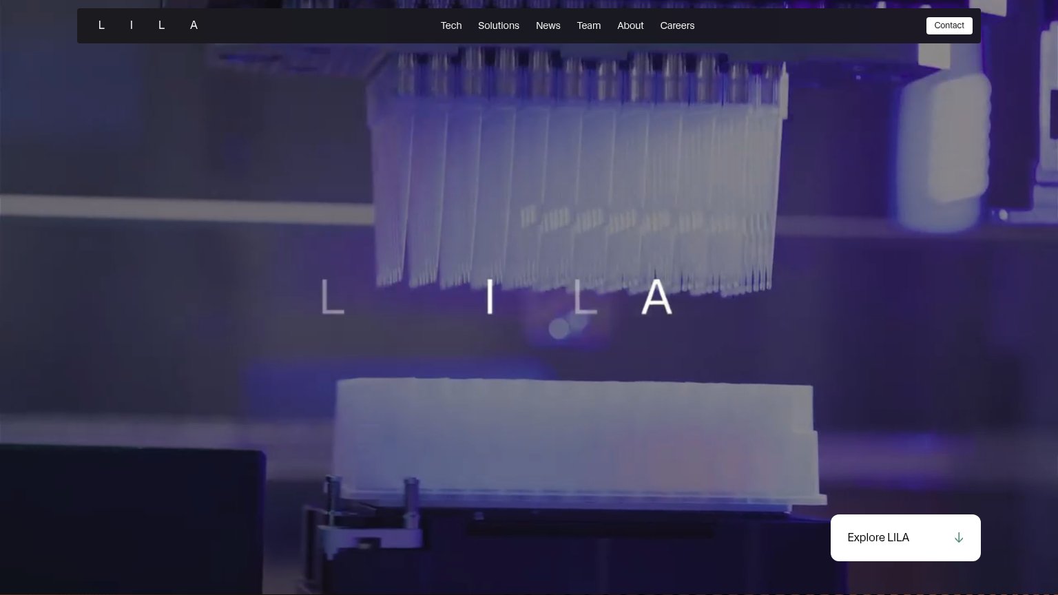
Problems
- no primary CTA anywhere in fold
- only nav links and a text link
- banner is news, not an action
- no path into the product
Mobile web
48PoorThe phone experience as a first-class citizen.
 123
- Uncollapsed nav row — Full desktop link row (Products, Plans, Inference, Join Us) crammed across the phone instead of a hamburger.
- Two-line announcement banner — Banner wraps to two lines and stacks with the nav into a double-decker header eating the top of the fold.
- Mission paragraph — Seven lines of prose stand in for a hero with no CTA button anywhere in the first viewport.
Information hierarchy
52FairDoes the design help or inhibit what the page is trying to say?
What works
What to improve
Value props
62FairTitle, subtitle, hero — do they sell the product's true value?
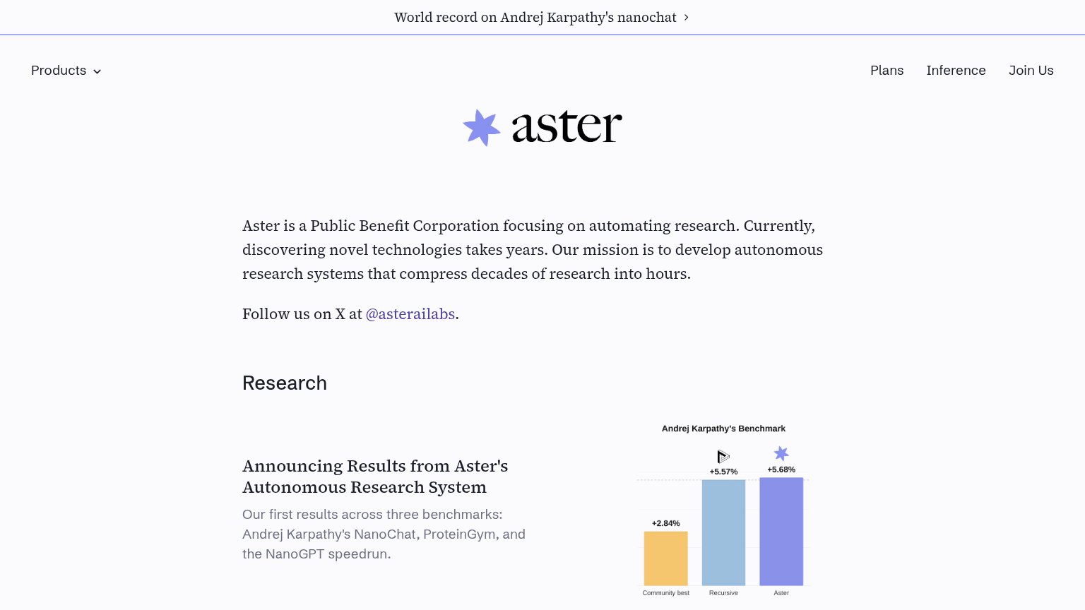
Aster’s headline
aster
Aster is a Public Benefit Corporation focusing on automating research. Currently, discovering novel technologies takes years. Our mission is to develop autonomous research systems that compress decades of research into hours.
Working
Could improve
Trust
62FairProof that the product is real, competent, and safe to try.
How Aster compares
Trust read