
Your landing page’s weakest score is CTA.
How ASML ranks
CTA
44PoorCopy, size, verb, cost-feel — does the primary CTA earn the click?
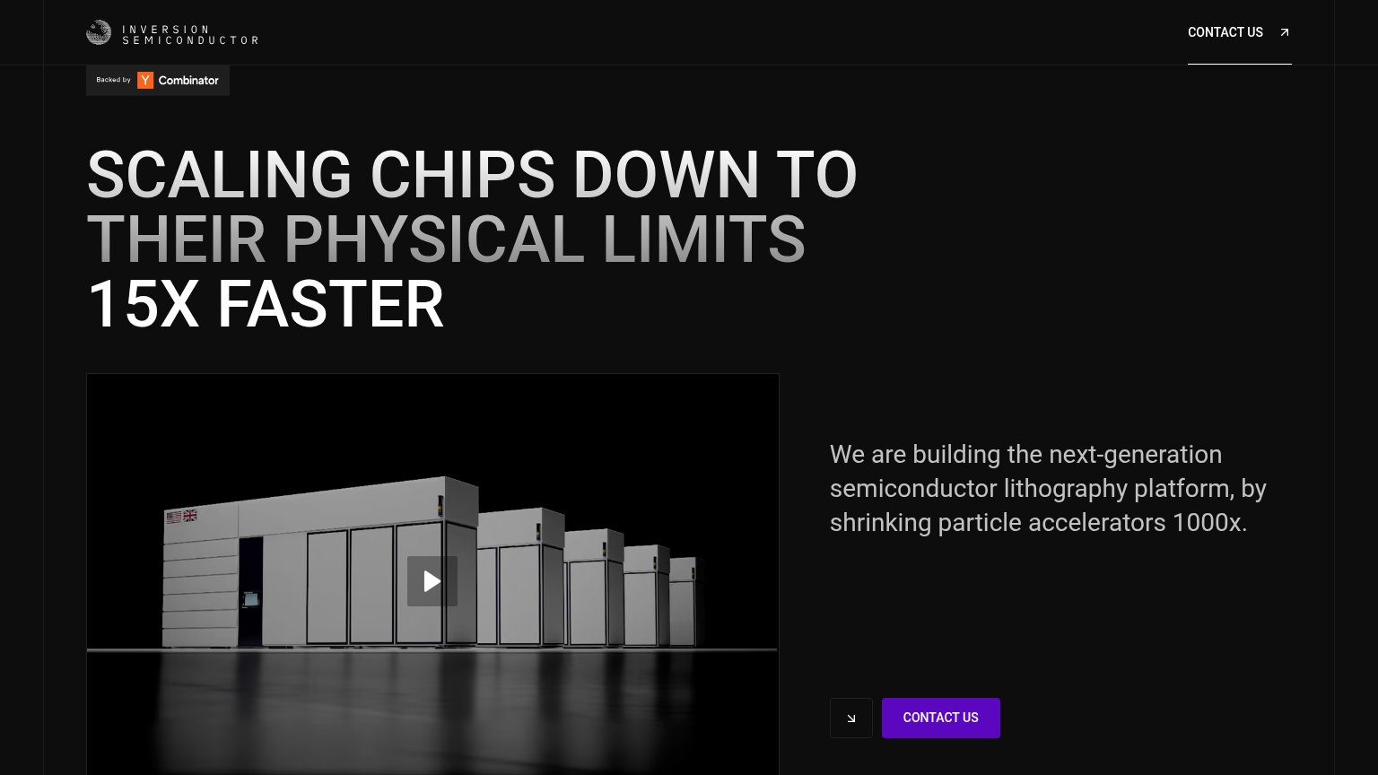
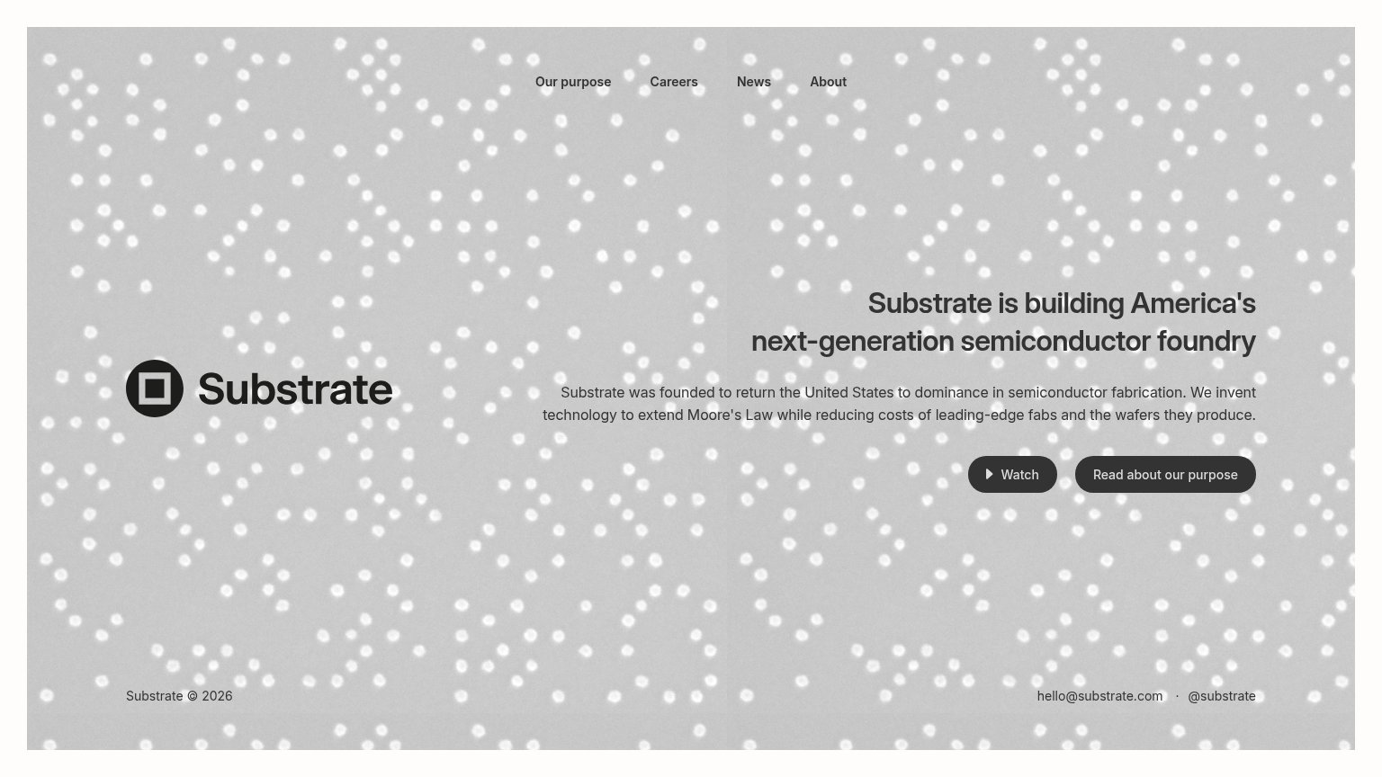
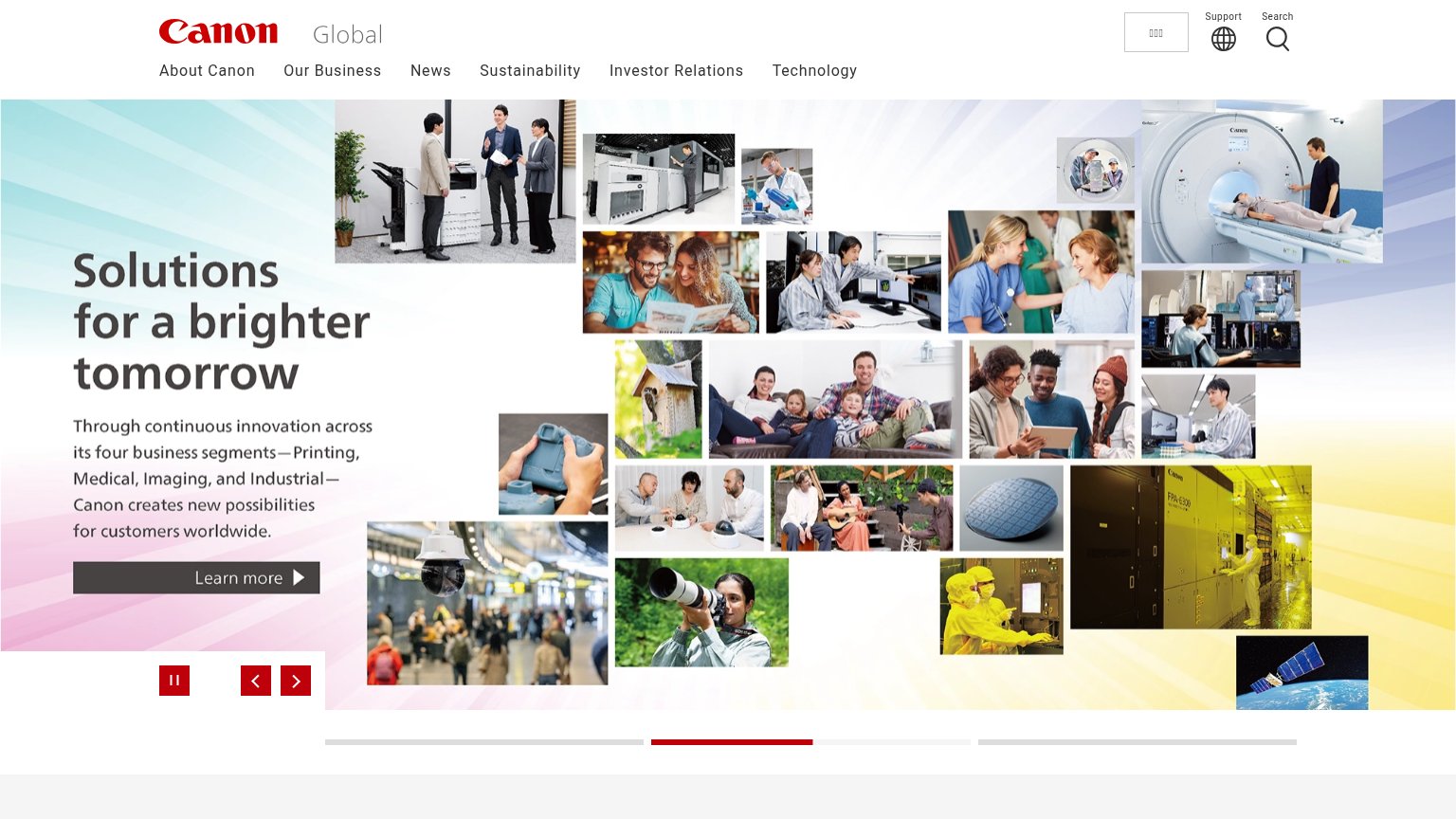
Problems
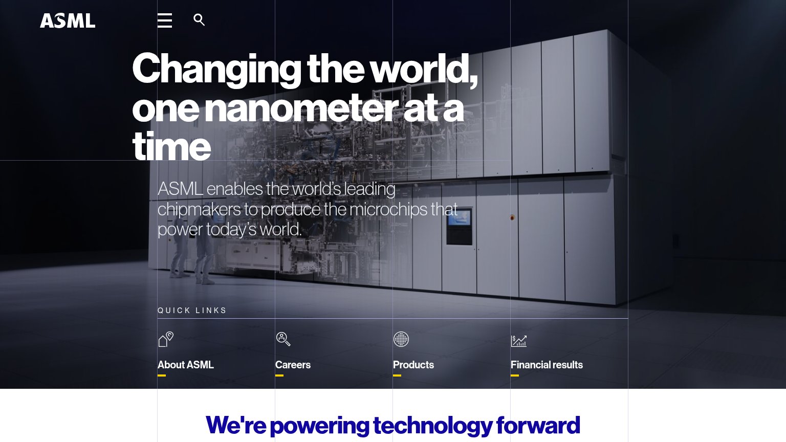
- no primary CTA anywhere in fold
- quick links are nav, not actions
- no action verbs on any link
- four equal links split attention
Mobile web
58FairThe phone experience as a first-class citizen.
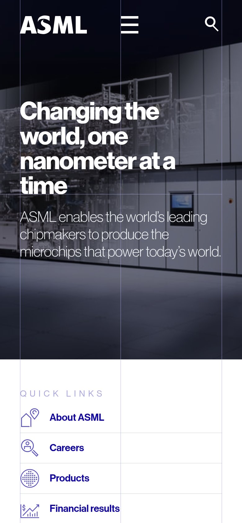
The mobile fold reads cleanly: the headline "Changing the world, one nanometer at a time" scales down to a comfortable four lines, the subhead is legible at arm's length, and the nav collapses to a tidy hamburger plus search icon that stays out of the hero's way. The problem is action: there is no primary CTA anywhere in the first mobile viewport — the entire fold is headline, subhead, and background photo, so a visitor has nothing to tap until scrolling past a full screen of hero image to reach the "Quick Links" list. Those quick links ("About ASML", "Careers", "Products", "Financial results") are themselves text-link rows rather than a thumb-friendly full-width button, and the hero image occupies a long dead stretch between the subhead and the first tappable element. The biggest lever is placing one full-width action — even a "Explore products" button — directly under the subhead inside the first viewport.
Trust
62FairProof that the product is real, competent, and safe to try.
How ASML compares
Trust read
Information hierarchy
68FairDoes the design help or inhibit what the page is trying to say?
What works
What to improve
Value props
72FairTitle, subtitle, hero — do they sell the product's true value?
Changing the world, one nanometer at a time
ASML enables the world's leading chipmakers to produce the microchips that power today's world.
Working
Could improve