
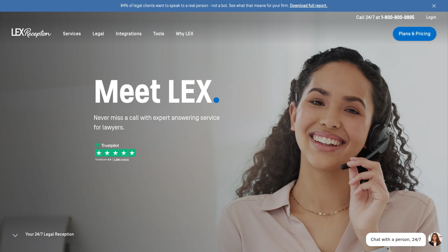
Your landing page’s weakest score is CTA.
How LEX Reception ranks
CTA
54FairCopy, size, verb, cost-feel — does the primary CTA earn the click?

Problems
- no action verb — reads as nav
- no CTA in the hero itself
- pricing-first feels costly
- label differs on mobile ('Plans')
Mobile web
58FairThe phone experience as a first-class citizen.
 123
- No primary CTA — The first mobile viewport has no tappable conversion button — the desktop 'Plans & Pricing' shrank to a bare 'Plans' text link in the top bar.
- Chat bubble bar — The 'Chat with a person, 24/7' widget with avatar spans the bottom of the fold, occupying the prime thumb zone where a full-width CTA belongs.
- Double-decker header — A blue phone/Plans bar stacked on the logo/Menu row eats two rows of the small viewport before the hero starts.
Value props
68FairTitle, subtitle, hero — do they sell the product's true value?
LEX Reception’s headline
Meet LEX.
Never miss a call with expert answering service for lawyers.
Working
Could improve
Trust
68FairProof that the product is real, competent, and safe to try.
How LEX Reception compares
Trust read
Information hierarchy
72FairDoes the design help or inhibit what the page is trying to say?
What works
What to improve