
Your landing page’s weakest score is CTA.
How AgPlenus ranks
CTA
42PoorCopy, size, verb, cost-feel — does the primary CTA earn the click?
Problems
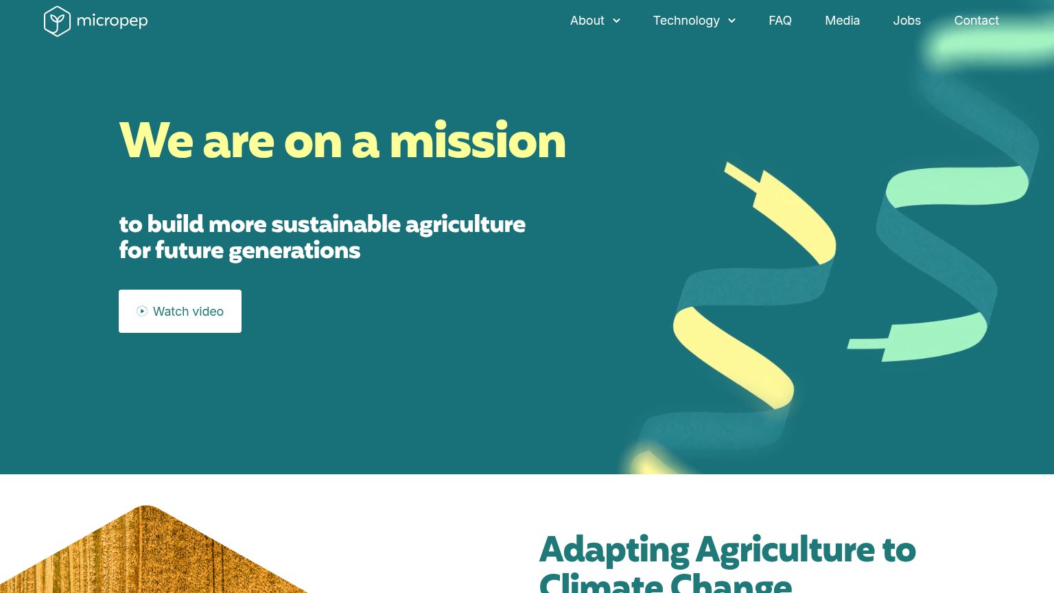
- no CTA in desktop hero
- 5 words, wraps to two lines
- 'Learn more' is vague, no verb payoff
- ghost style, weak visual footprint
Trust
44PoorProof that the product is real, competent, and safe to try.
| Trust read | |
|---|---|
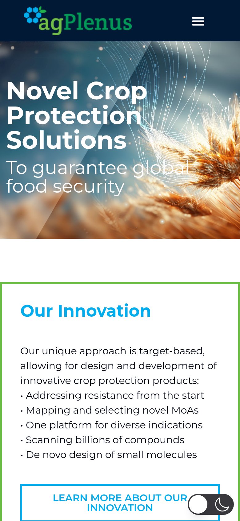
| AgPlenus | "Our Innovation" list detailing the platform: "Scanning billions of compounds", "De novo design of small molecules" |
| No visible trust signal identified. | |
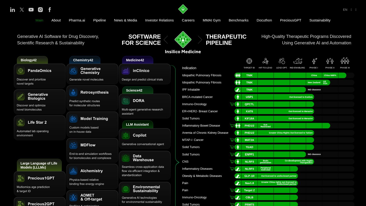
| Pipeline table rows showing "Out-licensed to Exelixis" and "Out-licensed to Menarini" with Phase I–III progress bars and | |
| No visible trust signal identified. | |
| No visible trust signal identified. | |
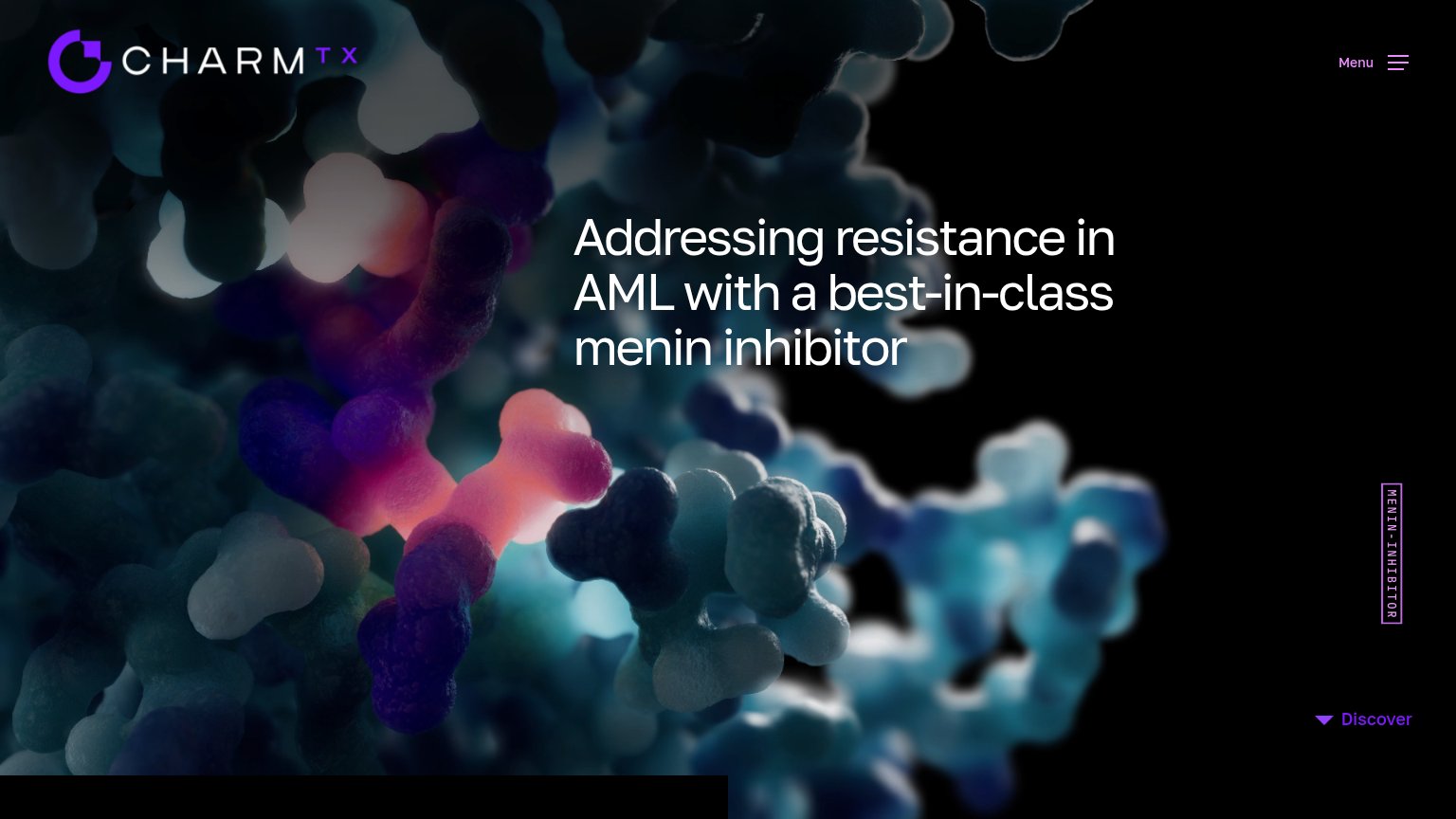
| Headline "Addressing resistance in AML with a best-in-class menin inhibitor" naming a specific target and indication |
Value props
52FairTitle, subtitle, hero — do they sell the product's true value?
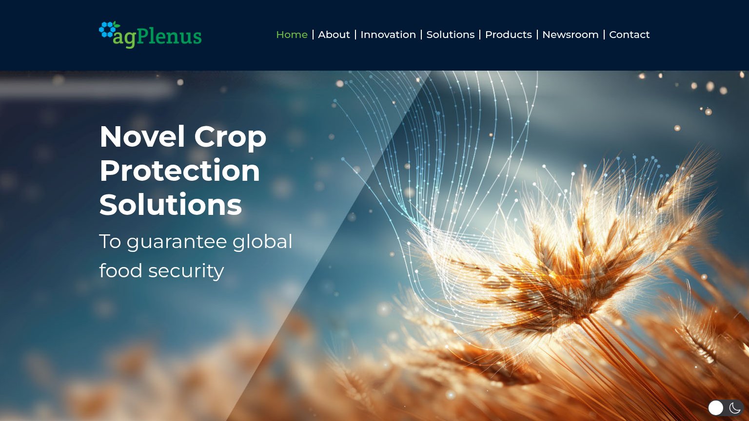
AgPlenus’s headline
Novel Crop Protection Solutions
To guarantee global food security
Working
Could improve
Mobile web
52FairThe phone experience as a first-class citizen.
What works
What to improve
Information hierarchy
54FairDoes the design help or inhibit what the page is trying to say?
What works
What to improve