
Your landing page’s weakest score is Information hierarchy.
How A1Zap by A1Base ranks
- 1.
A1Zap by A1Base76
- 2.
Fizz70
- 3.
Discord69
- 4.
Geneva58
76Growth scoreupdated
category scores
category scoresShowHide
Information hierarchy
68FairDoes the design help or inhibit what the page is trying to say?
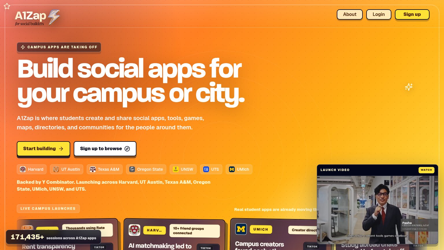 1234
- Sign up to browse button — Same-weight secondary CTA beside "Start building" splits the primary action into two equal choices.
- Launch video overlay — Floating video panel with WATCH button covers page content and pulls scan-path attention away from the CTA pair.
- Session count badge — Dark stat pill overlaps the campus launch cards, cutting off "Rent transparency" and cluttering the fold's bottom edge.
- Live campus launches row — Cards enter the fold half-cropped, adding a fourth competing band of content before the CTA decision is made.
Mobile web
76FairThe phone experience as a first-class citizen.
 123
- Uncollapsed desktop nav — Three full-size pill buttons crammed against the logo instead of a hamburger, eating the top of the fold.
- Oversized badge pill — "CAMPUS APPS ARE TAKING OFF" spans nearly the full width, adding a competing message before the headline.
- Four-line subheadline — Body copy wraps into four long lines, pushing the primary CTA toward the bottom of the first viewport.
CTA
78FairCopy, size, verb, cost-feel — does the primary CTA earn the click?
How A1Zap by A1Base compares
Recommended rewrites
Trust
78FairProof that the product is real, competent, and safe to try.
How A1Zap by A1Base compares
Trust read
Value props
82StrongTitle, subtitle, hero — do they sell the product's true value?
A1Zap by A1Base’s headline
Build social apps for your campus or city.
A1Zap is where students create and share social apps, tools, games, maps, directories, and communities for the people around them.
Working
Could improve