
Your landing page’s weakest score is CTA.
How Travo ranks
54Growth scoreupdated
category scores
category scoresShowHide
Score over time
CTA
32PoorCopy, size, verb, cost-feel — does the primary CTA earn the click?

Problems
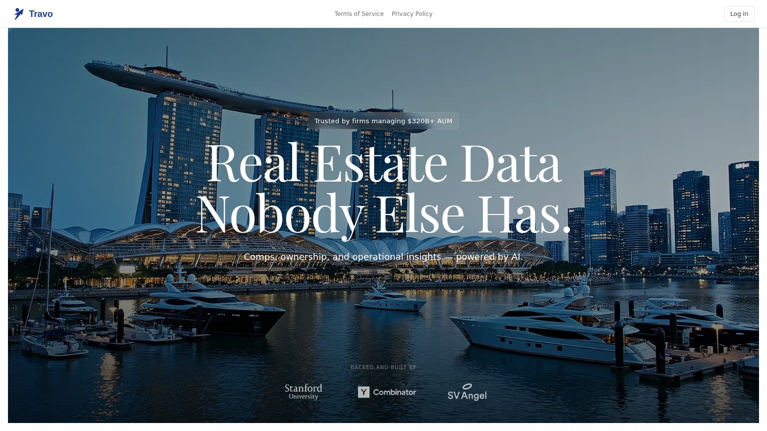
- no hero CTA at all
- Log In targets existing users only
- tiny ghost button in nav corner
- no action verb for new visitors
Mobile web
52FairThe phone experience as a first-class citizen.
 12
- Log In pill — Only tappable action on the fold serves existing users, not new visitors.
- Backed-by logo row — Fold's final slot goes to investor logos instead of a conversion action.
Information hierarchy
58FairDoes the design help or inhibit what the page is trying to say?
1234- Hero subheadline area — No primary CTA anywhere in the fold — the pitch lands and then gives the visitor no action to take.
- Log In button — The only clickable button in the fold serves existing users, making it the de facto CTA for new visitors.
- Terms/Privacy nav links — Legal links occupy the prime center-nav position where product or signup paths should be.
- Subheadline contrast — "Comps, ownership..." text sits on a busy mid-tone skyline band and loses legibility versus the headline.
Trust
58FairProof that the product is real, competent, and safe to try.
| Trust read | |
|---|---|
| Travo | "Trusted by firms managing $320B+ AUM" badge above the headline |
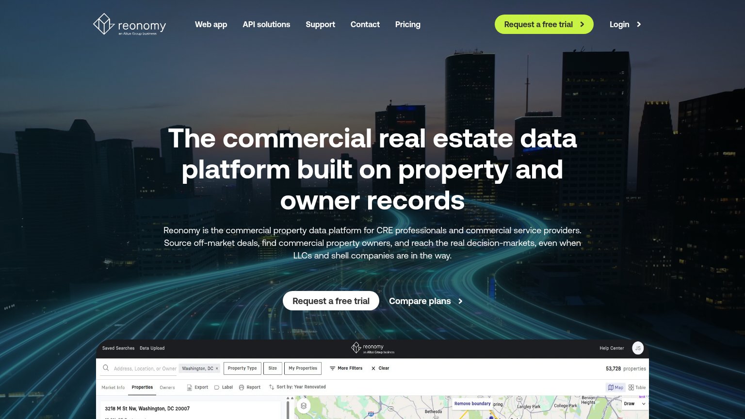
| Embedded product UI screenshot showing property search with map and "53,728 properties" | |
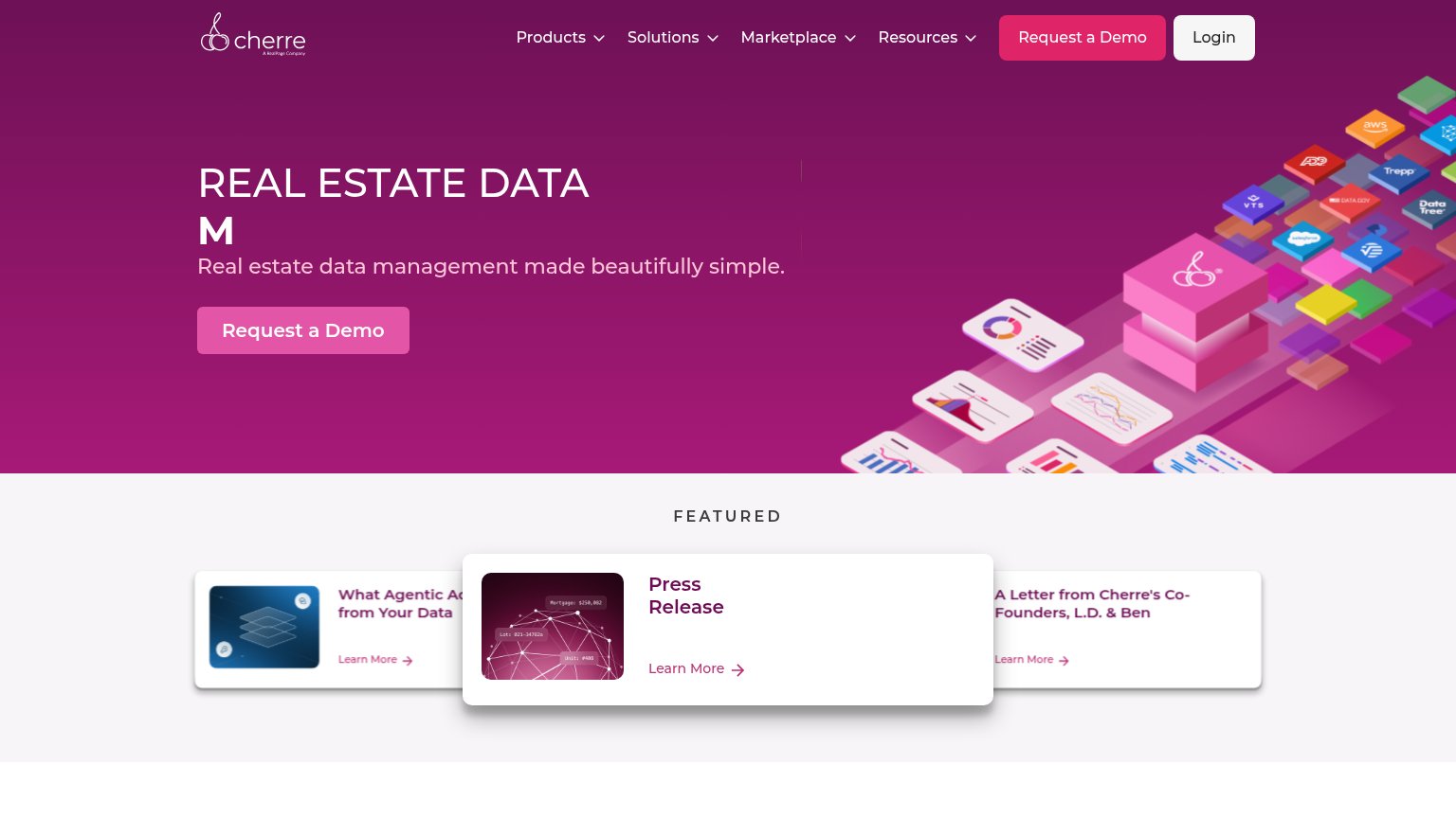
| Integration-partner logos (AWS, Salesforce, VTS, Trepp, DataTree) shown on hero data-stack illustration | |
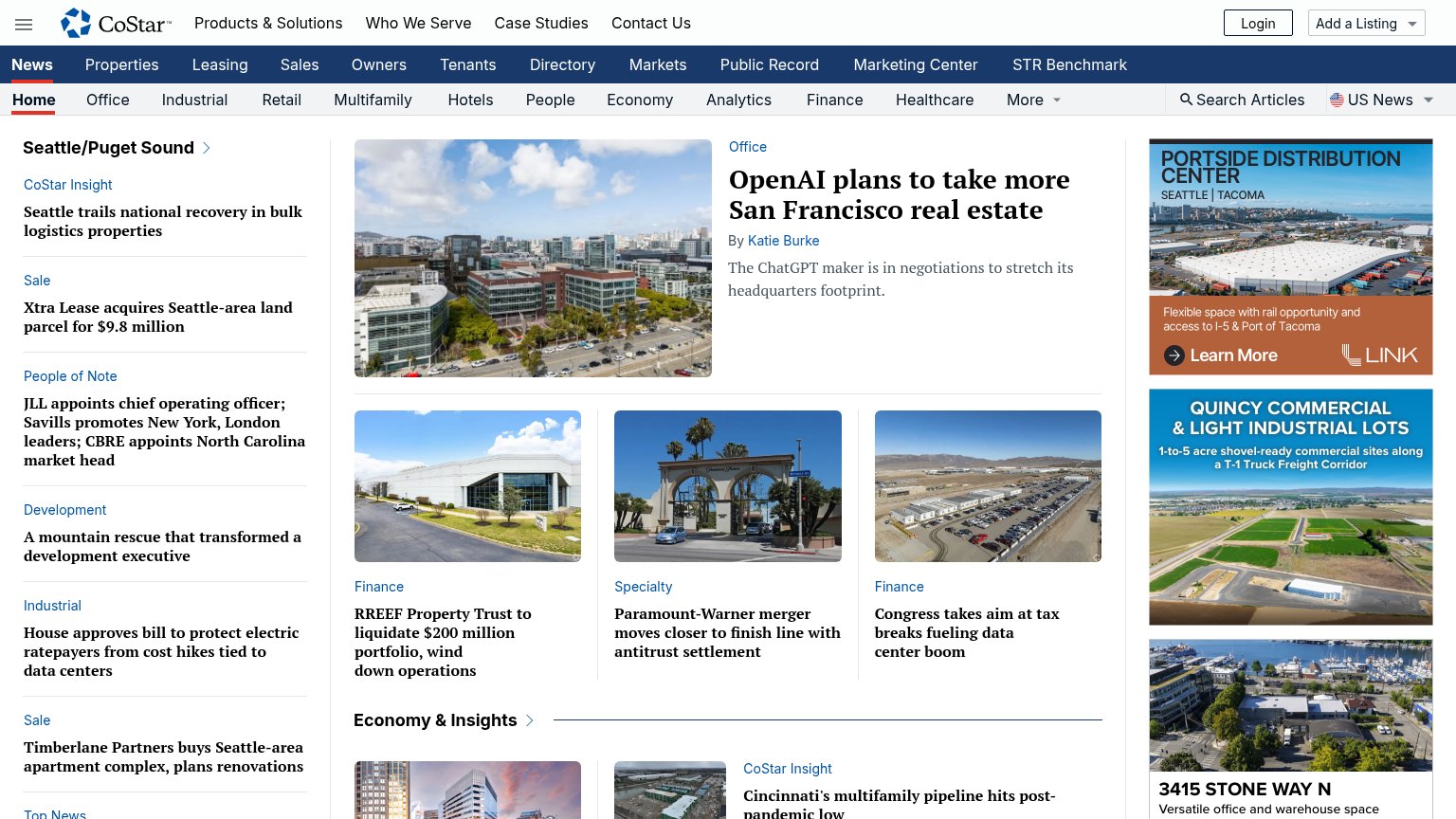
| Bylined editorial coverage, e.g. "OpenAI plans to take more San Francisco real estate — By Katie Burke" | |
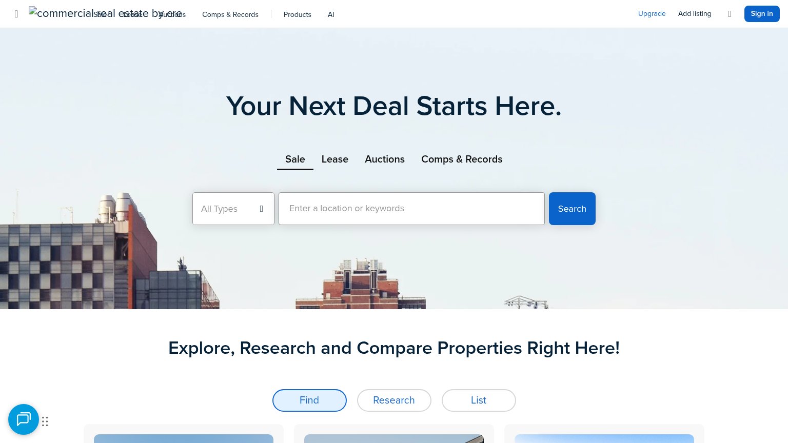
| Live property search UI with Sale / Lease / Auctions / Comps & Records tabs and a location search box | |
| "ARGUS Assist named CRE Analytics Innovation of the year at the 2026 PropTech Breakthrough awards" banner |
Value props
72FairTitle, subtitle, hero — do they sell the product's true value?
Travo’s headline sells
Real Estate Data Nobody Else Has.
Comps, ownership, and operational insights — powered by AI.
Working
- Bold exclusivity claim in the H1
- $320B+ AUM badge is concrete proof
- Subhead names three real data types
Could improve
- No outcome — data listed, result isn't
- Hero image decorates, never shows product
- "Powered by AI" is filler, cut or specify