The Token CompanyYC W26 landing page report.
← Back to YC W26

Your landing page’s weakest score is Trust.

How The Token Company ranks

  1. 1.OpenRouter77
  2. 2.Requesty76
  3. 3.The Token Company70
  4. 4.Not Diamond62
  5. 5.Martian52
Fix Trust

Score over time

908070605040Martian 49 on May 10 (Wayback)Martian 50 on May 21 (Wayback)Martian 48 on Jul 13 (Wayback)Martian 49 on Jul 24 (Wayback)Martian 52 on Jul 31 (Live)OpenRouter 79 on Jul 3 (Wayback)OpenRouter 79 on Jul 17 (Wayback)OpenRouter 78 on Jul 31 (Wayback)OpenRouter 76 on Aug 14 (Wayback)OpenRouter 77 on Aug 28 (Wayback)OpenRouter 78 on Sep 8 (Wayback)OpenRouter 77 on Sep 10 (Live)Not Diamond 58 on Feb 9 (Wayback)Not Diamond 58 on Feb 27 (Wayback)Not Diamond 59 on Mar 13 (Wayback)Not Diamond 58 on Apr 15 (Wayback)Not Diamond 56 on May 27 (Wayback)Not Diamond 56 on Jun 7 (Wayback)Not Diamond 62 on Jul 31 (Live)Requesty 76 on Apr 1 (Wayback)Requesty 74 on Apr 28 (Wayback)Requesty 71 on Jun 28 (Wayback)Requesty 67 on Jul 14 (Wayback)Requesty 71 on Jul 25 (Wayback)Requesty 69 on Aug 25 (Wayback)Requesty 76 on Sep 10 (Live)The Token Company 70 on Apr 12 (Wayback)The Token Company 72 on May 9 (Wayback)The Token Company 72 on May 31 (Wayback)The Token Company 71 on Jul 28 (Wayback)The Token Company 74 on Sep 5 (Wayback)The Token Company 70 on Sep 21 (Live)Apr 12May 9May 31Jul 28Sep 5Sep 21
Past reportsShow past reportsHide past reports
  1. Sep 21, 202670LiveOverall −4 · Information hierarchy −10 · CTA −6Viewing
  2. Sep 5, 202674Overall +3 · Information hierarchy +12 · CTA +2View →
  3. Jul 28, 202671Overall −1 · CTA −8 · Mobile web +6View →
  4. May 31, 202672Mobile web +6 · Information hierarchy −4View →
  5. May 9, 202672Overall +2 · Trust +10 · Mobile web −10View →
  6. Apr 12, 202670First tracked report — strongest Mobile web 80, weakest Trust 52View →

Trust

52Fair

Proof that the product is real, competent, and safe to try.

The Token Company
OpenRouter
Requesty
Trust read
The Token Company"BACKED BY Y Combinator" badge above the hero headline
Martian"We've worked on Google DeepMind's early scientific initiatives, developed Anthropic's interpretability efforts, and com
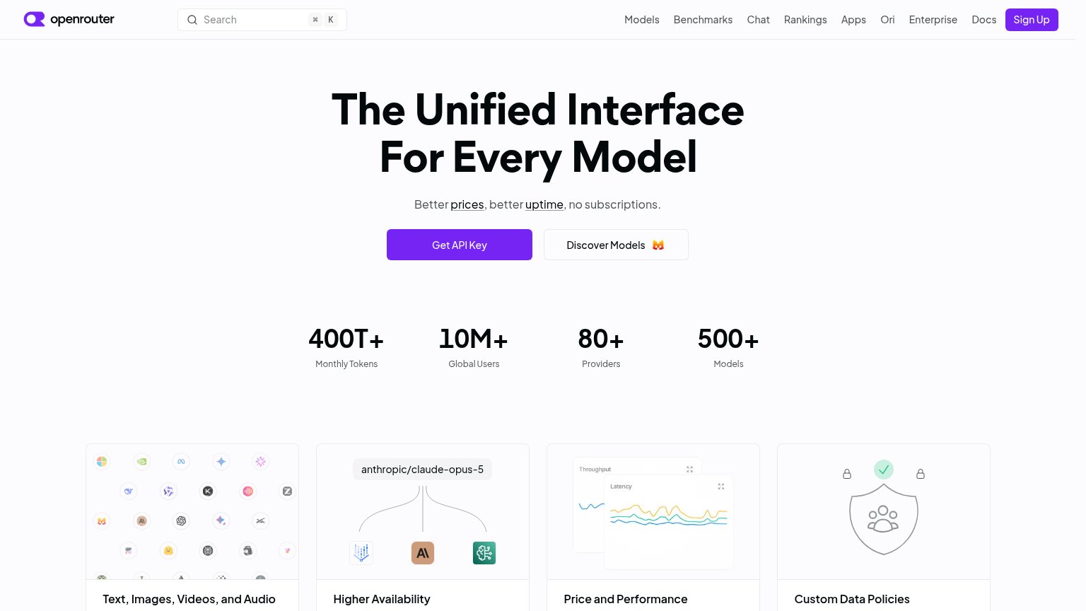
OpenRouterStat bar: "400T+ Monthly Tokens · 10M+ Global Users · 80+ Providers · 500+ Models"
Not Diamond5%+ accuracy gains | 30%+ cost savings | 2x faster dev cycles
RequestyDetailed analytics dashboard screenshot showing "Sum of Cost by Model Over Time — $445.95" with per-model usage table (o

CTA

70Fair

Copy, size, verb, cost-feel — does the primary CTA earn the click?

The Token Company
Requesty
OpenRouter

Problems

  • promises paperwork, not payoff
  • differs from nav's 'Get started'
  • 4 words, past single-fixation ideal
  • no echo of headline's cost promise

Information hierarchy

72Fair

Does the design help or inhibit what the page is trying to say?

Information hierarchy annotations on the desktop capture123
  1. Header exit cluster — Five nav links plus Sign in sit at the same scan height as Get started, splitting attention six ways before the hero CTA.
  2. Get started button — Same white pill styling as the hero's 'Get an API key', creating two equal-weight primary CTAs with different labels.
  3. Sunset hero image — The largest, brightest element on the page depicts a forest sunset with no visible tie to the token-efficiency promise, outranking the CTA in visual pull.

Value props

76Fair

Title, subtitle, hero — do they sell the product's true value?

The Token Company’s headline sellsLabs waste your tokens. We don't.Every filler token in your context is revenue for a lab. With bear-2 in front, filler never wastes the context window. Same answers, a fraction of the cost.

Working

  • Enemy framing creates instant tension
  • Names the incentive: filler is lab revenue
  • 'Same answers, a fraction of the cost' is an outcome

Could improve

  • No number behind 'a fraction of the cost'
  • 'bear-2' is unexplained jargon
  • Hero image decorates, shows nothing

Mobile web

78Fair

The phone experience as a first-class citizen.

Mobile web annotations on the mobile capture123
  1. Get an API key button — Desktop-proportioned half-width button instead of a full-bleed, thumb-friendly primary CTA.
  2. Read the docs button — Secondary button styled at near-equal weight beside the primary, splitting the tap decision on a narrow column.
  3. Hero headline — Headline scales down too little and wraps into four lines, pushing the CTA pair toward the bottom of the fold.

Competitors

inferred from product, audience, and value prop