
Your landing page’s weakest score is Information hierarchy.
How OpenRouter ranks
77Growth scoreupdated
category scores
category scoresShowHide
Information hierarchy
74FairDoes the design help or inhibit what the page is trying to say?
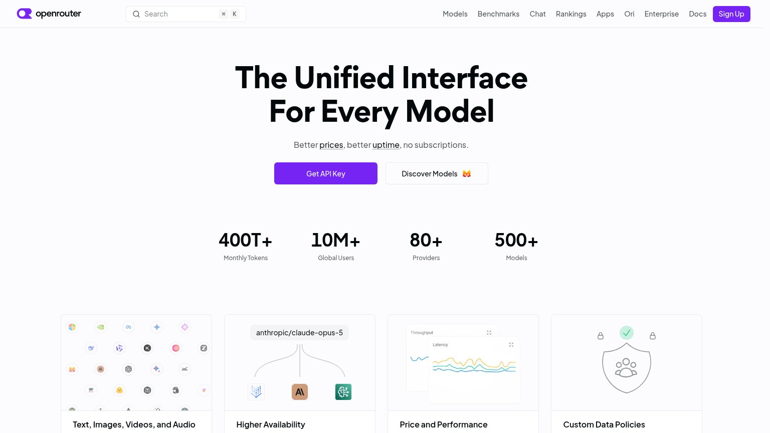 1234
- Nine-link nav row — Models through Docs offers nine equal-weight exits before the visitor reaches the hero CTA.
- Sign Up button — Same purple fill weight as Get API Key, splitting primary-action attention across the fold.
- Discover Models button — Sized identically to Get API Key beside it, diluting the single-action scan path.
- Prices/uptime links — Underlined 'prices' and 'uptime' links sit inside the subline, inviting exits mid-value-prop.
CTA
76FairCopy, size, verb, cost-feel — does the primary CTA earn the click?
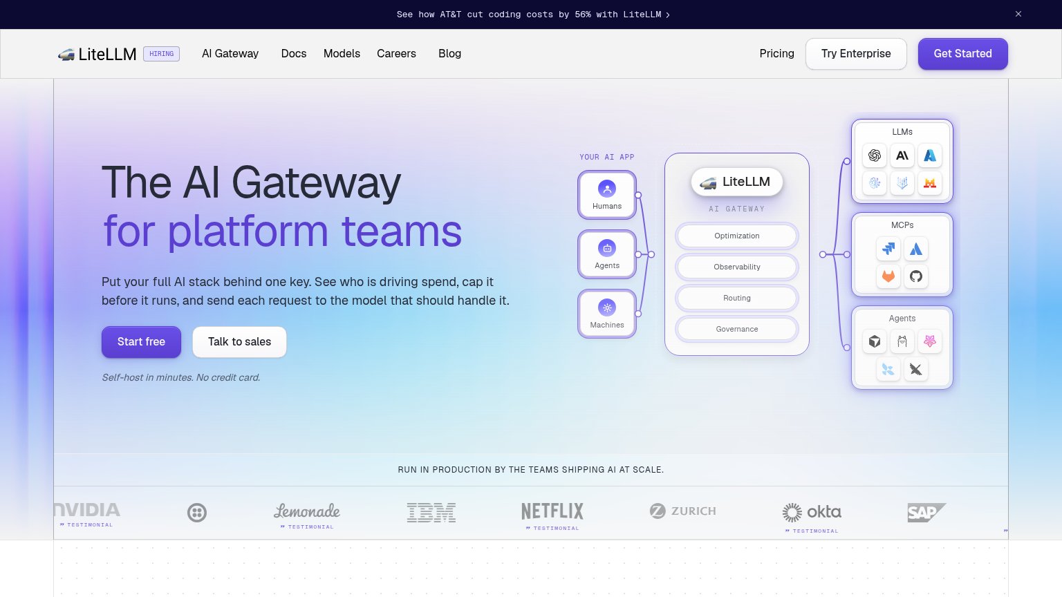
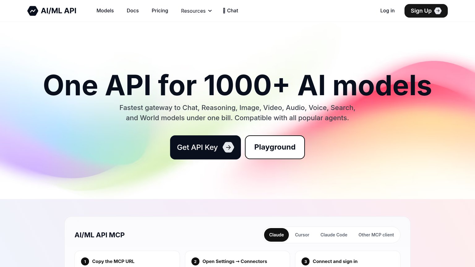
Problems
- click promises credential, not value
- competes with nav 'Sign Up' label
- no visible free-start reinforcement
Trust
76FairProof that the product is real, competent, and safe to try.
How OpenRouter compares
Trust read
Mobile web
78FairThe phone experience as a first-class citizen.
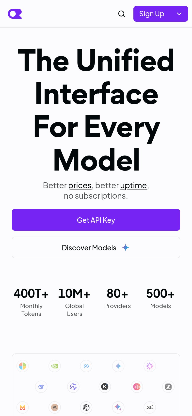
What works
What to improve
Value props
82StrongTitle, subtitle, hero — do they sell the product's true value?
OpenRouter’s headline
The Unified Interface For Every Model
Better prices, better uptime, no subscriptions.
Working
Could improve