RoboDockYC W26 landing page report.
← Back to YC W26

Your landing page’s weakest score is Trust.

How RoboDock ranks

  1. 1.UVeye72
  2. 2.RoboDock60
  3. 3.Electric Era57
Fix Trust

Score over time

8070605040Electric Era 60 on May 17 (Wayback)Electric Era 54 on Jun 20 (Wayback)Electric Era 55 on Jun 28 (Wayback)Electric Era 52 on Jul 5 (Wayback)Electric Era 53 on Aug 11 (Wayback)Electric Era 52 on Sep 16 (Wayback)Electric Era 57 on Sep 21 (Live)UVeye 72 on Sep 21 (Live)RoboDock 60 on Apr 17 (Wayback)RoboDock 60 on May 14 (Wayback)RoboDock 60 on Sep 21 (Live)Apr 17May 14Sep 21
Past reportsShow past reportsHide past reports
  1. Sep 21, 202660LiveMobile web −6 · Information hierarchy +2Viewing
  2. May 14, 202660CTA +3 · Information hierarchy −2View →
  3. Apr 17, 202660First tracked report — strongest Mobile web 76, weakest Trust 47View →

Trust

48Poor

Proof that the product is real, competent, and safe to try.

RoboDock
Electric Era
UVeye
Trust read
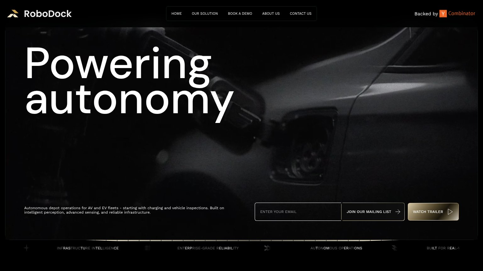
RoboDock"Backed by Y Combinator" badge in the header
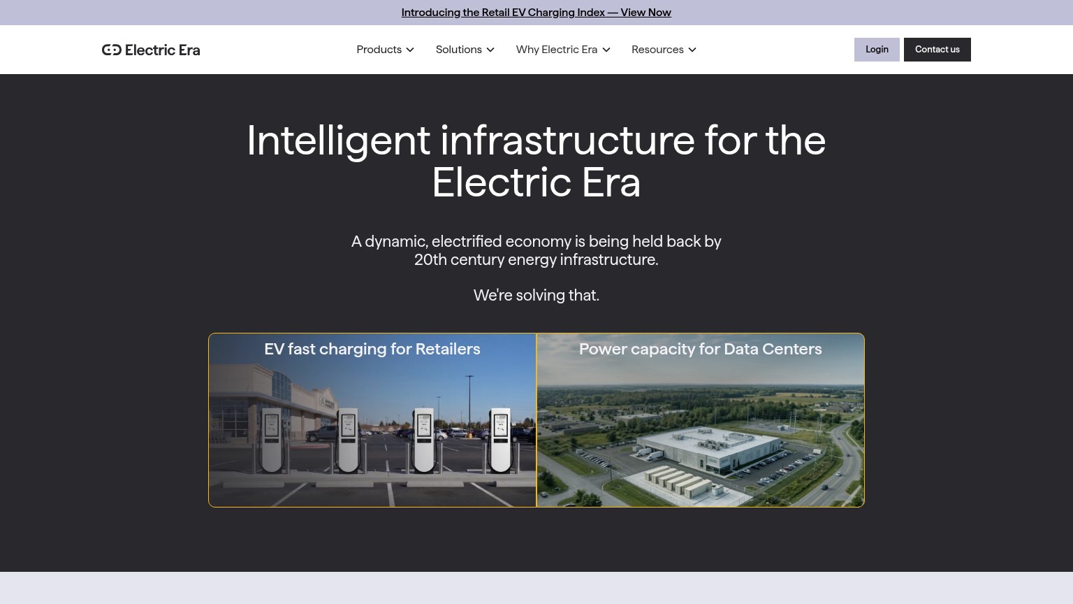
Electric EraPhoto of installed EV fast chargers at a retail parking lot in the "EV fast charging for Retailers" card
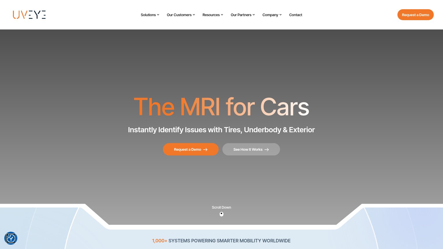
UVeye"1,000+ SYSTEMS POWERING SMARTER MOBILITY WORLDWIDE" usage stat

Value props

52Fair

Title, subtitle, hero — do they sell the product's true value?

RoboDock’s headline vaguePowering autonomyAutonomous depot operations for AV and EV fleets - starting with charging and vehicle inspections. Built on intelligent perception, advanced sensing, and reliable infrastructure.

Working

  • Subhead names the real offer: depot ops for AV/EV fleets
  • "Starting with charging and inspections" is concrete
  • YC badge adds credibility above the fold

Could improve

  • H1 is a two-word abstraction, sells nothing
  • No numbers or outcomes anywhere in the fold
  • Hero video too dark to show the product working

CTA

58Fair

Copy, size, verb, cost-feel — does the primary CTA earn the click?

RoboDock
UVeye

Problems

  • newsletter, not product value
  • four words, over limit
  • 'our' centers company, not visitor
  • demo CTA buried in nav

Information hierarchy

68Fair

Does the design help or inhibit what the page is trying to say?

Information hierarchy annotations on the desktop capture1234
  1. Watch Trailer button — Brightest element in the fold, pulling attention from the conversion action beside it.
  2. Join Mailing List CTA — The conversion CTA is styled darker and weaker than the adjacent trailer button, inverting the priority.
  3. Subtitle paragraph — Core value prop set in small, dim type in the bottom-left corner, disconnected from the headline.
  4. Five-item nav bar — Book a Demo, Contact Us and three more links compete as exits before the fold's own CTAs.

Mobile web

72Fair

The phone experience as a first-class citizen.

Mobile web annotations on the mobile capture123
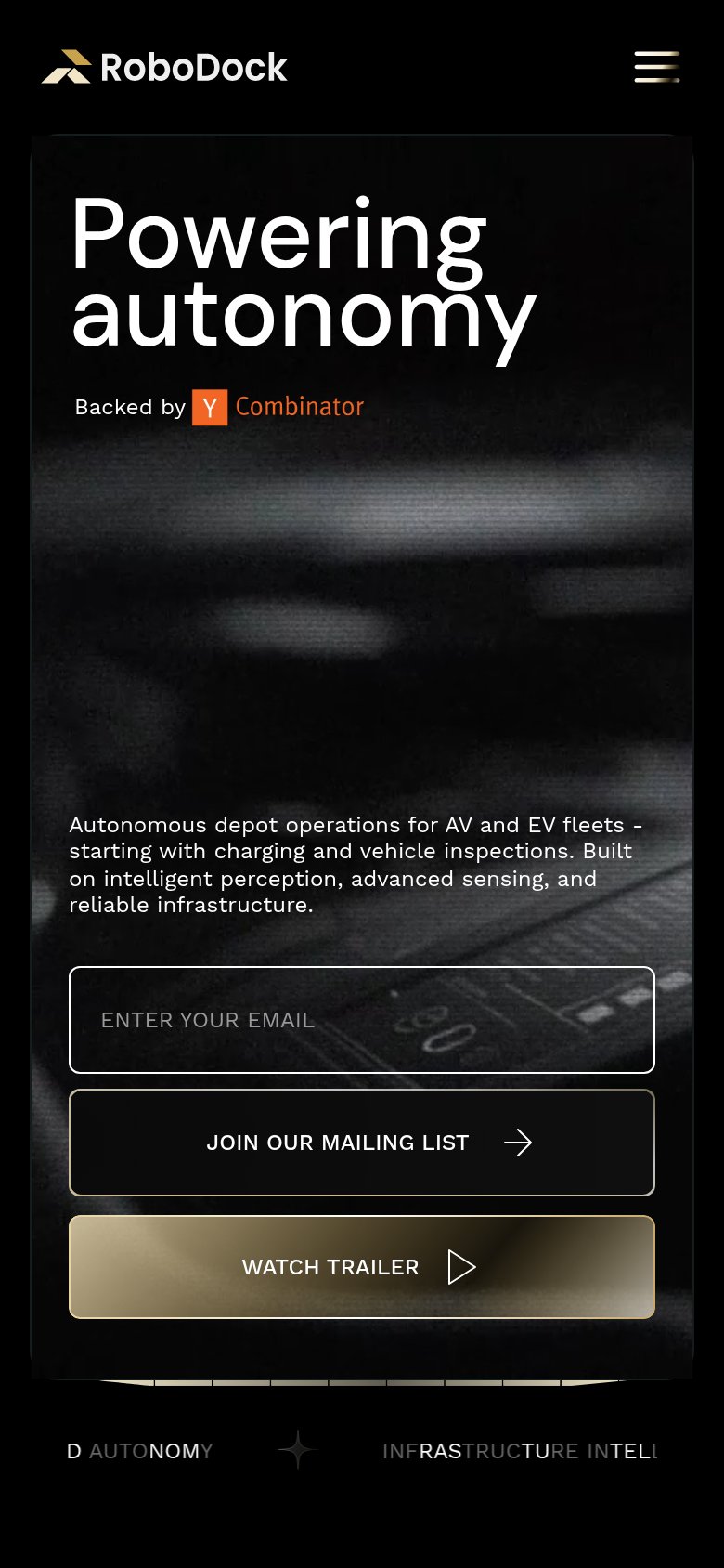
  1. Email capture block — Primary CTA sits far below the first viewport; visitors see no action without scrolling.
  2. Stacked CTA trio — Email field, mailing-list button, and trailer button compete with no clear primary action.
  3. Bottom ticker text — Partially faded scrolling ticker ('D AUTONOMY', 'INFRASTRUCTURE INTELL') reads as broken clipped text.

Competitors

inferred from product, audience, and value prop