
Your landing page’s weakest score is Trust.
How Electric Era ranks
- 1.
UVeye72
- 2.
RoboDock60
- 3.
Electric Era57
Trust
54FairProof that the product is real, competent, and safe to try.
| Trust read | |
|---|---|
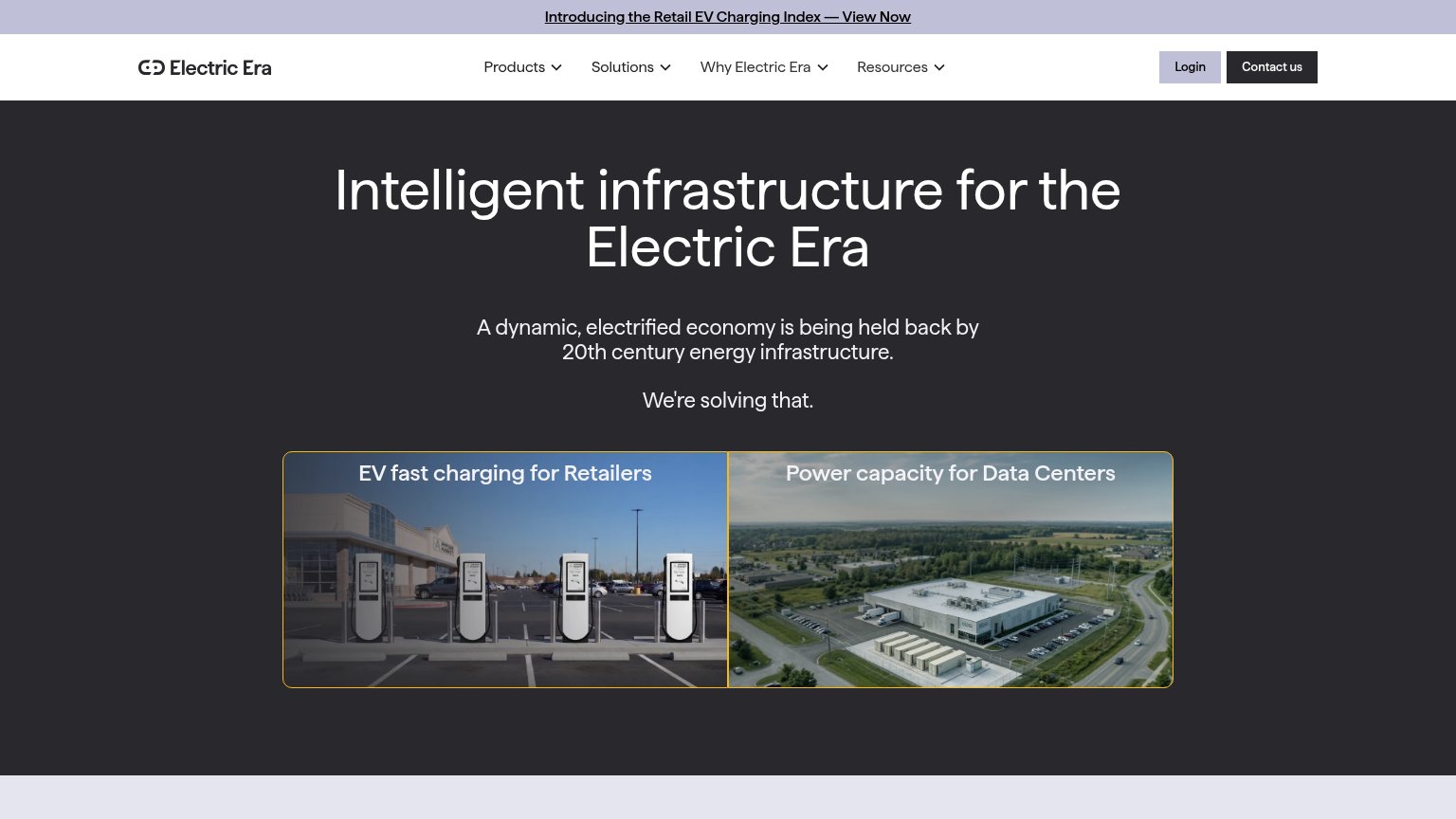
| Electric Era | Photo of installed EV fast chargers at a retail parking lot in the "EV fast charging for Retailers" card |
| "Backed by Y Combinator" badge in the header | |
| "1,000+ SYSTEMS POWERING SMARTER MOBILITY WORLDWIDE" usage stat |
Mobile web
54FairThe phone experience as a first-class citizen.
 123
- Six-line hero headline — The desktop headline barely scaled down, wrapping into four oversized lines that consume more than a third of the viewport before any value copy.
- Promo bar above logo — The 'Retail EV Charging Index' banner sits above the header and eats the top slice of the fold with a secondary link.
- Cropped path tiles — The 'EV fast charging' and 'Power capacity' cards are cut off mid-image with three-line wrapped titles, weakening the only actionable elements.
CTA
55FairCopy, size, verb, cost-feel — does the primary CTA earn the click?
How Electric Era compares
Recommended rewrites
Information hierarchy
62FairDoes the design help or inhibit what the page is trying to say?
What works
What to improve
Value props
62FairTitle, subtitle, hero — do they sell the product's true value?
Electric Era’s headline
Intelligent infrastructure for the Electric Era
A dynamic, electrified economy is being held back by 20th century energy infrastructure. We're solving that.
Working
Could improve