
Your landing page’s weakest score is Trust.
How UVeye ranks
- 1.
UVeye72
- 2.
RoboDock60
- 3.
Electric Era57
72Growth scoreupdated
category scores
category scoresShowHide
Trust
54FairProof that the product is real, competent, and safe to try.
| Trust read | |
|---|---|
| UVeye | "1,000+ SYSTEMS POWERING SMARTER MOBILITY WORLDWIDE" usage stat |
| "Backed by Y Combinator" badge in the header | |
| Photo of installed EV fast chargers at a retail parking lot in the "EV fast charging for Retailers" card |
Information hierarchy
72FairDoes the design help or inhibit what the page is trying to say?
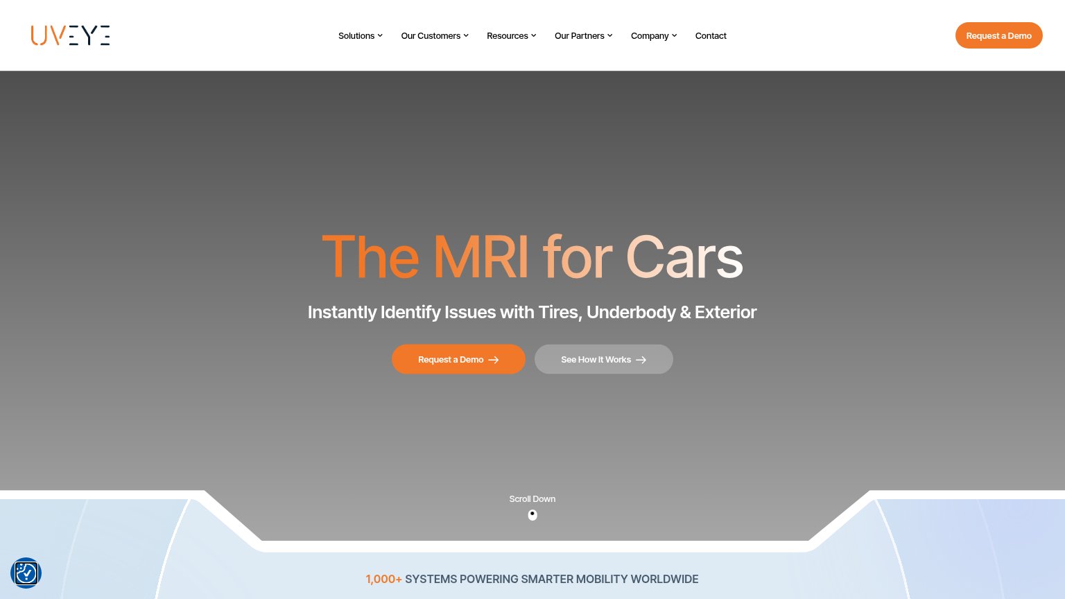 123
- Six-item dropdown nav — Six same-weight dropdown menus plus Contact create heavy exit density before the hero CTA can win attention.
- Duplicate demo CTA — Header 'Request a Demo' duplicates the hero button at equal orange weight, splitting the single conversion focus.
- See How It Works — Low-contrast gray-on-gray secondary button sits at nearly the same size as the primary, diluting the scan path.
CTA
72FairCopy, size, verb, cost-feel — does the primary CTA earn the click?
How UVeye compares
Recommended rewrites
Value props
78FairTitle, subtitle, hero — do they sell the product's true value?
UVeye’s headline
The MRI for Cars
Instantly Identify Issues with Tires, Underbody & Exterior
Working
Could improve
Mobile web
82StrongThe phone experience as a first-class citizen.
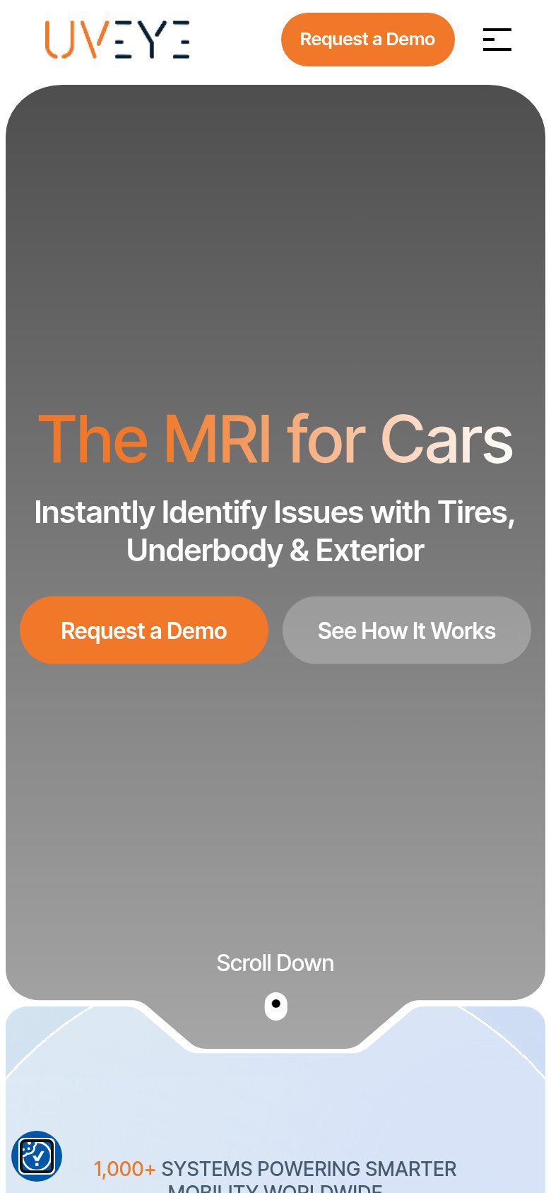
What works
What to improve