LegalOSYC W26 landing page report.
← Back to YC W26

Your landing page’s weakest score is Mobile web.

Fix Mobile web

Score over time

100806040200Alma 68 on Apr 2 (Wayback)Alma 68 on May 16 (Wayback)Alma 74 on Jul 2 (Wayback)Alma 75 on Aug 11 (Wayback)Alma 74 on Sep 21 (Live)Lighthouse 73 on Apr 7 (Wayback)Lighthouse 73 on Apr 22 (Wayback)Lighthouse 73 on May 17 (Wayback)Lighthouse 73 on Jun 14 (Wayback)Lighthouse 76 on Sep 21 (Live)Plymouth Street 58 on Apr 21 (Wayback)Plymouth Street 58 on May 18 (Wayback)Plymouth Street 59 on May 27 (Wayback)Plymouth Street 59 on Jun 13 (Wayback)Plymouth Street 60 on Jul 10 (Wayback)Plymouth Street 56 on Sep 5 (Wayback)Plymouth Street 57 on Sep 21 (Live)Bridge 58 on Sep 22 (Live)Deel Immigration 59 on Jun 30 (Wayback)Deel Immigration 20 on Jul 23 (Wayback)Deel Immigration 77 on Sep 21 (Live)LegalOS 41 on May 15 (Wayback)LegalOS 39 on Jun 14 (Wayback)LegalOS 70 on Jul 12 (Wayback)LegalOS 68 on Jul 20 (Wayback)LegalOS 72 on Sep 22 (Live)May 15Jun 14Jul 12Jul 20Sep 22
Past reportsShow past reportsHide past reports
  1. Sep 22, 202672LiveOverall +4 · Trust +14 · Information hierarchy +4Viewing
  2. Jul 20, 202668Overall −2 · CTA −8 · Information hierarchy −4View →
  3. Jul 12, 202670Overall +31 · Information hierarchy +54 · Value props +34View →
  4. Jun 14, 202639Overall −2 · Information hierarchy −12 · CTA −6View →
  5. May 15, 202641First tracked report — strongest CTA 68, weakest Mobile web 28View →

Mobile web

64Fair

The phone experience as a first-class citizen.

Mobile web annotations on the mobile capture1234
  1. Primary CTA row — "Get Started" and "Explore Visas" sit at the very bottom of the fold as two half-width buttons instead of one full-bleed action.
  2. Serif hero headline — "Faster Immigration for High-Growth Teams" barely scaled down and wraps into six tall lines, consuming most of the first viewport.
  3. Duplicate Get Started — Header "Get Started" pill duplicates the hero CTA below, splitting attention between two identical actions.
  4. Dashboard screenshot mockup — Desktop-density product UI with three tiny visa cards is illegible at phone width and adds clutter below the CTAs.

CTA

72Fair

Copy, size, verb, cost-feel — does the primary CTA earn the click?

LegalOS

Problems

  • generic label, no product payoff
  • no echo of headline promise
  • click destination unclear

Trust

72Fair

Proof that the product is real, competent, and safe to try.

LegalOS
Deel Immigration
Lighthouse
Trust read
LegalOS"Backed by Y" (Y Combinator badge above the headline)
AlmaCustomer logo wall under "WHEN QUALITY AND SPEED MATTER, TEAMS CHOOSE ALMA." (Sybill, Ekho, Crossmint, Rundoo, Voltai, L
LighthouseCustomer logo row (Chai Discovery, Clay, Cursor, Endex, Extropic) with metrics strip "AVG DAYS TO SUBMISSION: 21*" and "
Plymouth Street"PROUDLY SUPPORTING" heading at the mobile fold edge
BridgeNo visible trust signal identified.
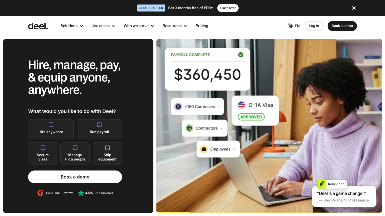
Deel ImmigrationG2 4.8/5 (5K+ Reviews) and Trustpilot 4.5/5 (9K+ Reviews) badges directly below the "Book a demo" CTA

Value props

74Fair

Title, subtitle, hero — do they sell the product's true value?

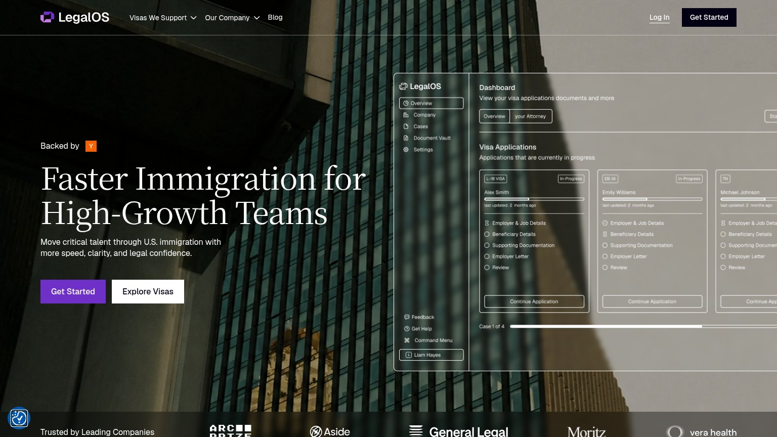
LegalOS’s headline sellsFaster Immigration for High-Growth TeamsMove critical talent through U.S. immigration with more speed, clarity, and legal confidence.

Working

  • Names the audience: high-growth teams
  • Hero shows real visa dashboard, not decoration
  • Taps urgency and legal-confidence emotions

Could improve

  • 'Faster' has no number behind it
  • Subhead repeats 'speed' from headline
  • No named outcome like days-to-approval

Information hierarchy

76Fair

Does the design help or inhibit what the page is trying to say?

Information hierarchy annotations on the desktop capture1234
  1. Duplicate Get Started — Two identically labeled 'Get Started' buttons (nav and hero) split visual weight; the dark nav copy competes with the purple primary.
  2. Explore Visas button — White secondary button sits at nearly equal size and contrast to the purple primary, forcing a choice at the decision point.
  3. Dashboard screenshot cropped — Product UI runs off the right edge and its low-contrast micro-copy is illegible at this size, adding density without communicating.
  4. Hero headline contrast — White serif headline sits directly on busy glass-facade photography with no scrim, reducing glanceability of the value prop.