
Your landing page’s weakest score is Trust.
How Fenrock AI ranks
- 1.
Sardine72
- 2.
Fenrock AI68
- 3.
Greenlite67
- 4.
Hummingbird61
- 5.
Lucinity59
68Growth scoreupdated
category scores
category scoresShowHide
Score over time
Trust
42PoorProof that the product is real, competent, and safe to try.
| Trust read | |
|---|---|
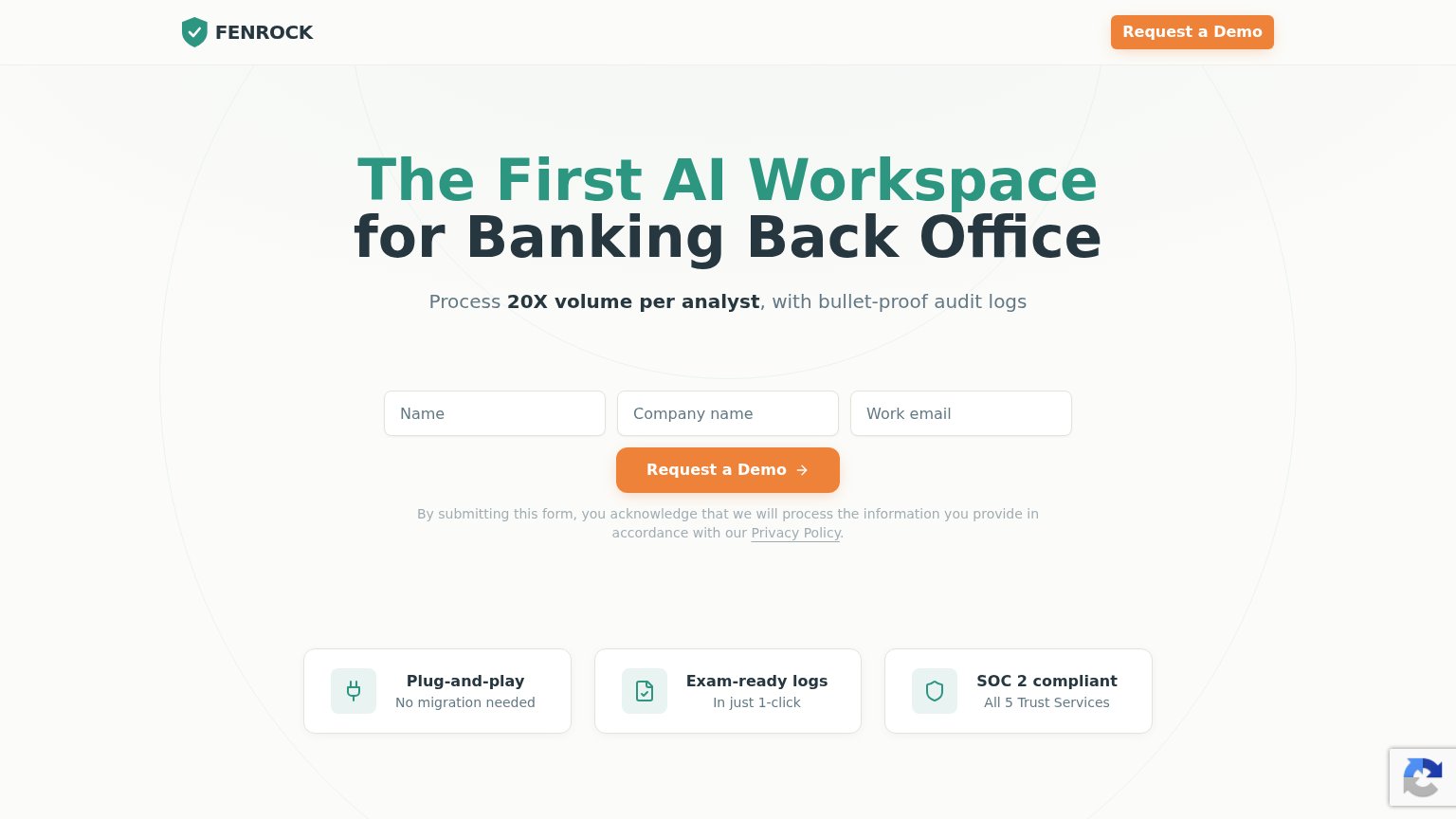
| Fenrock AI | SOC 2 compliant — All 5 Trust Services |
| No visible trust signal identified. | |
| No visible trust signal identified. | |
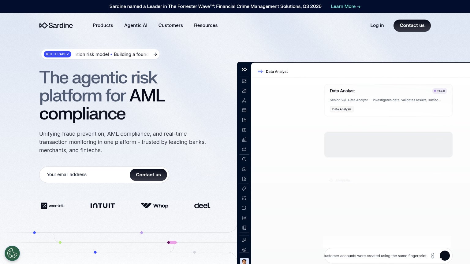
| Announcement bar: "Sardine named a Leader in The Forrester Wave™: Financial Crime Management Solutions, Q3 2026" | |
| No visible trust signal identified. |
CTA
70FairCopy, size, verb, cost-feel — does the primary CTA earn the click?
Problems
- 'Request' feels like asking, not getting
- 3-field form gates the first click
- no low-friction alternative path
Value props
72FairTitle, subtitle, hero — do they sell the product's true value?
Fenrock AI’s headline sells
The First AI Workspace for Banking Back Office
Process 20X volume per analyst, with bullet-proof audit logs
Working
- 20X volume claim is concrete and bold
- Audit logs address regulator fear
- Trust chips preempt bank objections
Could improve
- 'First AI Workspace' is category, not outcome
- No hero image showing the product
- Doesn't say what back-office tasks it does
Mobile web
72FairThe phone experience as a first-class citizen.
 123
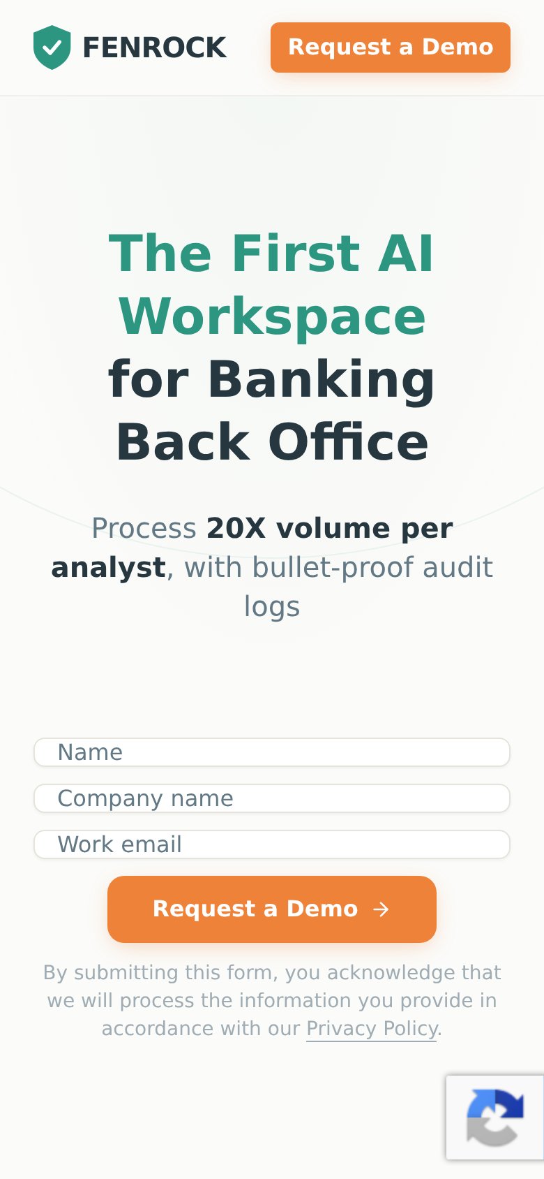
- Hero headline — Desktop-scale headline wraps into four tall lines and pushes the form and CTA out of the first viewport.
- Request a Demo button — Primary CTA sits well below the fold; visitors must scroll past headline and three form fields to reach it.
- reCAPTCHA badge — Floating reCAPTCHA widget overlaps the bottom-right corner and crowds the privacy text.
Information hierarchy
86StrongDoes the design help or inhibit what the page is trying to say?
12- Header Request a Demo — Full-weight duplicate of the form submit; competes with the in-fold form instead of pointing to it.
- Hero headline area — No product visual or brand imagery accompanies the claim; the fold reads generic for a category-defining promise.