
Your landing page’s weakest score is CTA.
How Sardine ranks
- 1.
Socratix AI75
- 2.
Sardine72
- 3.
Greenlite67
- 4.
Lucinity59
72Growth scoreupdated
category scores
category scoresShowHide
CTA
58FairCopy, size, verb, cost-feel — does the primary CTA earn the click?
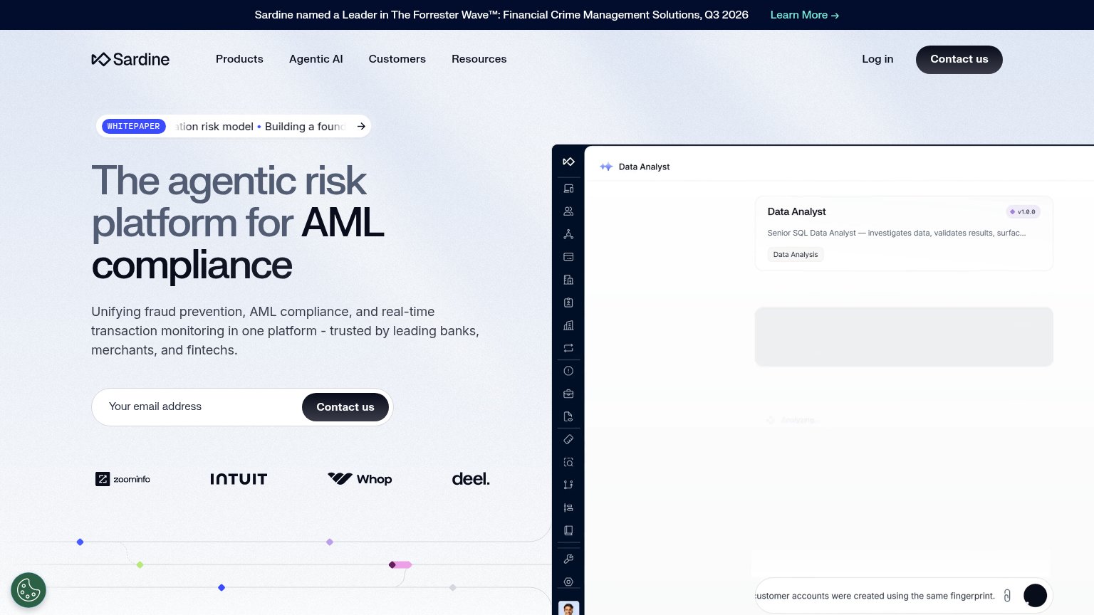
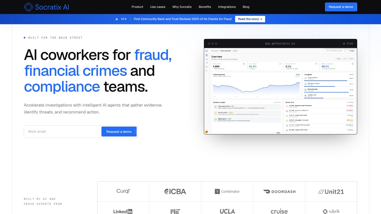
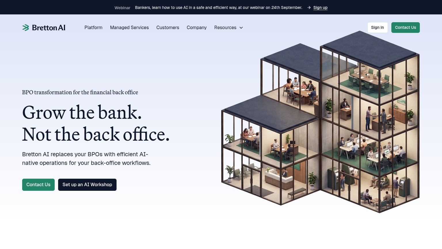
Problems
- no action verb, reads as sales ask
- click feels costly — no stated payoff
- email field with vague deliverable
Information hierarchy
72FairDoes the design help or inhibit what the page is trying to say?
1234- Whitepaper ticker pill — Scrolling truncated text ("ation risk model • Building a found") sits directly above the headline and pulls the first fixation to an unreadable exit.
- Duplicate Contact us buttons — Nav "Contact us" is styled at the same dark-pill weight as the hero form button, splitting the primary action into two equal targets.
- Forrester banner Learn More — A full-width top banner with its own "Learn More →" link is the first exit path visitors see before the value prop.
- Product screenshot cut off — The Data Analyst panel bleeds off the right edge with a mostly blank loading skeleton, communicating little at the cost of half the fold.
Mobile web
72FairThe phone experience as a first-class citizen.
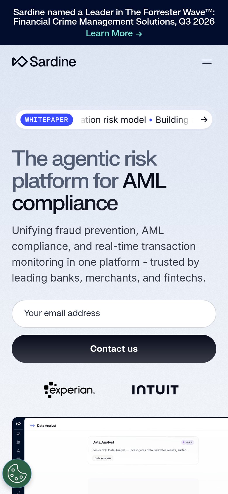
What works
What to improve
Value props
74FairTitle, subtitle, hero — do they sell the product's true value?
Sardine’s headline
The agentic risk platform for AML compliance
Unifying fraud prevention, AML compliance, and real-time transaction monitoring in one platform - trusted by leading banks, merchants, and fintechs.
Working
Could improve
Trust
82StrongProof that the product is real, competent, and safe to try.
How Sardine compares
Trust read