CopperlaneYC W26 landing page report.
← Back to YC W26

Your landing page’s weakest score is Value props.

Fix Value props

Score over time

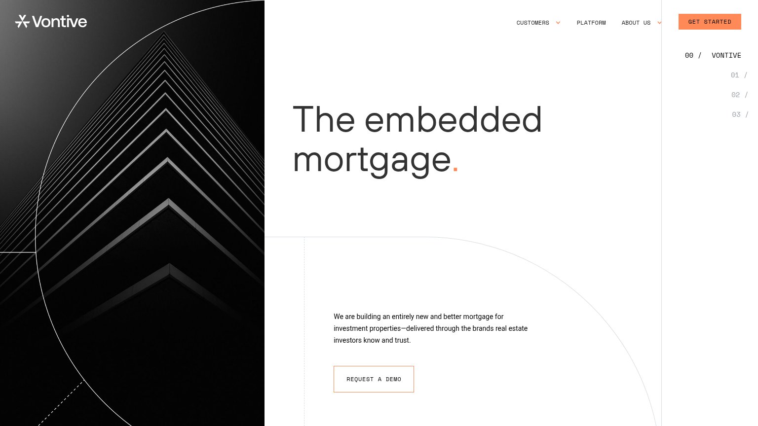
80757065605550Vesta 65 on Sep 21 (Live)Blend 72 on Jun 13 (Wayback)Blend 75 on Jun 27 (Wayback)Blend 72 on Jul 17 (Wayback)Blend 74 on Jul 27 (Wayback)Blend 74 on Aug 18 (Wayback)Blend 74 on Aug 26 (Wayback)Blend 69 on Sep 21 (Live)Maxwell 56 on Apr 21 (Wayback)Maxwell 57 on Jun 14 (Wayback)Maxwell 59 on Sep 21 (Live)LoanPASS 64 on Apr 15 (Wayback)LoanPASS 65 on Jun 17 (Wayback)LoanPASS 73 on Jul 28 (Wayback)LoanPASS 73 on Sep 21 (Live)Vontive 58 on Sep 21 (Live)Copperlane 68 on Jun 4 (Wayback)Copperlane 68 on Aug 19 (Wayback)Copperlane 68 on Sep 19 (Wayback)Copperlane 68 on Sep 21 (Live)Jun 4Aug 19Sep 19Sep 21
Past reportsShow past reportsHide past reports
  1. Sep 21, 202668LiveInformation hierarchy +2 · CTA +1Viewing
  2. Sep 19, 202668Information hierarchy −4 · Trust −2View →
  3. Aug 19, 202668Information hierarchy +4 · CTA −4View →
  4. Jun 4, 202668First tracked report — strongest Mobile web 78, weakest Value props 58View →

Value props

62Fair

Title, subtitle, hero — do they sell the product's true value?

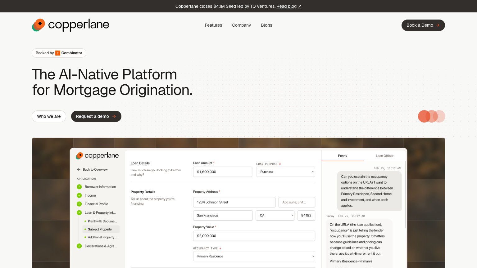
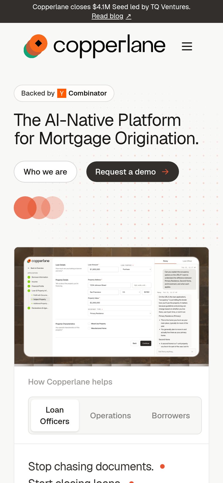
Copperlane’s headline undersellsThe AI-Native Platform for Mortgage Origination.

Working

  • Names exact category and buyer
  • Hero shows real product in action
  • YC badge and seed round add trust

Could improve

  • No subhead explaining the payoff
  • No numbers or outcomes anywhere
  • 'AI-Native Platform' is identity, not value

Trust

62Fair

Proof that the product is real, competent, and safe to try.

Copperlane
LoanPASS
Blend
Trust read
Copperlane"Backed by Y Combinator" badge above the hero headline
Vesta"Increase in AI agent use by lenders 988%" stat with "See report" link
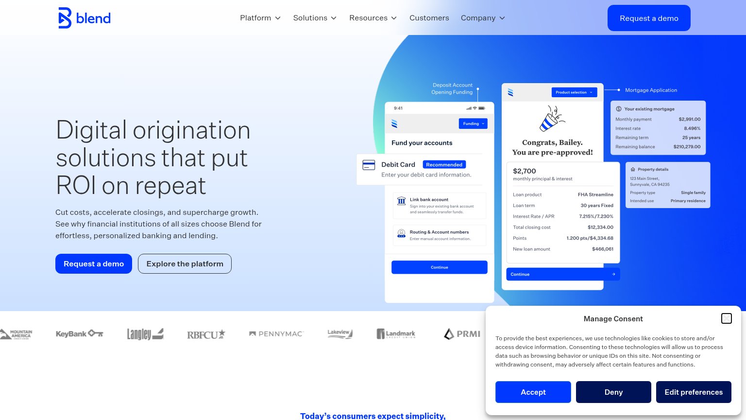
BlendCustomer logo strip naming KeyBank, Pennymac, RBFCU, Langley, Landmark, Lakeview, PRMI, and Mountain America
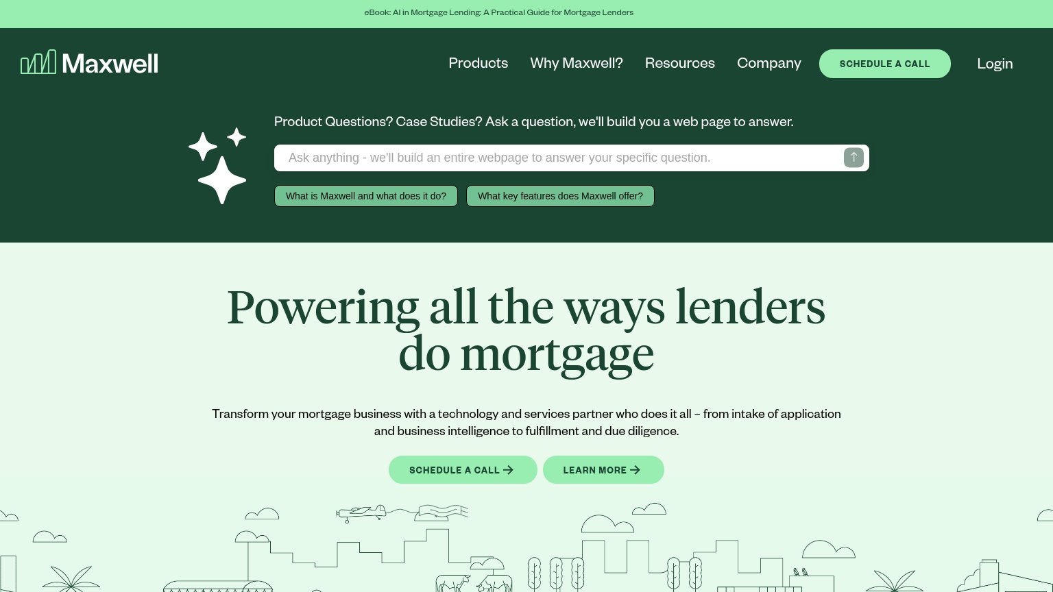
MaxwellNo visible trust signal identified.
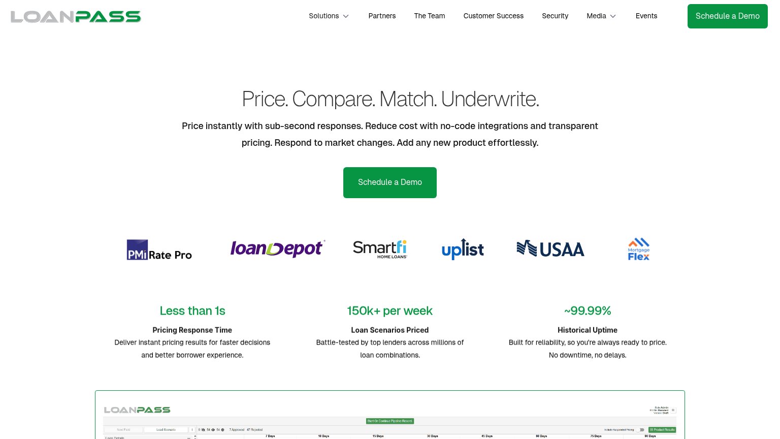
LoanPASSCustomer logo strip including loanDepot and USAA below the hero CTA
VontiveNo visible trust signal identified.

CTA

63Fair

Copy, size, verb, cost-feel — does the primary CTA earn the click?

Copperlane
Maxwellin-product action
Blend
LoanPASS
Vontive

Problems

  • 'Request' feels like asking permission
  • nav says 'Book a Demo' — two labels
  • demo-gated: no direct product value
  • secondary 'Who we are' adds no action

Information hierarchy

76Fair

Does the design help or inhibit what the page is trying to say?

Information hierarchy annotations on the desktop capture1234
  1. Announcement banner blog link — "Read blog ↗" is the first clickable element visitors see and sends them off-page before the pitch begins.
  2. Duplicate demo CTAs — "Book a Demo" in the nav and "Request a demo" in the hero use different labels for the same action, splitting attention across two dark buttons.
  3. Dense product screenshot — The mortgage-form screenshot packs form fields, a sidebar checklist, and a chat panel into one frame, giving the eye no single focal point at fold scale.
  4. Who we are button — Sits left of the primary CTA in the scan path at nearly identical size, so it intercepts clicks before "Request a demo".

Mobile web

78Fair

The phone experience as a first-class citizen.

Mobile web annotations on the mobile capture123
  1. Request a demo button — Partial-width and paired with an equal-weight secondary, splitting the tap decision instead of owning a full-bleed row.
  2. Announcement bar — Wraps to two lines on mobile and consumes header space before the brand or hero appears.
  3. Embedded product screenshot — Desktop UI shrunk to phone width renders its text illegibly, adding noise instead of proof.

Competitors

inferred from product, audience, and value prop