
Your landing page’s weakest score is Information hierarchy.
How LoanPASS ranks
73Growth scoreupdated
category scores
category scoresShowHide
Information hierarchy
68FairDoes the design help or inhibit what the page is trying to say?
 1234
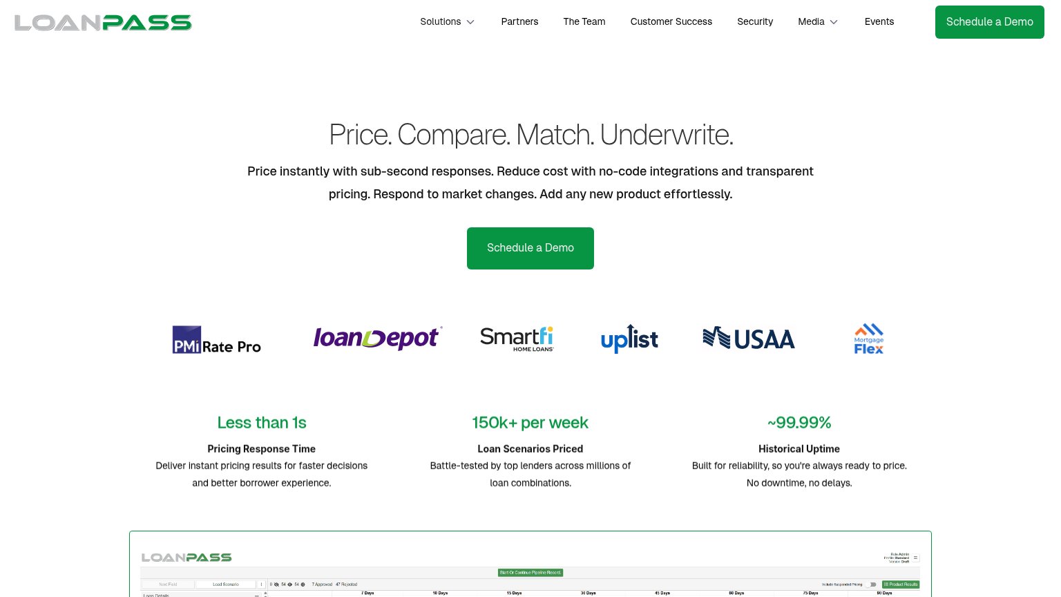
- Duplicate Schedule a Demo — Nav CTA repeats the hero CTA at equal green weight, splitting the single-action focus.
- Eight-item nav row — Solutions, Partners, The Team, Customer Success, Security, Media, Events offer nine-plus exits before the pitch is read.
- Product screenshot strip — Dashboard peeks into the fold as an unreadable sliver of tiny UI chrome, adding noise without communicating.
- Four-verb headline — 'Price. Compare. Match. Underwrite.' assumes category knowledge and gives the same visual weight to four ideas.
CTA
70FairCopy, size, verb, cost-feel — does the primary CTA earn the click?
Problems
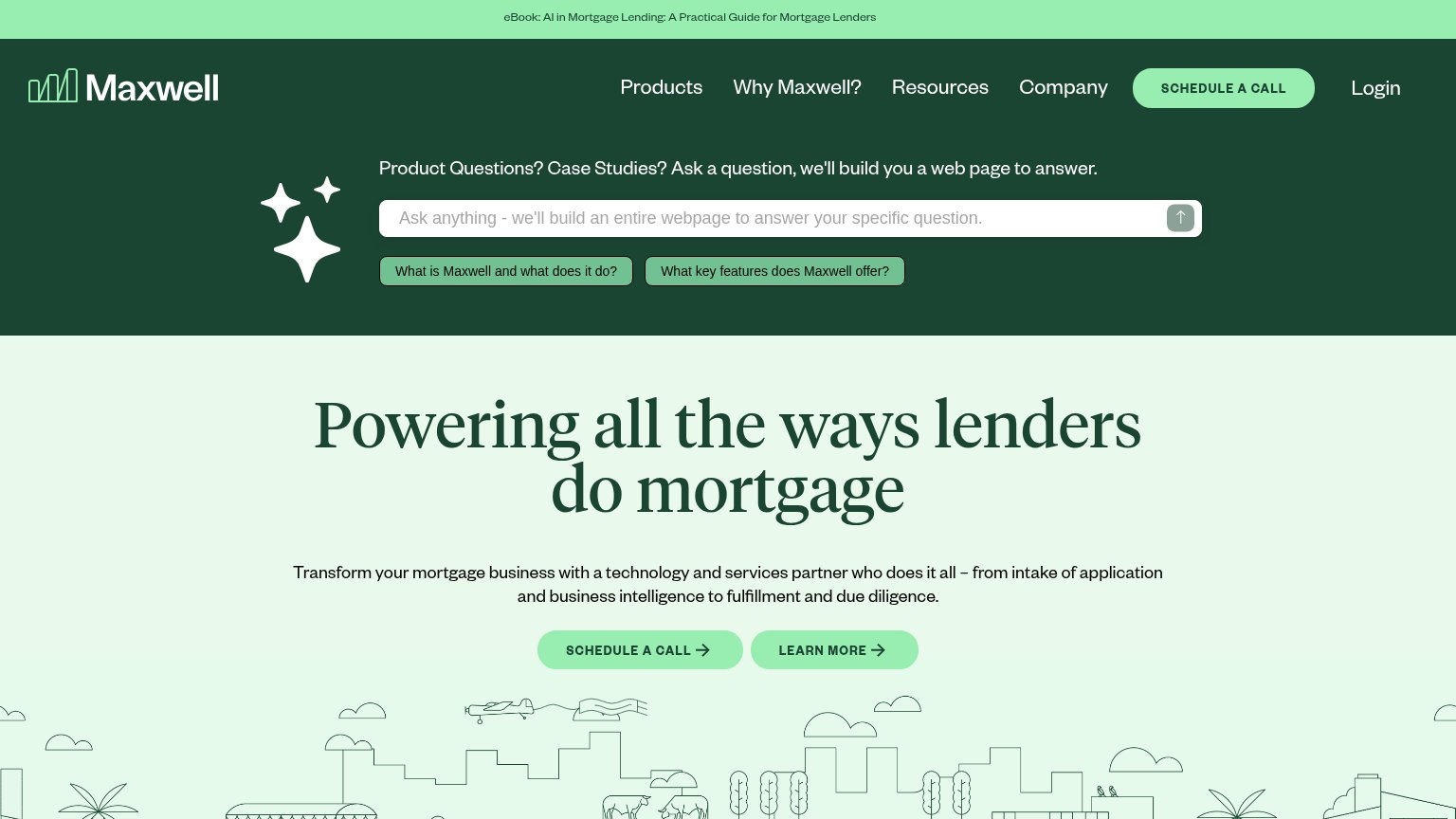
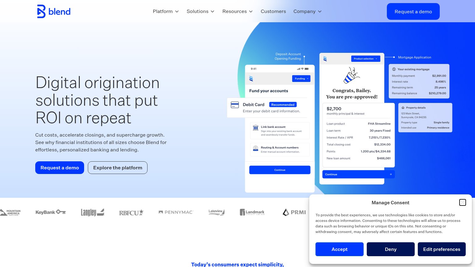
- 'Schedule' feels like a time cost
- demo gate, no in-product action
- no value payoff in the label
Mobile web
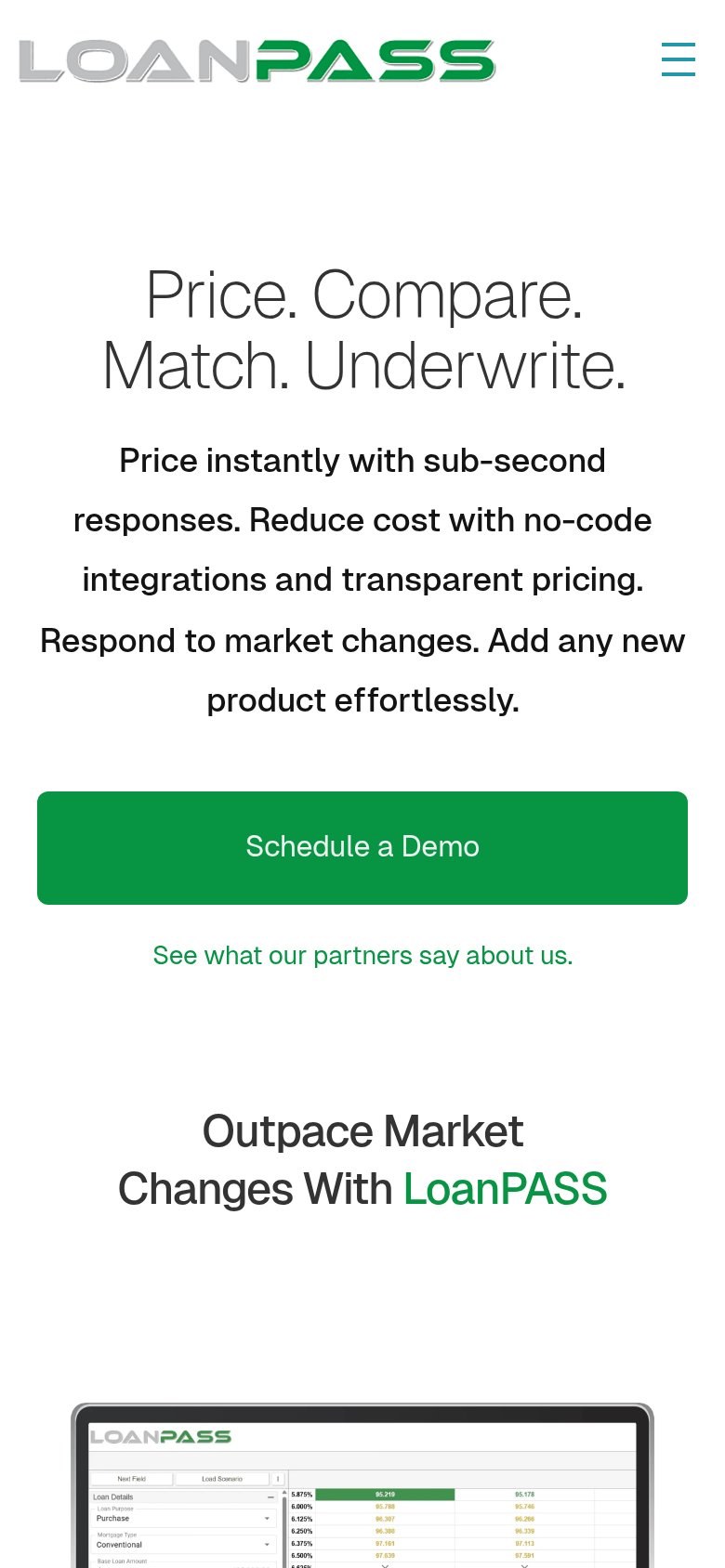
72FairThe phone experience as a first-class citizen.
What works
What to improve
Value props
78FairTitle, subtitle, hero — do they sell the product's true value?
LoanPASS’s headline
Price. Compare. Match. Underwrite.
Price instantly with sub-second responses. Reduce cost with no-code integrations and transparent pricing. Respond to market changes. Add any new product effortlessly.
Working
Could improve
Trust
78FairProof that the product is real, competent, and safe to try.
How LoanPASS compares
Trust read