
Your landing page’s weakest score is Mobile web.
How Blend ranks
69Growth scoreupdated
category scores
category scoresShowHide
Mobile web
62FairThe phone experience as a first-class citizen.
 123
- Cookie consent sheet — Covers nearly half the viewport with a dead consent wall, crowding right up against the CTA row.
- Request a demo button — Desktop-proportioned at half the column width instead of a full-bleed thumb target.
- Explore the platform button — Competes side-by-side with the primary CTA at equal visual weight, splitting the tap decision.
Information hierarchy
68FairDoes the design help or inhibit what the page is trying to say?
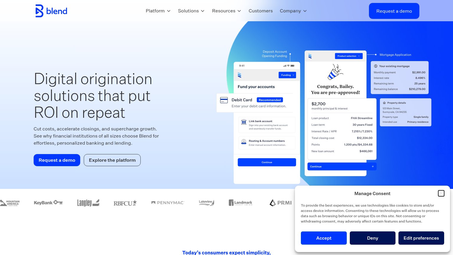 1234
- Cookie consent banner — Three heavy same-weight buttons hijack the fold's bottom-right and outrank the hero CTA on first paint.
- Duplicate demo CTAs — Nav 'Request a demo' repeats the hero button at equal visual weight, splitting the primary action's authority.
- Product screenshot cluster — Three overlapping UI panels with dense loan figures compete with the headline for first-glance attention.
- Customer logo strip — Logos are clipped mid-fold and half-hidden by the consent modal, muddying the transition beat.
CTA
72FairCopy, size, verb, cost-feel — does the primary CTA earn the click?
How Blend compares
Recommended rewrites
Value props
72FairTitle, subtitle, hero — do they sell the product's true value?
Blend’s headline
Digital origination solutions that put ROI on repeat
Cut costs, accelerate closings, and supercharge growth. See why financial institutions of all sizes choose Blend for effortless, personalized banking and lending.
Working
Could improve
Trust
72FairProof that the product is real, competent, and safe to try.
How Blend compares
Trust read