
Your landing page’s weakest score is Trust.
How Avoice ranks
- 1.
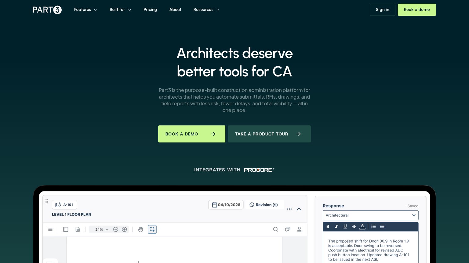
Part371
- 2.
Avoice69
- 3.
Motif69
- 4.
NBS Chorus64
69Growth scoreupdated
category scores
category scoresShowHide
Score over time
Trust
58FairProof that the product is real, competent, and safe to try.
| Trust read | |
|---|---|
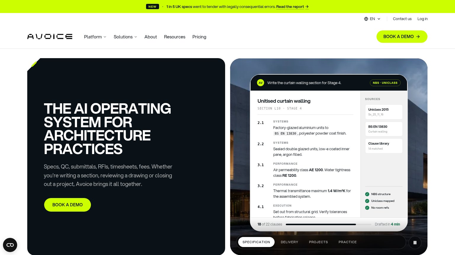
| Avoice | Product demo UI drafting "Unitised curtain walling" with sources "Uniclass 2015" and "BS EN 13830" and "18 of 22 clauses |
| Free access to over 1,000 RIBA-accredited CPD courses from more than 500 Providers. | |
| "INTEGRATES WITH PROCORE" badge beneath the hero CTAs | |
| In-app BIM editor screenshot showing a 3D building model with layer panel and annotation tools |
Mobile web
64FairThe phone experience as a first-class citizen.
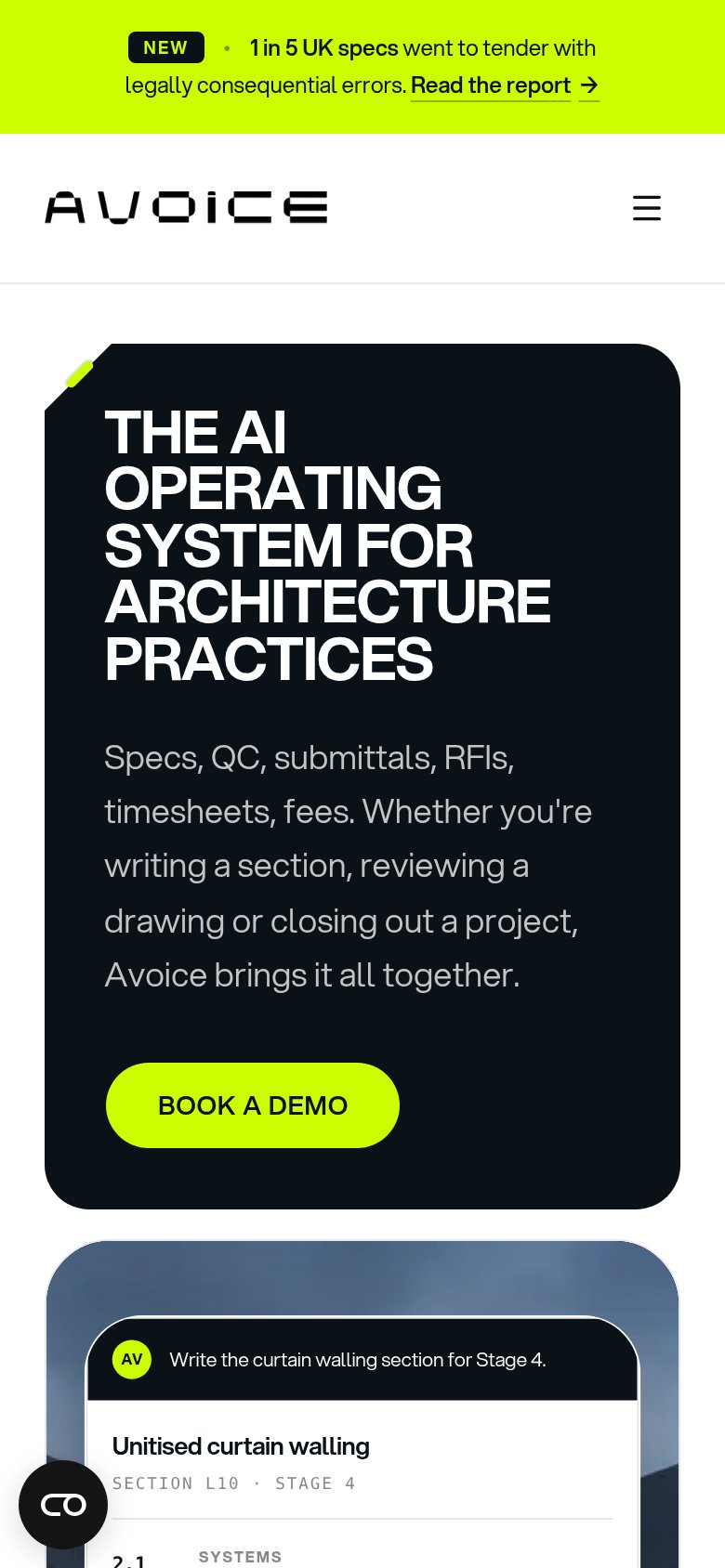
1234- Oversized headline block — "THE AI OPERATING SYSTEM FOR ARCHITECTURE PRACTICES" wraps into six tall lines, consuming roughly a third of the viewport before any supporting copy.
- BOOK A DEMO button — Primary CTA sits at the bottom edge of the first viewport and is desktop-proportioned rather than full-bleed within the card.
- Announcement banner — Three-line "1 in 5 UK specs" promo bar eats a meaningful slice of the top of the fold with a competing "Read the report" link.
- Chat bubble overlay — Floating chat widget hovers over hero content and will overlap the demo-animation area as the user scrolls.
CTA
72FairCopy, size, verb, cost-feel — does the primary CTA earn the click?
Problems
- demo booking feels costly/committal
- no self-serve or low-cost path
- generic label, no product payoff
Value props
72FairTitle, subtitle, hero — do they sell the product's true value?
Avoice’s headline undersells
The AI operating system for architecture practices
Specs, QC, submittals, RFIs, timesheets, fees. Whether you're writing a section, reviewing a drawing or closing out a project, Avoice brings it all together.
Working
- Subhead lists real architect workflows
- Hero demo shows spec drafted in 4 min
- Audience named precisely in headline
Could improve
- 'Operating system' is category jargon
- No outcome or emotion in headline
- '1 in 5 specs' stat buried in banner
Information hierarchy
78FairDoes the design help or inhibit what the page is trying to say?
1234- Read the report banner — Underlined arrow link at the very top pulls first attention to an exit before the value prop lands.
- Utility nav row — EN selector, Contact us, and Log in add three extra exits stacked above the main nav's five links.
- Demo panel clause list — Dense small-type spec clauses (2.1–4.1) compete with the headline for first read instead of registering as one visual beat.
- Specification tab strip — Four same-weight tabs (Specification/Delivery/Projects/Practice) add a second interactive decision inside the fold.