
Your landing page’s weakest score is Trust.
How Stamp ranks
72Growth scoreupdated
category scores
category scoresShowHide
Score over time
Trust
44PoorProof that the product is real, competent, and safe to try.


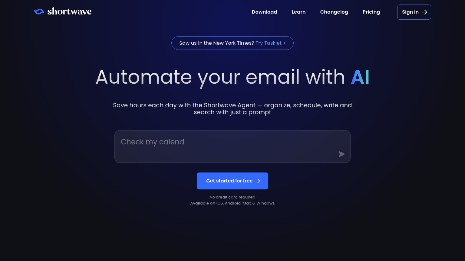

| Trust read | |
|---|---|
| Stamp | Embedded product screenshot in the "Watch the Demo" card showing the real Stamp inbox UI with Priority tab and Stamp Age |
| Rendered inbox UI with split tabs (Important 8, Calendar 18, Team 15, Docs 40) and an "Auto Draft to Karl" AI-composed r | |
| "Saw us in the New York Times?" press banner | |
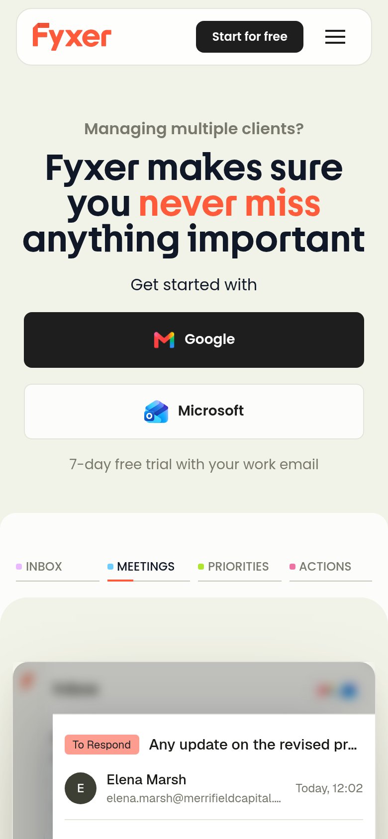
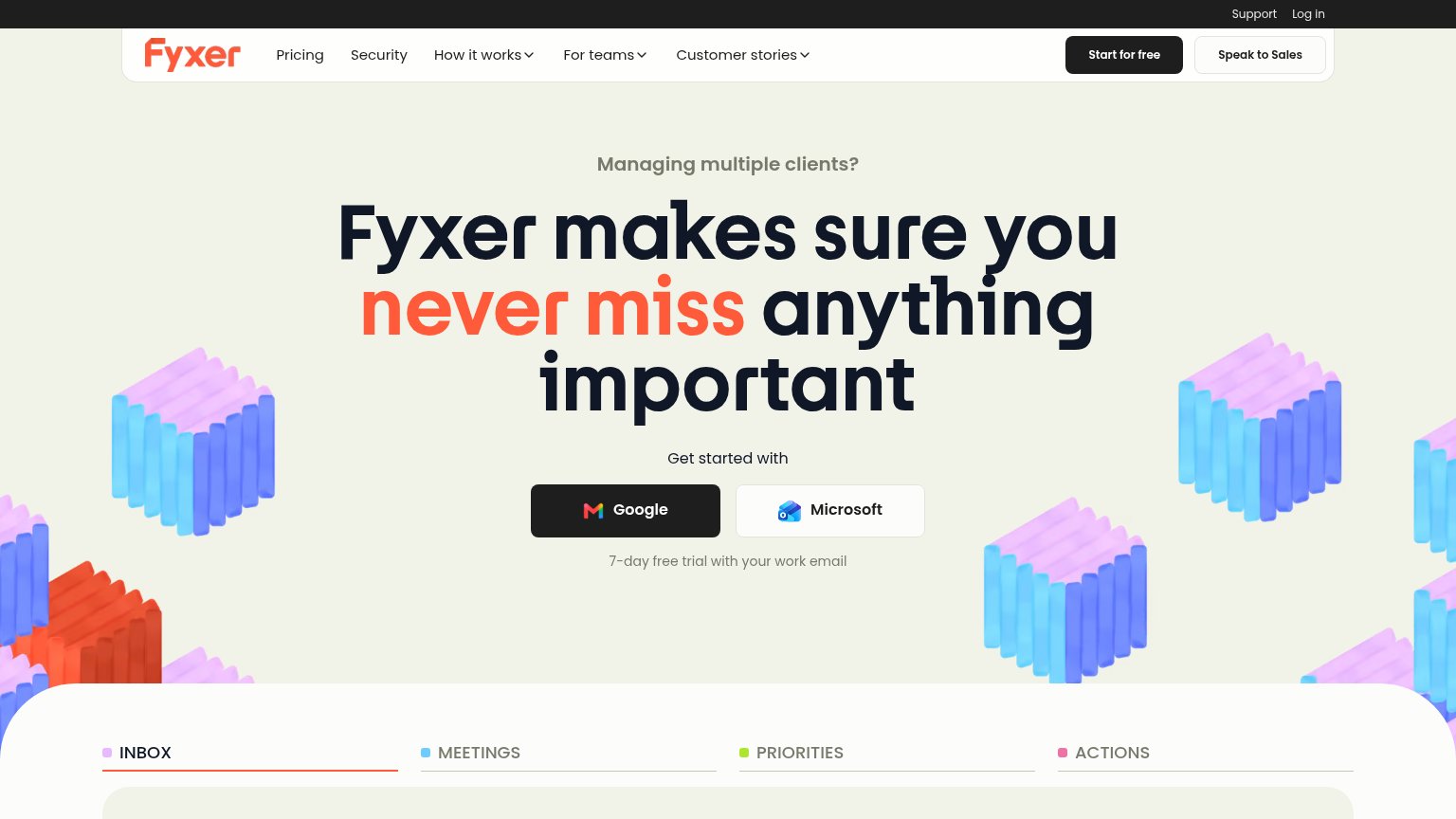
| Product UI demo with INBOX/MEETINGS/PRIORITIES/ACTIONS tabs showing a real email tagged "To Respond" from Elena Marsh | |
| "Trusted by 98% of the Forbes Cloud 100" with Riot Games, affirm, and 1Password logos (mobile) | |
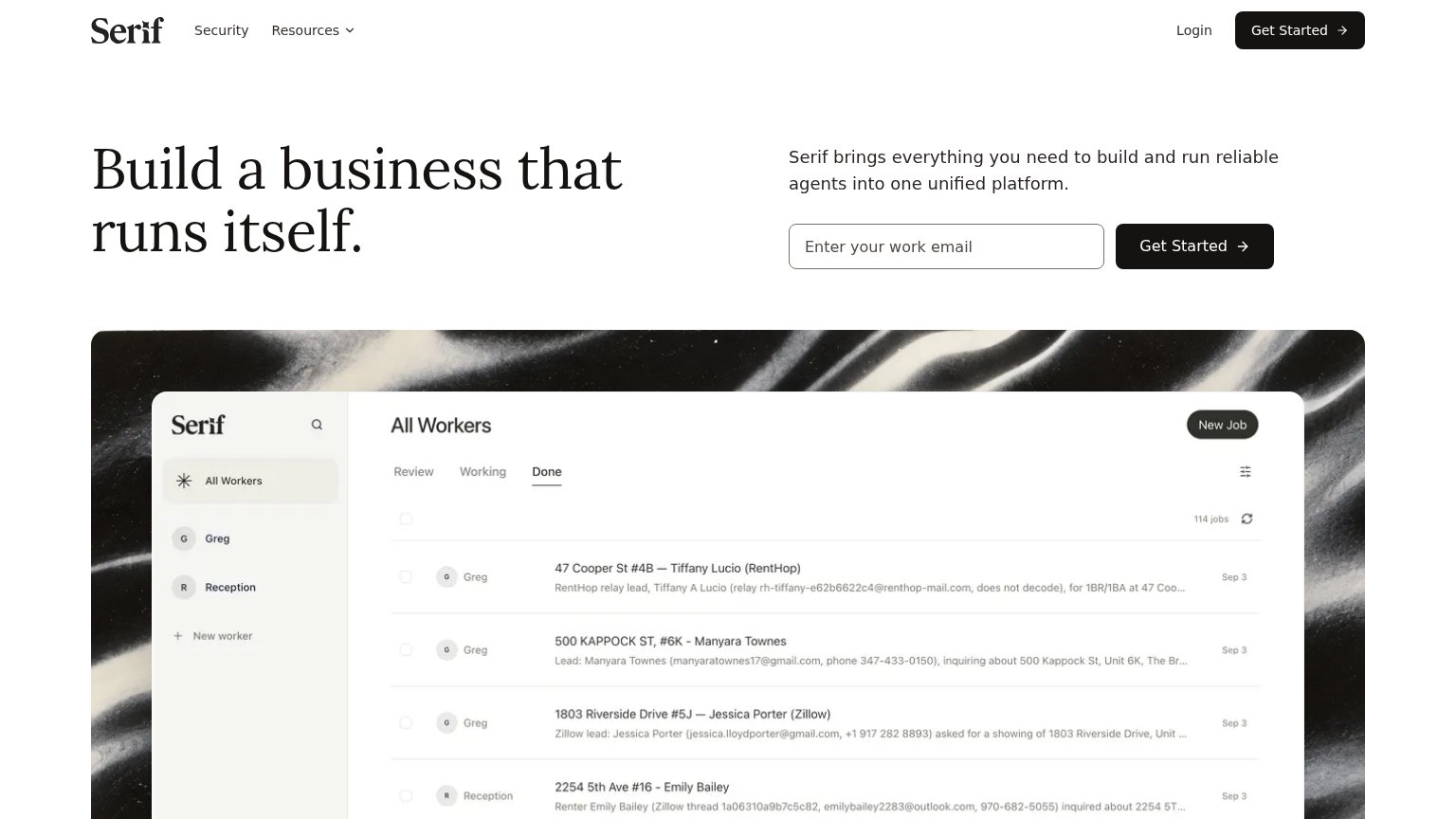
| "All Workers" dashboard screenshot showing agents Greg and Reception handling 114 real lead jobs from RentHop and Zillow |
CTA
76FairCopy, size, verb, cost-feel — does the primary CTA earn the click?

Problems
- generic label, no payoff named
- no headline echo
- no offer signal (free/trial unclear)
Value props
76FairTitle, subtitle, hero — do they sell the product's true value?
Stamp’s headline sells
The AI Secretary That Drafts Your Replies.
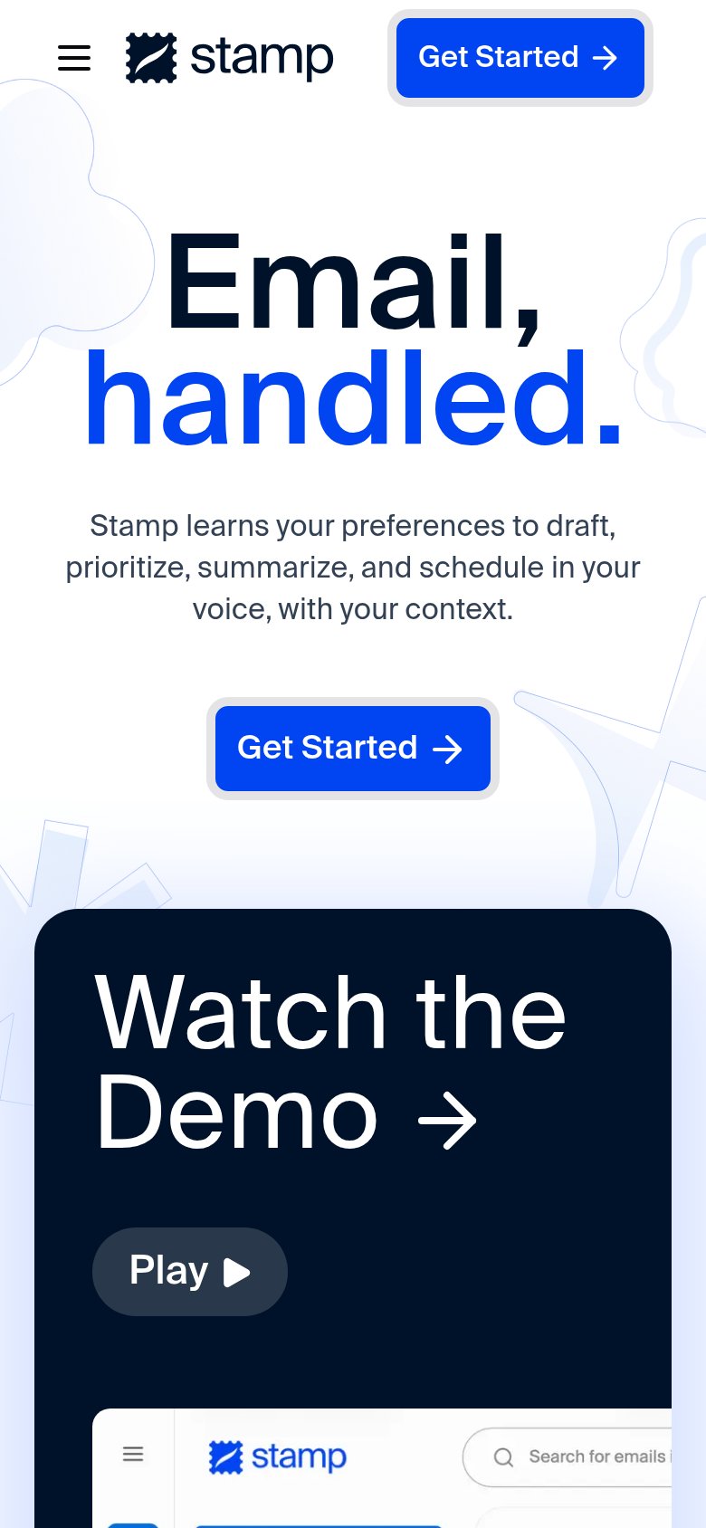
Stamp learns your preferences to draft, prioritize, summarize, and schedule in your voice, with your context.
Working
- Names the concrete job: drafting replies
- "In Stamp's voice, with Stamp's context" kills objection
- Screenshot shows a real drafted email
Could improve
- No numbers or proof points anywhere
- Mobile "Email, handled." is too vague
- No emotional payoff like hours saved
Information hierarchy
82StrongDoes the design help or inhibit what the page is trying to say?
123- Seven-item nav row — Features, Pricing, Downloads, Blog, Contact, Sign In offer six exits before the hero CTA gets a look.
- Header Get Started button — Same weight and label as the hero CTA below, splitting the primary action into two equal targets.
- Play button — High-contrast pill pulls attention toward the demo before the hero conversion is made.
Mobile web
84StrongThe phone experience as a first-class citizen.
 12
- Hero Get Started button — Desktop-proportioned at half the column width instead of a full-bleed thumb target.
- Header Get Started button — Duplicates the hero CTA in the same viewport, splitting the tap decision.