
Your landing page’s weakest score is Value props.
How ReJot ranks
50Growth scoreupdated
category scores
category scoresShowHide
Score over time
Value props
32PoorTitle, subtitle, hero — do they sell the product's true value?
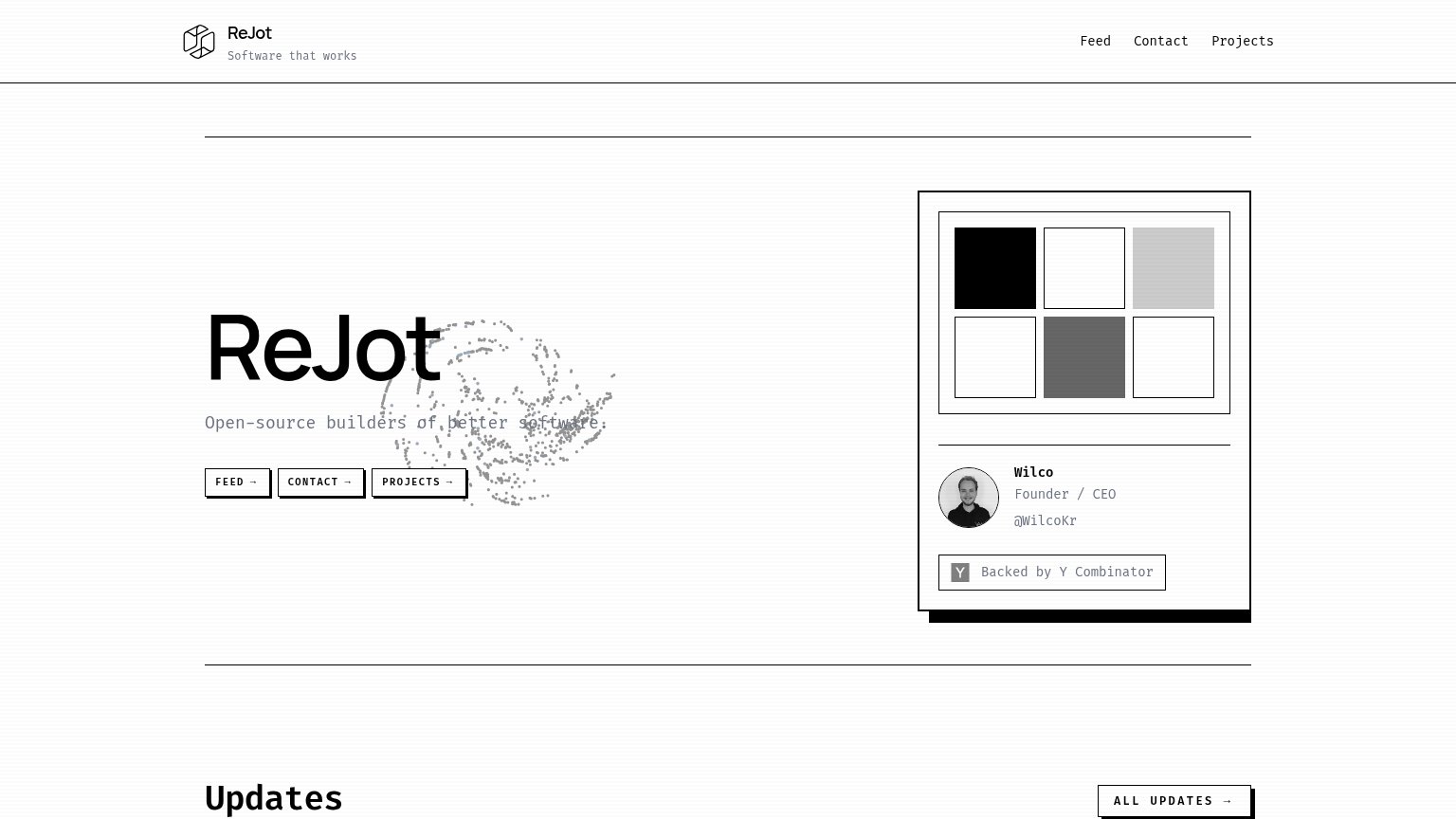
ReJot’s headline vague
ReJot
Open-source builders of better software.
Working
- Y Combinator badge lends credibility
- Open-source signal fits dev audience
- Clean, confident brand presentation
Could improve
- Headline is just the company name
- Subhead describes the team, not value
- No outcome, number, or product demo
CTA
48PoorCopy, size, verb, cost-feel — does the primary CTA earn the click?


Problems
- no action verb — reads as nav label
- three equal CTAs split attention
- duplicates the top navigation
- no payoff implied by any label
Trust
52FairProof that the product is real, competent, and safe to try.
| Trust read | |
|---|---|
| ReJot | "Backed by Y Combinator" badge with named founder "Wilco, Founder / CEO" |
| Banner: "Electric is joining Neon at Databricks »" | |
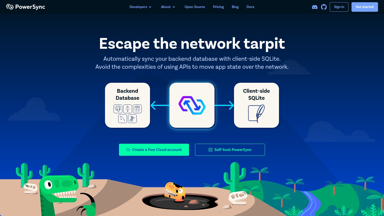
| "Connects to these backend databases" panel listing Postgres and MongoDB with official database icons | |
| "Gigabugs – Our 1.2 million row issue tracker" live product demo with "Instant Navigation — Literally next-frame page lo | |
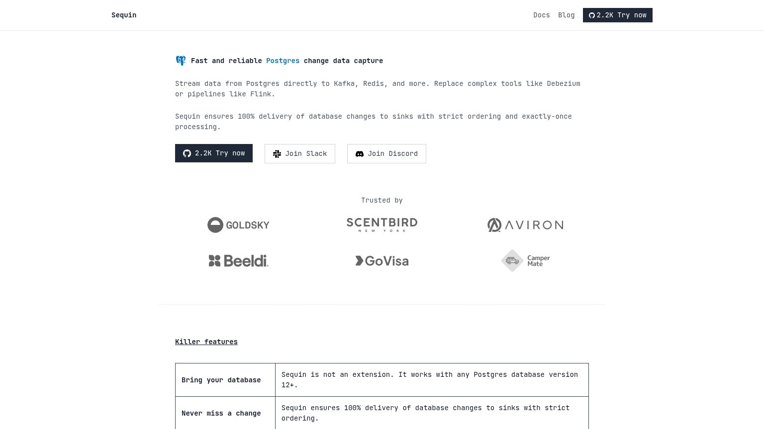
| "Trusted by" logo wall with Goldsky, Scentbird, Aviron, Beeldi, GoVisa, and CamperMate |
Information hierarchy
58FairDoes the design help or inhibit what the page is trying to say?
1234- Three equal-weight CTAs — FEED, CONTACT, and PROJECTS buttons share identical styling, so no single primary action exists in the fold.
- Faint subtitle over scatter — "Open-source builders of better software" sits in low-contrast gray with a particle graphic running through it, degrading legibility of the core message.
- Grayscale grid card — The six-tile gray/black swatch panel occupies the fold's right half yet communicates nothing about what ReJot does.
- Duplicate nav links — Feed, Contact, and Projects repeat the hero buttons verbatim, doubling exit paths without adding a new action.
Mobile web
58FairThe phone experience as a first-class citizen.
 123
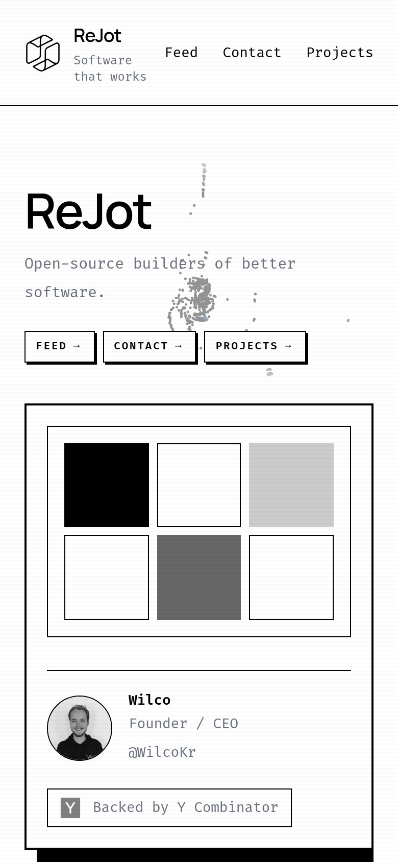
- Three equal CTA buttons — Three desktop-sized buttons compete with equal weight; no single full-width primary action to tap.
- Uncollapsed desktop nav — Full link row stays expanded on mobile and crowds against the logo and tagline instead of collapsing to a menu.
- Dot-scatter graphic overlap — Decorative particle graphic bleeds behind the subhead text, reducing legibility of the value statement.