
Your landing page’s weakest score is Trust.
How PowerSync ranks
72Growth scoreupdated
category scores
category scoresShowHide
Trust
44PoorProof that the product is real, competent, and safe to try.


| Trust read | |
|---|---|
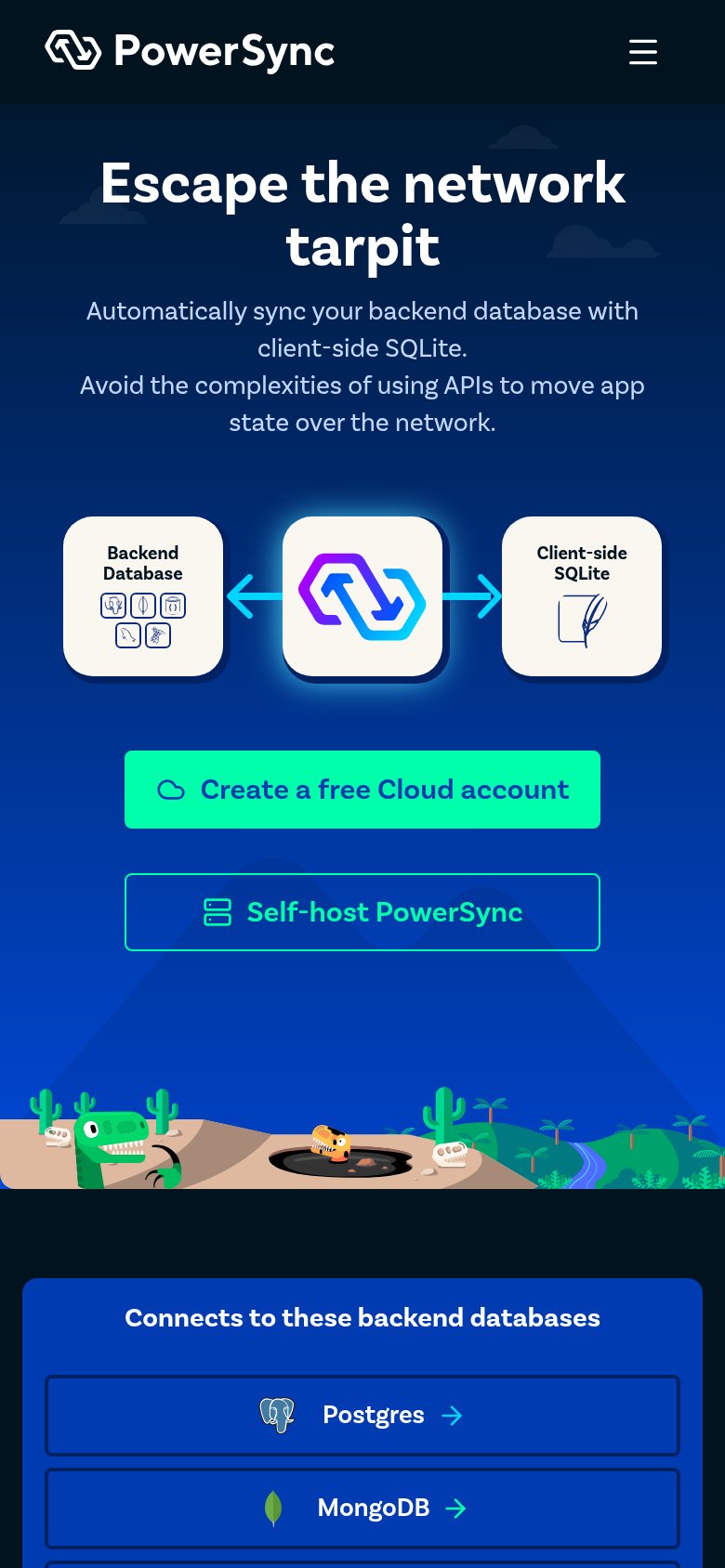
| PowerSync | "Connects to these backend databases" panel listing Postgres and MongoDB with official database icons |
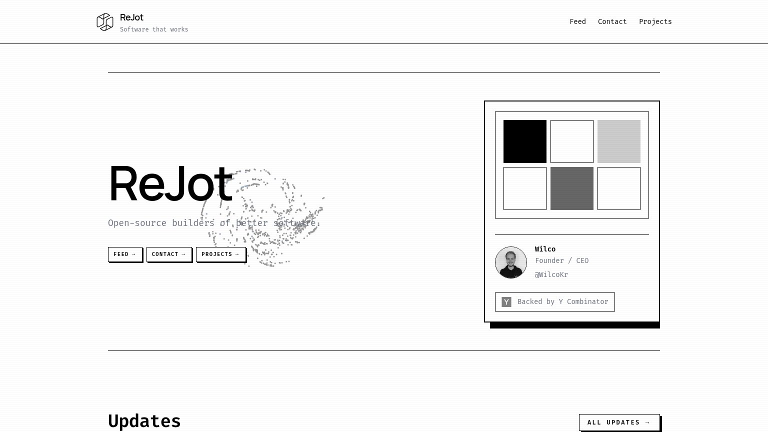
| "Backed by Y Combinator" badge with named founder "Wilco, Founder / CEO" | |
| Banner: "Electric is joining Neon at Databricks »" | |
| "Gigabugs – Our 1.2 million row issue tracker" live product demo with "Instant Navigation — Literally next-frame page lo | |
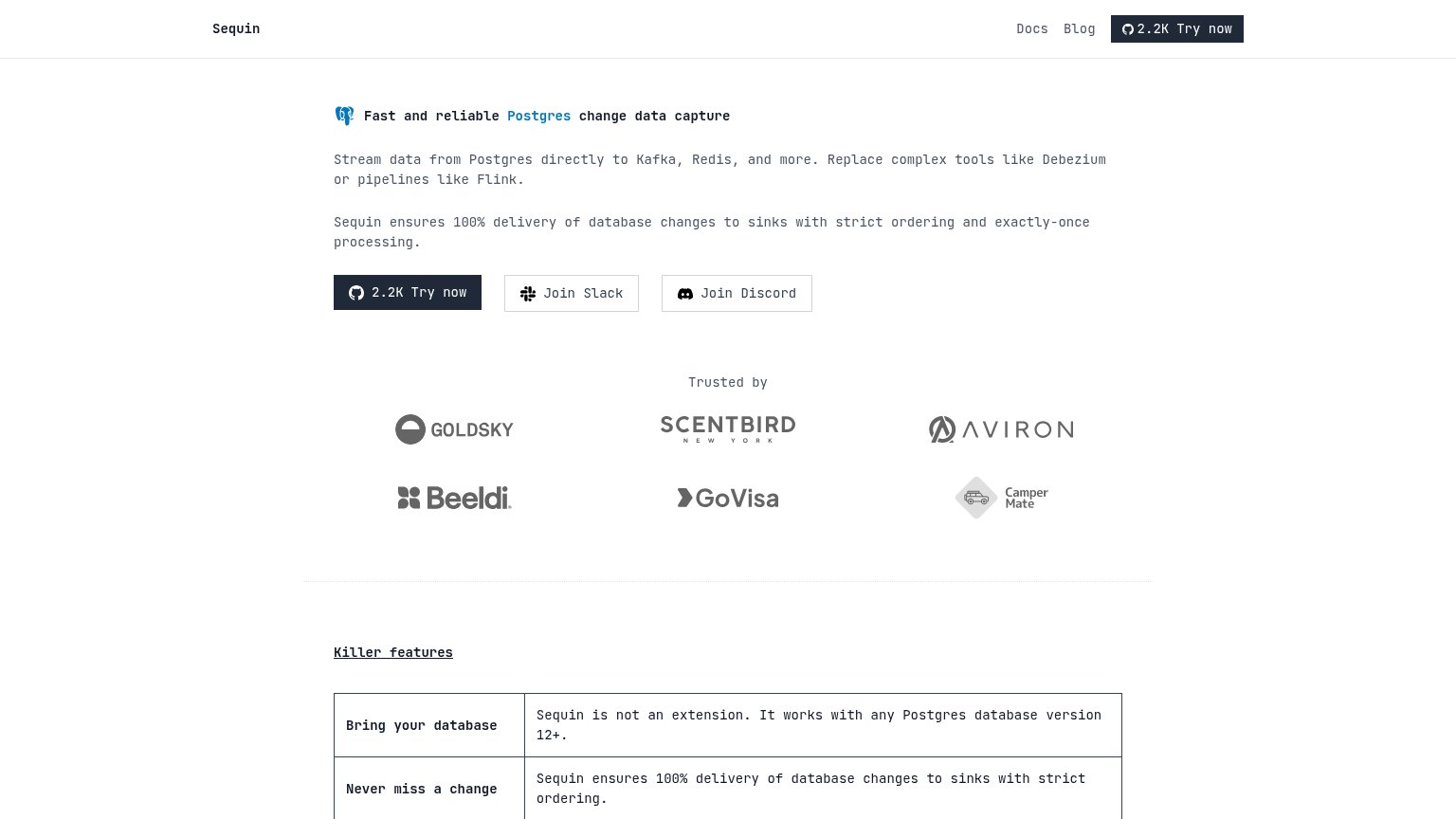
| "Trusted by" logo wall with Goldsky, Scentbird, Aviron, Beeldi, GoVisa, and CamperMate |
Information hierarchy
76FairDoes the design help or inhibit what the page is trying to say?
 123
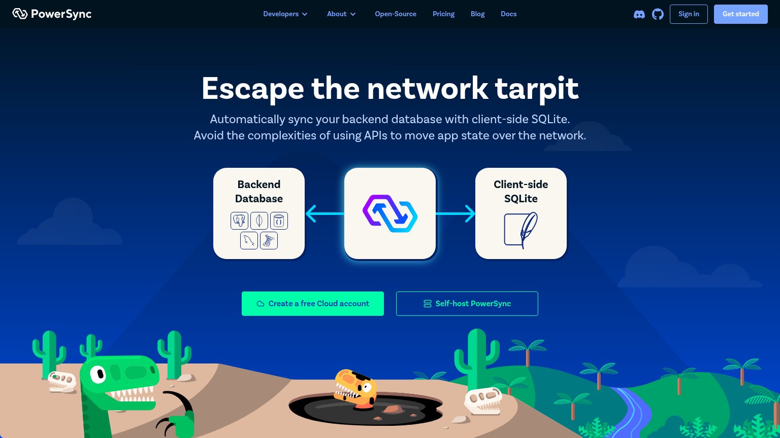
- Two equal-weight CTAs — "Self-host PowerSync" sits at nearly identical size beside "Create a free Cloud account", splitting the fold's one action into a fork.
- Header nav cluster — Seven nav items plus Discord, GitHub, and Sign in create ten exit paths before the visitor reaches the hero CTA.
- Muted Get started button — The header's "Get started" is a washed-out blue-grey pill that reads as disabled and competes weakly as a third CTA style.
Value props
76FairTitle, subtitle, hero — do they sell the product's true value?
PowerSync’s headline
Escape the network tarpit
Automatically sync your backend database with client-side SQLite. Avoid the complexities of using APIs to move app state over the network.
Working
Could improve
CTA
78FairCopy, size, verb, cost-feel — does the primary CTA earn the click?
How PowerSync compares
Recommended rewrites
Mobile web
86StrongThe phone experience as a first-class citizen.
What works
What to improve