
Your landing page’s weakest score is Trust.
How Mentra ranks
69Growth scoreupdated
category scores
category scoresShowHide
Score over time
Trust
55FairProof that the product is real, competent, and safe to try.
| Trust read | |
|---|---|
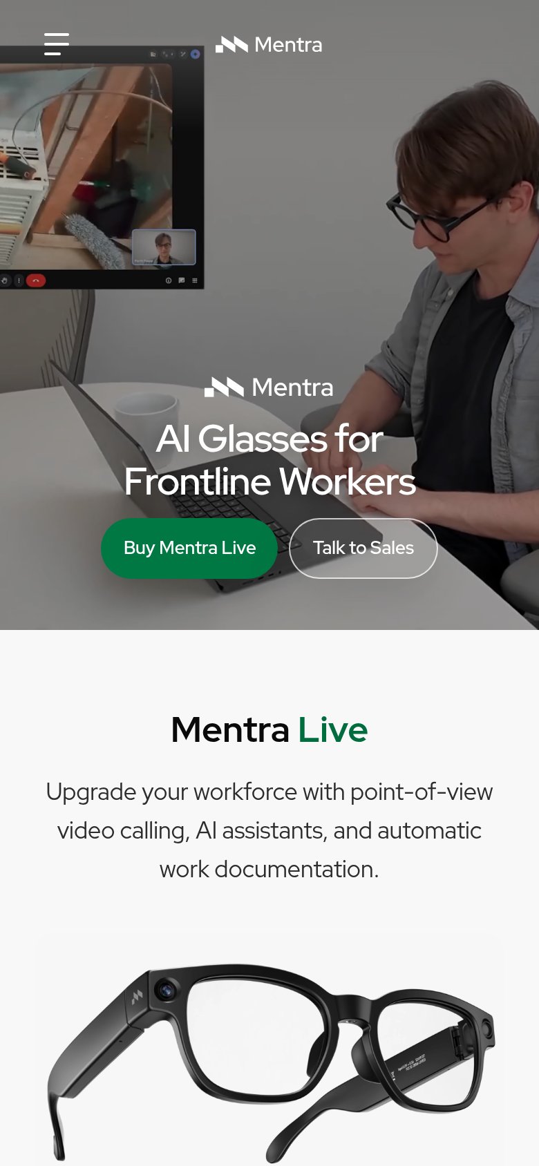
| Mentra | Point-of-view video call UI shown live from the glasses on the mobile hero |
| No visible trust signal identified. | |
| Stats bar fragments: "500+", "~30 years", "US-based", "20 years", "Tier-1" | |
| implicit context XREAL may benefit from pre-existing familiarity among its target audience. | |
| No visible trust signal identified. | |
| No visible trust signal identified. |
Value props
62FairTitle, subtitle, hero — do they sell the product's true value?
Mentra’s headline undersells
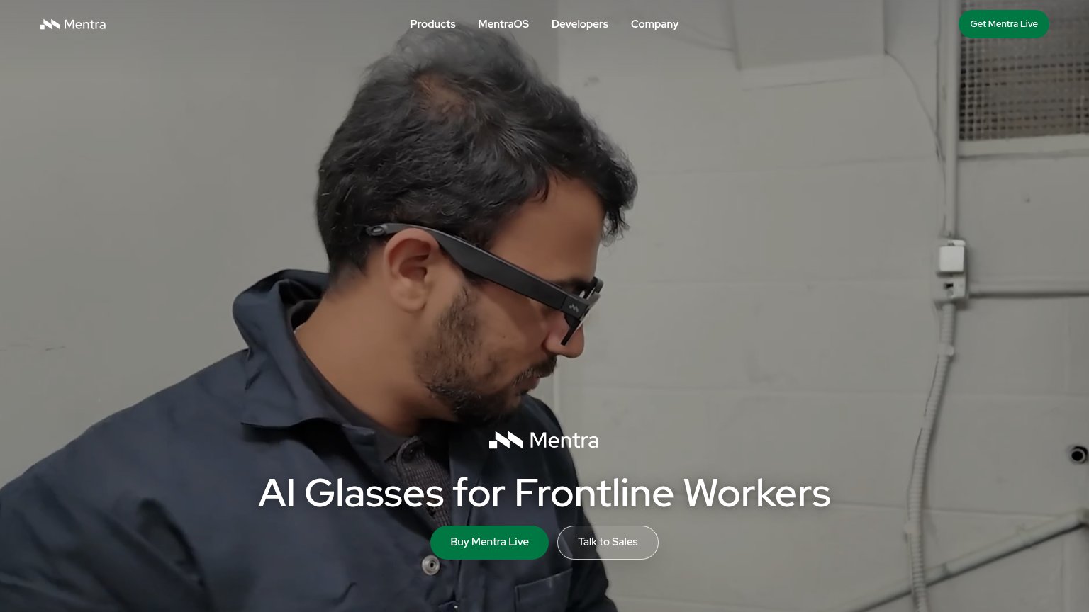
AI Glasses for Frontline Workers
Working
- Names the exact audience in six words
- Category is instantly clear
- Hero shows product worn on the job
Could improve
- No subhead on desktop fold
- No outcome or capability stated
- Zero numbers or proof points
CTA
72FairCopy, size, verb, cost-feel — does the primary CTA earn the click?
Problems
- 'Buy' feels costly, no price shown
- nav says 'Get Mentra Live' instead
- no low-risk path besides sales call
Information hierarchy
76FairDoes the design help or inhibit what the page is trying to say?
1234- Duplicate green CTAs — "Get Mentra Live" duplicates the hero's "Buy Mentra Live" with a different label, splitting the primary action's identity.
- Headline pinned to bottom — "AI Glasses for Frontline Workers" and its buttons crowd the last fifth of the viewport, arriving late in the scan path.
- Talk to Sales button — Outlined button sits at equal size beside the buy CTA, offering a second intent at nearly equal weight.
- Repeated centered wordmark — The Mentra logo appears twice in the fold; the hero repetition adds a visual beat without new information.
Mobile web
78FairThe phone experience as a first-class citizen.
 12
- Side-by-side CTA pair — "Buy Mentra Live" and "Talk to Sales" share one row as desktop-sized pills instead of stacked full-width thumb targets.
- Headline over busy video — "AI Glasses for Frontline Workers" sits on a bright, cluttered video frame with no scrim, weakening legibility.