
Your landing page’s weakest score is Mobile web.
How XREAL ranks
47Growth scoreupdated
category scores
category scoresShowHide
Mobile web
34PoorThe phone experience as a first-class citizen.
 12
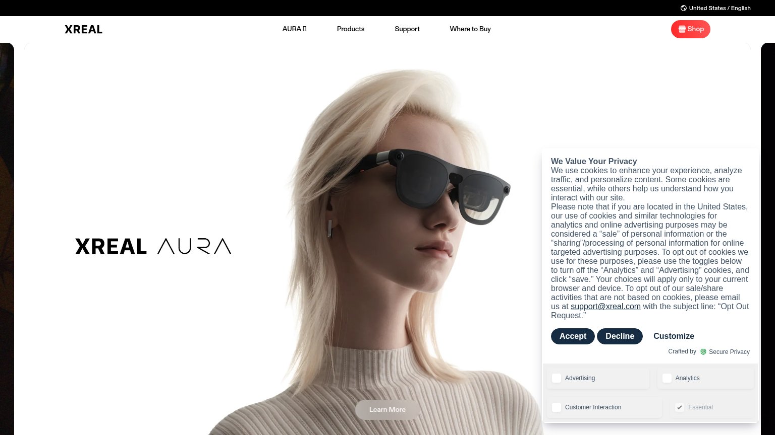
- Consent toggle grid — Advertising/Analytics/Customer Interaction toggles extend the consent UI a full extra screen, pushing product content two viewports down.
- Locale utility bar — The black 'United States / English' strip stacks on the header, creating a double-decker top bar that eats hero space.
Information hierarchy
44PoorDoes the design help or inhibit what the page is trying to say?
 1234
- Cookie consent panel — A wall of legal text with expanded toggles covers the right third of the hero, burying the product image and competing with every message on the fold.
- Learn More button — The only page CTA is low-contrast gray on light knitwear, small, and pinned at the fold's bottom edge — invisible within a one-second scan.
- Decline button weight — Accept and Decline share identical dark styling, so the consent panel presents two equal-weight buttons that outshout the actual page CTA.
- XREAL AURA wordmark — The hero headline is a logotype with no supporting subtitle on desktop, so the fold names the product without stating what it does.
Value props
48PoorTitle, subtitle, hero — do they sell the product's true value?
XREAL’s headline
XREAL AURA
Spatial computing, in glasses
Working
Could improve
Trust
52FairProof that the product is real, competent, and safe to try.
How XREAL compares
Trust read
CTA
56FairCopy, size, verb, cost-feel — does the primary CTA earn the click?
How XREAL compares
Recommended rewrites