careCycleYC W25 landing page report.
← Back to YC W25

Your landing page’s weakest score is Trust.

Fix Trust

Score over time

807060504030AgencyBloc 64 on Mar 28 (Wayback)AgencyBloc 66 on Apr 4 (Wayback)AgencyBloc 67 on Apr 17 (Wayback)AgencyBloc 66 on May 7 (Wayback)AgencyBloc 68 on Sep 22 (Live)Radiusbob 60 on Apr 12 (Wayback)Radiusbob 60 on Apr 22 (Wayback)Radiusbob 61 on May 13 (Wayback)Radiusbob 61 on May 20 (Wayback)Radiusbob 61 on Jun 17 (Wayback)Radiusbob 60 on Jul 11 (Wayback)Radiusbob 50 on Sep 22 (Live)Shape Software 40 on May 9 (Wayback)Shape Software 38 on Sep 22 (Live)MedicarePRO CRM 64 on Sep 22 (Live)Insureio 69 on May 20 (Wayback)Insureio 69 on Sep 22 (Live)careCycle 42 on Apr 21 (Wayback)careCycle 45 on Jun 6 (Wayback)careCycle 62 on Sep 22 (Live)Apr 21Jun 6Sep 22
Past reportsShow past reportsHide past reports
  1. Sep 22, 202662LiveOverall +17 · Information hierarchy +50 · Mobile web +32Viewing
  2. Jun 6, 202645Overall +3 · Value props +10 · Trust +6View →
  3. Apr 21, 202642First tracked report — strongest Value props 58, weakest Information hierarchy 22View →

Trust

44Poor

Proof that the product is real, competent, and safe to try.

careCycle
Insureio
AgencyBloc
Trust read
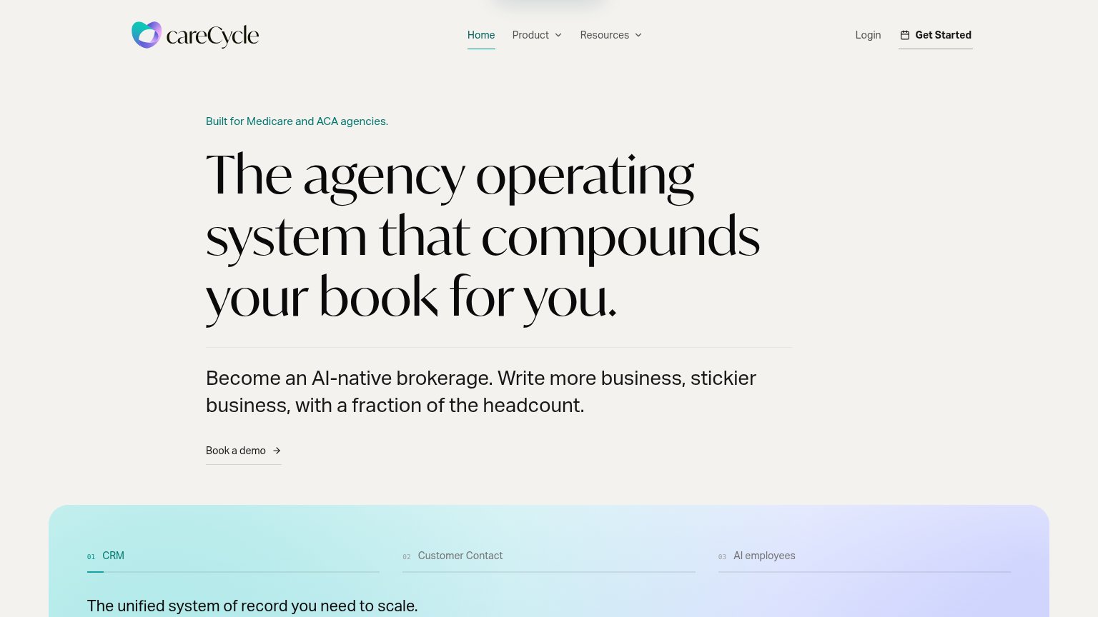
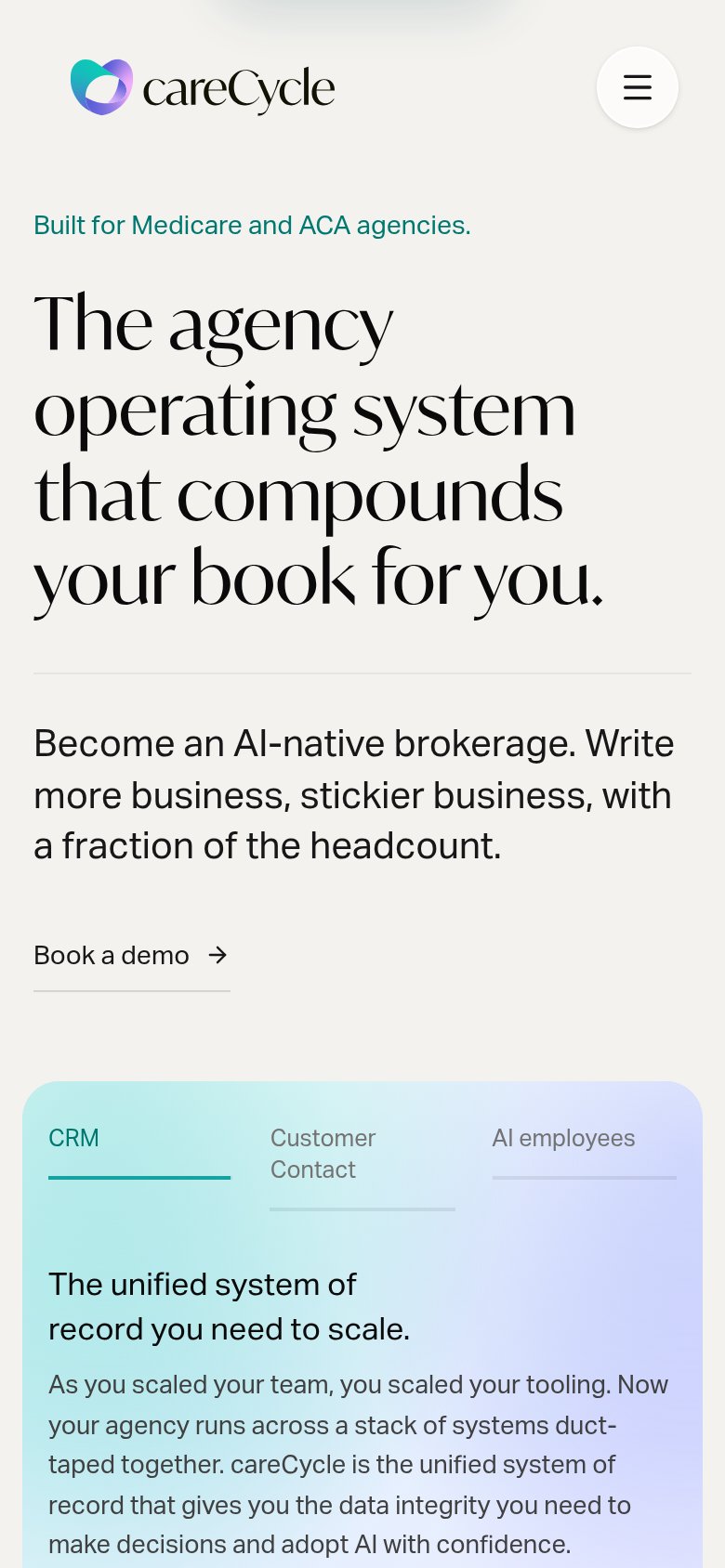
careCycleTabbed feature module labeled "CRM / Customer Contact / AI employees" with "The unified system of record you need to sca
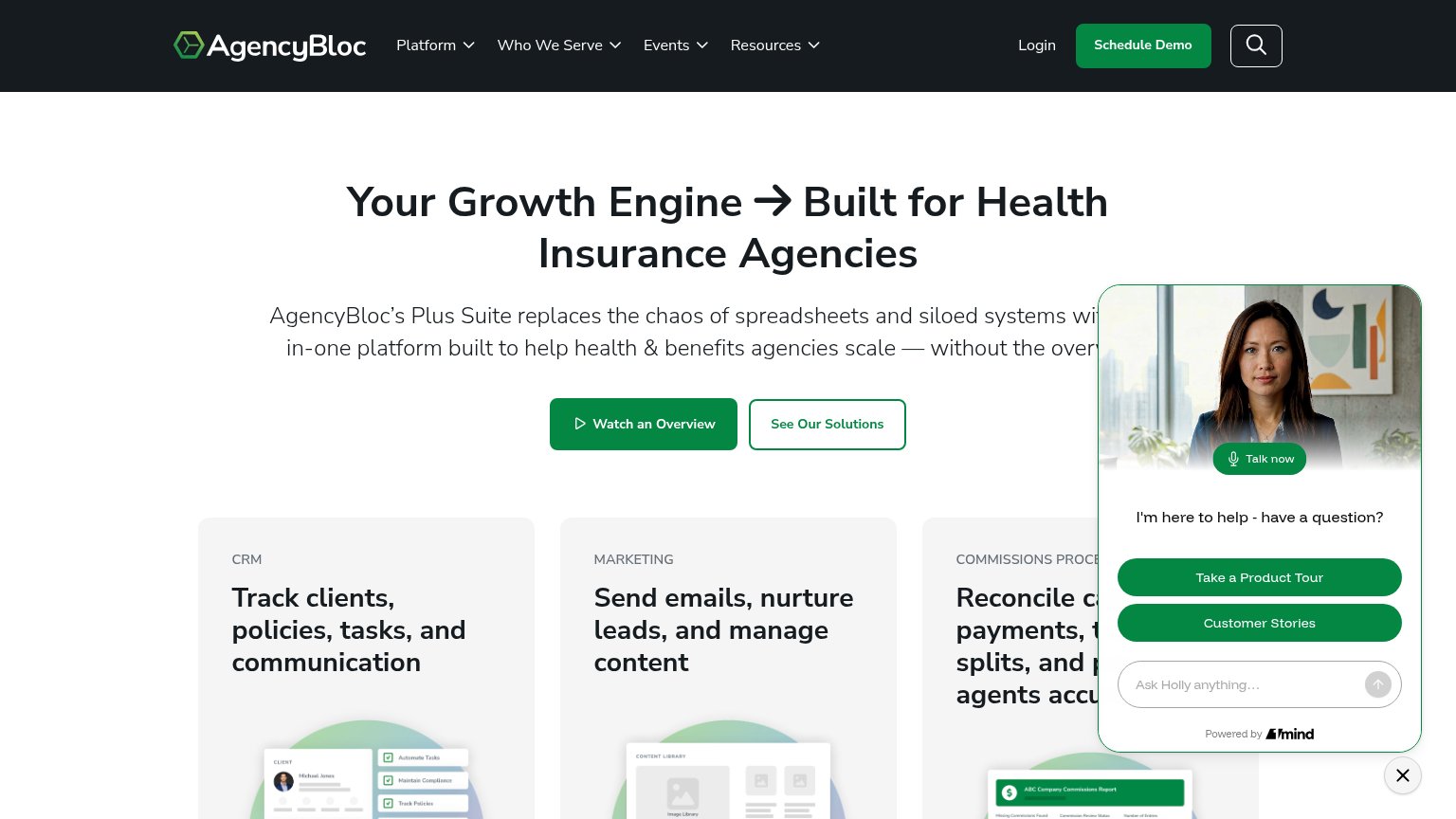
AgencyBlocProduct UI mockups in the capability cards (CRM client record, content library, "ABC Company Commissions Report")
Radiusbob"For years, Radius has helped insurance agencies manage leads, communications, and sales" paired with AgencyBloc co-bran
Shape SoftwareNo visible trust signal identified.
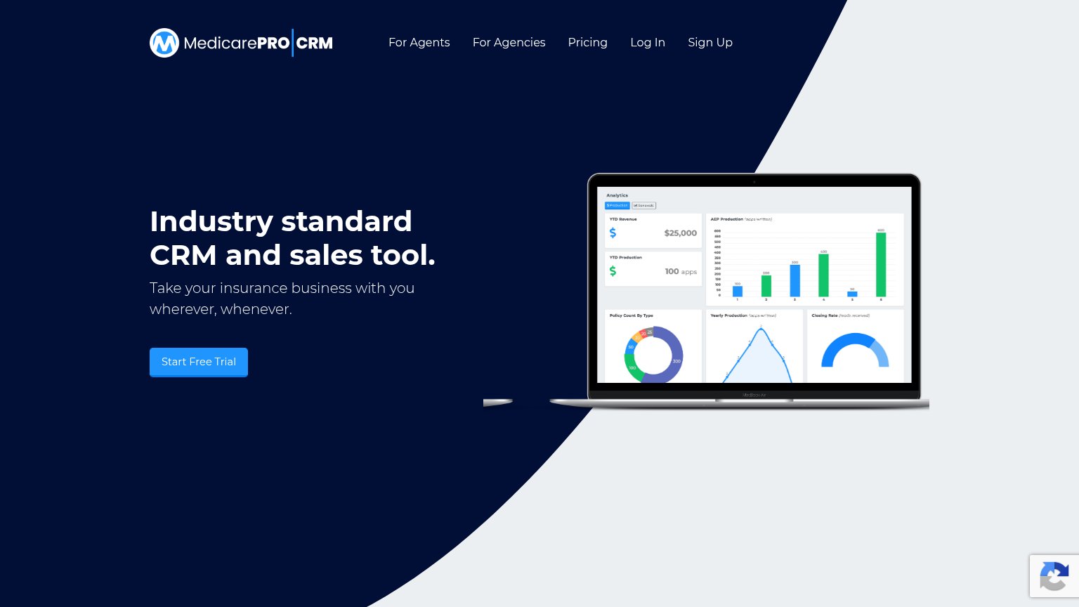
MedicarePRO CRMLaptop mockup showing the analytics dashboard UI ("YTD Revenue $25,000", "AEP Production", "Closing Rate")
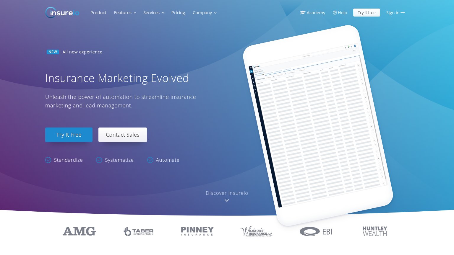
InsureioCustomer logo strip: AMG, Taber Brokerage, Pinney Insurance, Wholesale Insurance, EBI, Huntley Wealth

CTA

58Fair

Copy, size, verb, cost-feel — does the primary CTA earn the click?

careCycle
Insureio
MedicarePRO CRM
AgencyBloc

Problems

  • styled as text link, not button
  • demo click feels costly/committal
  • competes with nav 'Get Started'
  • less visual weight than nav CTA

Mobile web

66Fair

The phone experience as a first-class citizen.

Mobile web annotations on the mobile capture123
  1. Book a demo link — Primary CTA is a small text link with an underline, not a thumb-friendly full-width button, and it sits at the very bottom of the fold.
  2. Serif headline block — "The agency operating system that compounds careCycle's book for careCycle." wraps into five tall lines, pushing the CTA to the fold's edge.
  3. Tab labels row — "Customer Contact" wraps to two lines and misaligns with the other tabs, making the CRM/Contact/AI-employees switcher look broken.

Information hierarchy

72Fair

Does the design help or inhibit what the page is trying to say?

Information hierarchy annotations on the desktop capture123
  1. Book a demo link — Primary action styled as a small underlined text link — nearly invisible against the massive headline.
  2. Get Started nav button — Second CTA with different label competes with 'Book a demo', splitting the conversion path.
  3. Tabbed feature strip — Three same-weight tab labels peek into the fold and add a competing decision before the CTA is acted on.

Value props

72Fair

Title, subtitle, hero — do they sell the product's true value?

careCycle’s headline sellsThe agency operating system that compounds your book for you.Become an AI-native brokerage. Write more business, stickier business, with a fraction of the headcount.

Working

  • Names exact ICP: Medicare and ACA agencies
  • Outcome-led: compounds careCycle's book
  • Subhead hits volume, retention, cost

Could improve

  • Zero numbers anywhere in the fold
  • Empty hero right side; no product shown
  • "Stickier business" is vague jargon