CardamonYC W25 landing page report.
← Back to YC W25

Your landing page’s weakest score is CTA.

Fix CTA

Score over time

9080706050403020Norm Ai 65 on Mar 22 (Wayback)Norm Ai 40 on Apr 25 (Wayback)Norm Ai 63 on May 9 (Wayback)Norm Ai 58 on Jul 19 (Wayback)Norm Ai 59 on Sep 6 (Wayback)Norm Ai 60 on Sep 20 (Live)CUBE 40 on Apr 10 (Wayback)CUBE 52 on Apr 17 (Wayback)CUBE 52 on May 12 (Wayback)CUBE 52 on Jun 17 (Wayback)CUBE 68 on Sep 7 (Wayback)CUBE 68 on Sep 22 (Live)Regology 65 on Apr 11 (Wayback)Regology 66 on May 12 (Wayback)Regology 64 on May 19 (Wayback)Regology 60 on Jun 6 (Wayback)Regology 65 on Jun 17 (Wayback)Regology 60 on Sep 6 (Wayback)Regology 68 on Sep 20 (Live)Corlytics 59 on Mar 30 (Wayback)Corlytics 57 on Jun 17 (Wayback)Corlytics 52 on Jul 7 (Wayback)Corlytics 52 on Aug 9 (Wayback)Corlytics 61 on Sep 22 (Live)Compliance.ai 53 on Apr 2 (Wayback)Compliance.ai 50 on Jun 17 (Wayback)Compliance.ai 48 on Jul 15 (Wayback)Compliance.ai 61 on Sep 20 (Live)Cardamon 67 on Apr 26 (Wayback)Cardamon 69 on Aug 4 (Wayback)Cardamon 32 on Sep 2 (Wayback)Cardamon 75 on Sep 20 (Live)Apr 26Aug 4Sep 2Sep 20
Past reportsShow past reportsHide past reports
  1. Sep 20, 202675LiveOverall +43 · Value props +63 · Mobile web +50Viewing
  2. Sep 2, 202632Overall −37 · Value props −57 · Information hierarchy −40View →
  3. Aug 4, 202669Overall +2 · Mobile web +16 · Trust −4View →
  4. Apr 26, 202667First tracked report — strongest Information hierarchy 72, weakest Mobile web 54View →

CTA

68Fair

Copy, size, verb, cost-feel — does the primary CTA earn the click?

Cardamon
CUBE

Problems

  • demo booking feels costly
  • no value in the click itself
  • casing differs from nav label
  • no headline echo

Trust

72Fair

Proof that the product is real, competent, and safe to try.

Trust read
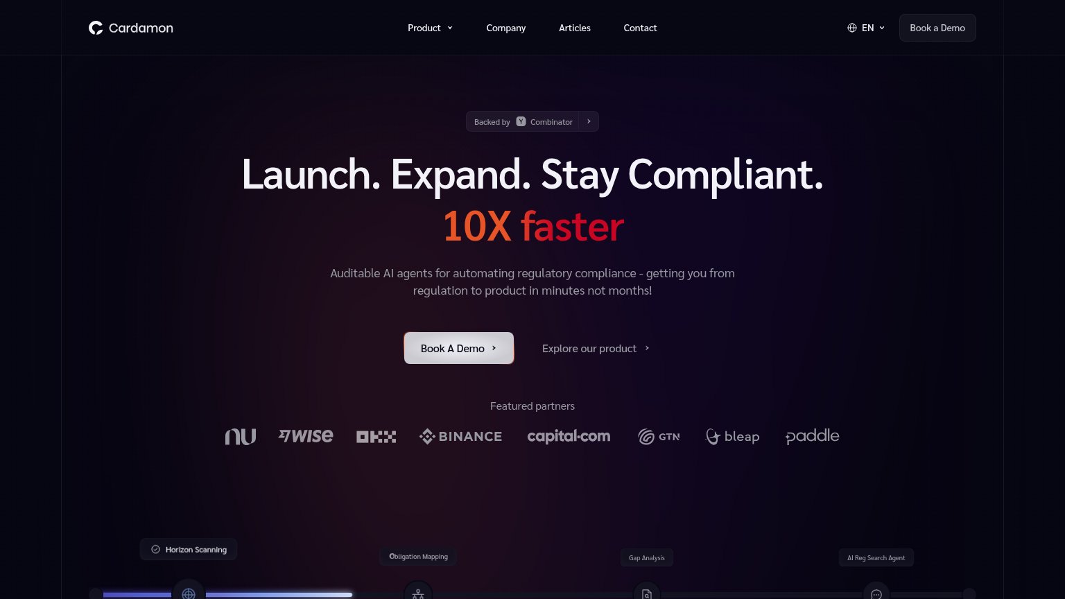
Cardamon"Featured partners" logo row: Nubank, Wise, OKX, Binance, capital.com, GTN, bleap, Paddle
Norm Ai"Trusted by institutions managing over" line at the bottom of the desktop fold
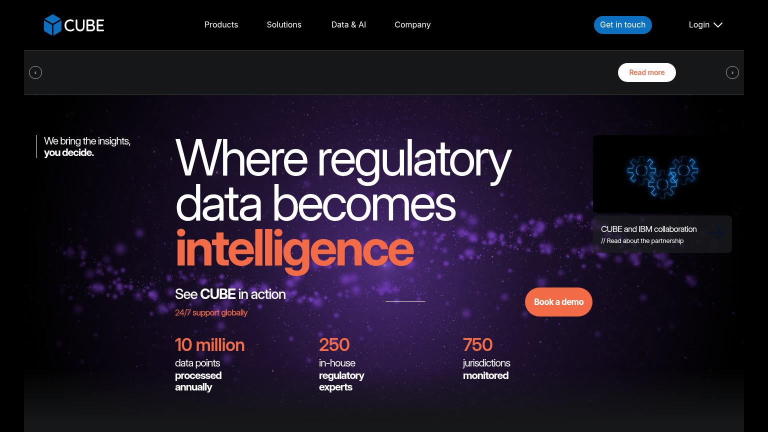
CUBE"10 million data points processed annually / 250 in-house regulatory experts / 750 jurisdictions monitored" stat row
RegologyEmbedded product UI screenshot showing the "Regulatory Research Agent" dashboard
CorlyticsNo visible trust signal identified.
Compliance.aiStat bar: "21M+ regulatory documents", "8,000+ sources across 3,000+ agencies", "230+ jurisdictions", "100+ languages"

Information hierarchy

74Fair

Does the design help or inhibit what the page is trying to say?

Information hierarchy annotations on the desktop capture1234
  1. Duplicate demo CTAs — "Book a Demo" in the nav duplicates the hero's "Book A Demo", splitting one action across two same-labeled buttons.
  2. Nav link cluster — Product, Company, Articles, Contact and the EN switcher offer five exits before the visitor reaches the promise.
  3. Muted hero CTA — The light-grey "Book A Demo" pill barely outshines "Explore our product" beside it; the brand's orange/red accent is spent on "10X faster" instead of the button.
  4. Backed-by chip link — The clickable "Backed by Y Combinator" chevron sits directly above the headline, inviting an outbound click at the top of the scan path.

Value props

78Fair

Title, subtitle, hero — do they sell the product's true value?

Cardamon’s headline sellsLaunch. Expand. Stay Compliant. 10X fasterAuditable AI agents for automating regulatory compliance - getting you from regulation to product in minutes not months!

Working

  • Outcome-first verbs: launch, expand, comply
  • Subhead names the mechanism: auditable AI agents
  • Heavy proof: YC badge + Binance, Wise logos

Could improve

  • 10X and minutes-not-months claims compete
  • Speed claims lack a concrete anchor
  • Hero visual decorates, doesn't demo product

Mobile web

84Strong

The phone experience as a first-class citizen.

Mobile web annotations on the mobile capture12
  1. Book A Demo button — Sits below the fold on many phones after the long headline and subhead push it down; the first viewport risks ending before the primary action.
  2. Hero subheadline — Four-line paragraph in mid-grey on near-black adds vertical bulk and low contrast between the headline and the CTA.