
Your landing page’s weakest score is Trust.
How CUBE ranks
68Growth scoreupdated
category scores
category scoresShowHide
Trust
62FairProof that the product is real, competent, and safe to try.
| Trust read | |
|---|---|
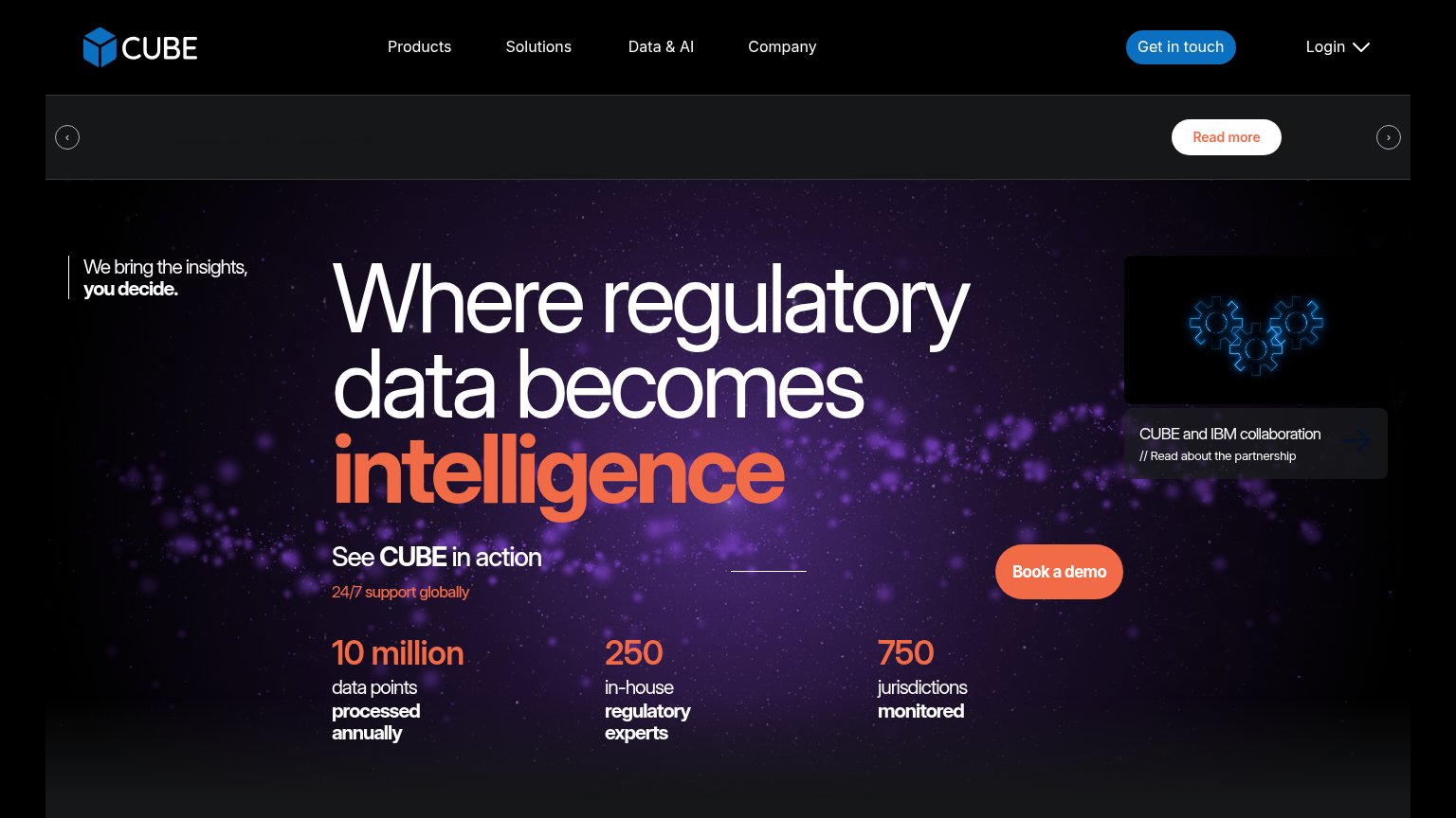
| CUBE | "10 million data points processed annually / 250 in-house regulatory experts / 750 jurisdictions monitored" stat row |
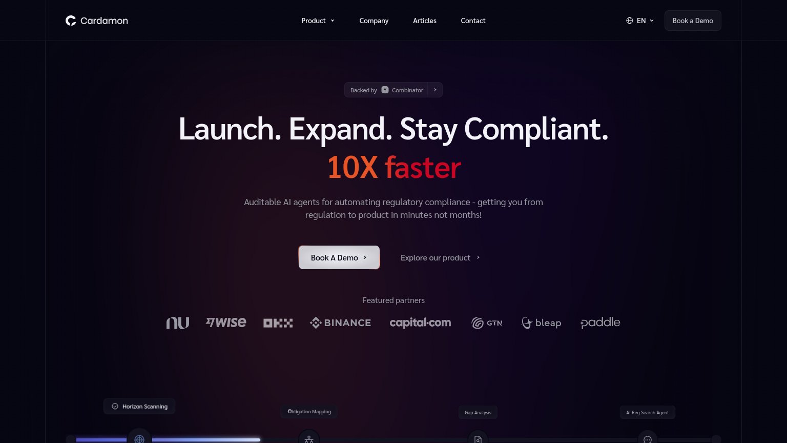
| "Featured partners" logo row: Nubank, Wise, OKX, Binance, capital.com, GTN, bleap, Paddle | |
| "Trusted by institutions managing over" line at the bottom of the desktop fold | |
| Embedded product UI screenshot showing the "Regulatory Research Agent" dashboard | |
| No visible trust signal identified. | |
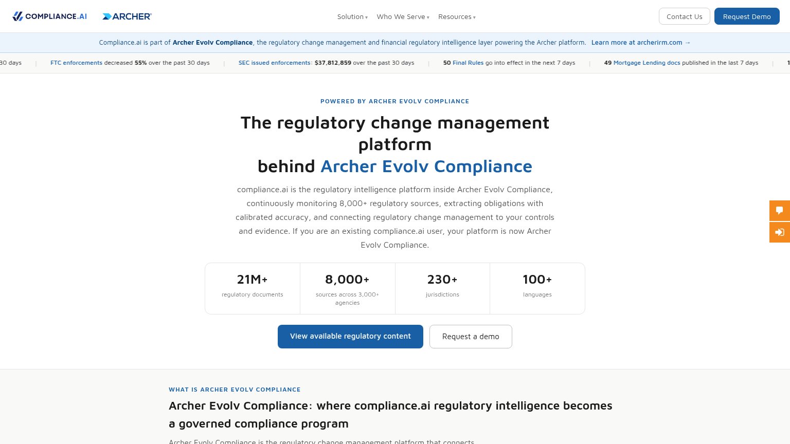
| Stat bar: "21M+ regulatory documents", "8,000+ sources across 3,000+ agencies", "230+ jurisdictions", "100+ languages" |
Information hierarchy
68FairDoes the design help or inhibit what the page is trying to say?
1234- Broken carousel banner — The announcement strip renders nearly empty on desktop — its headline is invisible while its 'Read more' button competes with the hero CTA.
- IBM collaboration card — A secondary panel with its own arrow CTA sits at the hero's right edge, pulling scan-path attention away from 'Book a demo'.
- Book a demo placement — The primary CTA floats to the right of the subhead, detached from the headline column where the eye actually lands.
- Read more button — White pill styling gives this carousel exit more contrast than the orange primary CTA below it.
Value props
68FairTitle, subtitle, hero — do they sell the product's true value?
CUBE’s headline
Where regulatory data becomes intelligence
See CUBE in action — 24/7 support globally
Working
Could improve
CTA
72FairCopy, size, verb, cost-feel — does the primary CTA earn the click?
How CUBE compares
Recommended rewrites
Mobile web
72FairThe phone experience as a first-class citizen.
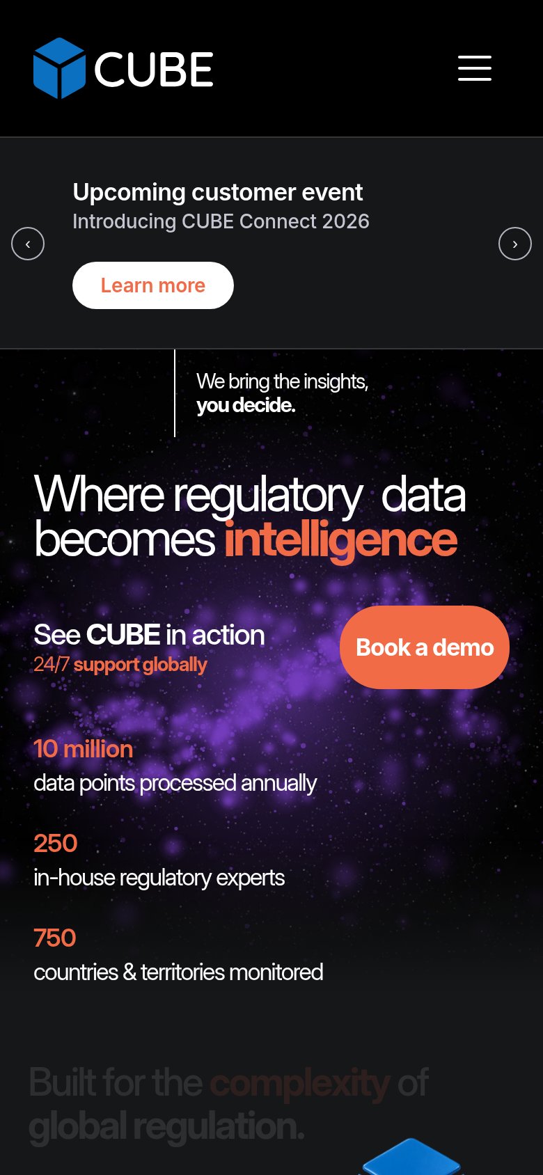
What works
What to improve