TensrYC S26 landing page report.
← Back to YC S26

Your landing page’s weakest score is CTA.

Fix CTA

Score over time

80706050403020Hadrian 60 on Apr 3 (Wayback)Hadrian 33 on May 4 (Wayback)Hadrian 62 on Sep 20 (Live)Machina Labs 56 on Apr 15 (Wayback)Machina Labs 55 on May 6 (Wayback)Machina Labs 55 on May 21 (Wayback)Machina Labs 56 on Jun 9 (Wayback)Machina Labs 52 on Aug 15 (Wayback)Machina Labs 58 on Sep 2 (Wayback)Machina Labs 57 on Sep 20 (Live)Isembard 66 on May 9 (Wayback)Isembard 68 on May 17 (Wayback)Isembard 68 on Jul 22 (Wayback)Isembard 56 on Sep 20 (Live)Tensr 37 on Mar 25 (Wayback)Tensr 36 on Apr 20 (Wayback)Tensr 65 on Sep 6 (Wayback)Tensr 55 on Sep 20 (Live)Mar 25Apr 20Sep 6Sep 20
Past reportsShow past reportsHide past reports
  1. Sep 20, 202655LiveOverall −10 · Mobile web −24 · CTA −20Viewing
  2. Sep 6, 202665Overall +29 · Mobile web +44 · CTA +32View →
  3. Apr 20, 202636Overall −1 · CTA −12 · Trust +4View →
  4. Mar 25, 202637First tracked report — strongest Information hierarchy 42, weakest Trust 28View →

CTA

42Poor

Copy, size, verb, cost-feel — does the primary CTA earn the click?

Contact
Tensr
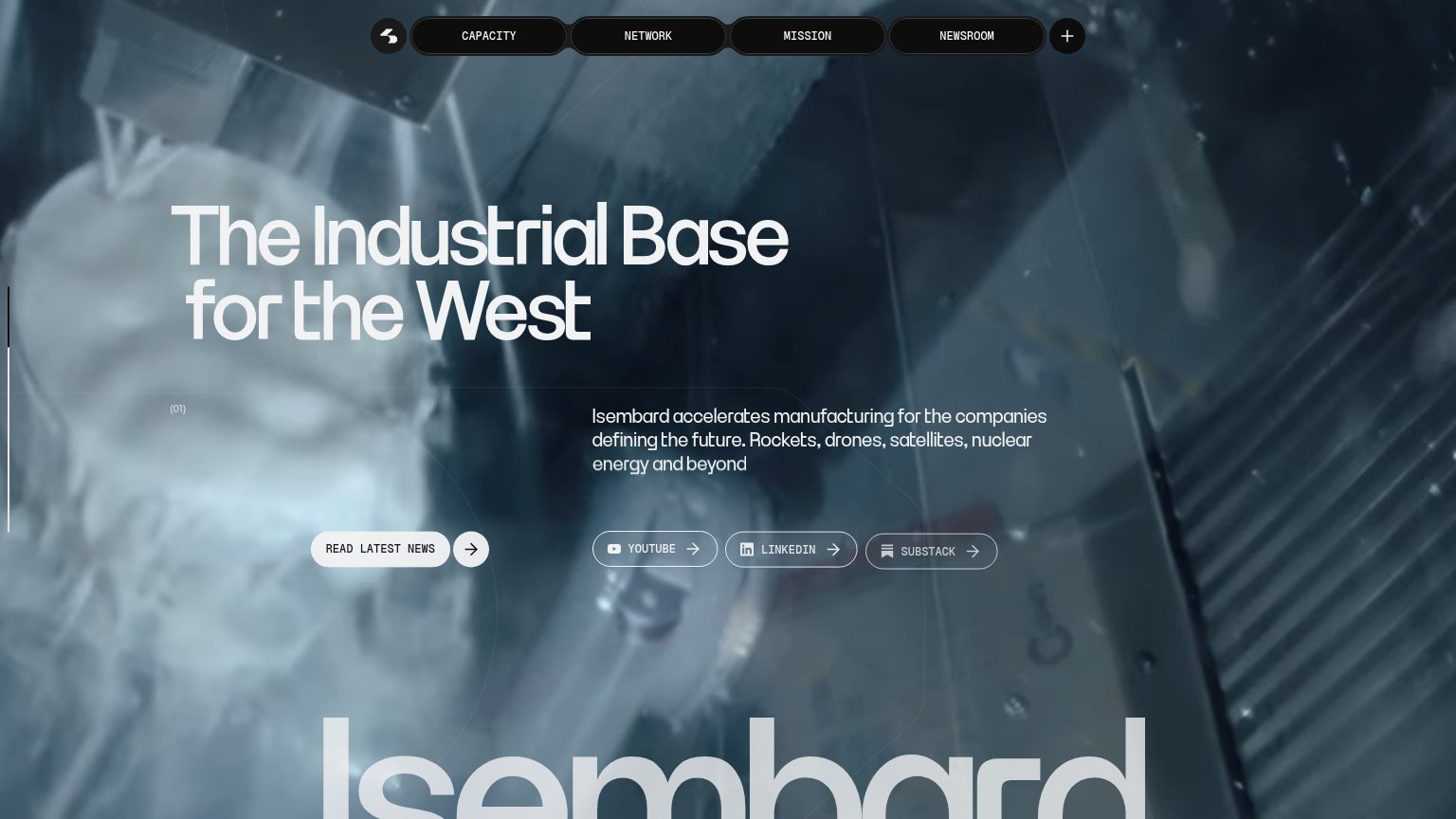
Isembard
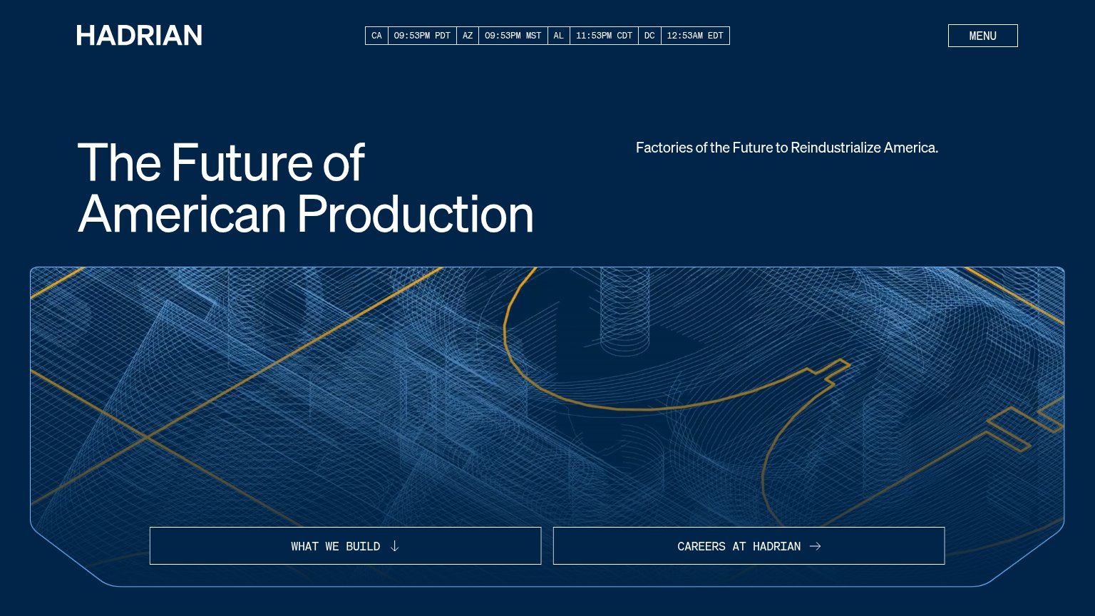
Hadrian
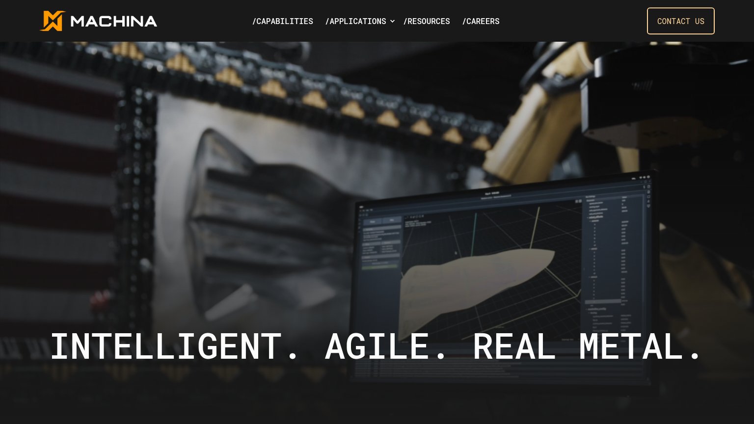
Machina Labs

Problems

  • no hero button or in-product action
  • only CTA is a banner text link
  • 'Contact' is a noun, not an action
  • tiny footprint vs. huge headline

Trust

48Poor

Proof that the product is real, competent, and safe to try.

Tensr
Machina Labs
Trust read
Tensr"NOW ONLINE | 12,000 SQFT | BAY AREA, CALIFORNIA" facility stats under "A robotic factory that builds robots."
HadrianMulti-location timezone bar listing CA, AZ, AL, and DC facilities with live local times
Machina LabsHero photo of the real robotic forming cell shaping a metal part with live CAD/simulation UI on the monitor
IsembardNo visible trust signal identified.

Mobile web

54Fair

The phone experience as a first-class citizen.

Mobile web annotations on the mobile capture123
  1. Hero status line — The fold ends at "BAY AREA, CALIFORNIA" with no tappable CTA button anywhere in the first viewport.
  2. Truncated desktop nav — Full desktop link row crammed into the phone header and cut off mid-list instead of collapsing to a hamburger.
  3. Promo bar Contact link — The only visible action is a tiny underlined text link in the banner, far below thumb-friendly size.

Information hierarchy

58Fair

Does the design help or inhibit what the page is trying to say?

Information hierarchy annotations on the desktop capture123
  1. Seven-link nav row — HOME through CONTACT plus two social icons offer nine equal-weight exits with no primary action to compete against.
  2. Red compliance banner — The highest-contrast element on the page is regulatory text ('47 CFR §§ 1.50002'), outranking the headline and value prop.
  3. Truncated headline — 'ROBOTS' is cut by the fold, so the core message reads as 'BUILD MORE' at first glance.

Value props

72Fair

Title, subtitle, hero — do they sell the product's true value?

Tensr’s headline sellsBUILD MORE ROBOTSA robotic factory that builds robots.

Working

  • Recursive claim is concrete and memorable
  • Real proof points: 12,000 SQFT, Bay Area
  • US LAW banner signals compliance angle

Could improve

  • Facility stats, not customer outcomes
  • Hero video decorates, doesn't demonstrate
  • No audience named — who is this for?