
Your landing page’s weakest score is Trust.
How Studio ranks
72Growth scoreupdated
category scores
category scoresShowHide
Score over time
Trust
48PoorProof that the product is real, competent, and safe to try.

| Trust read | |
|---|---|
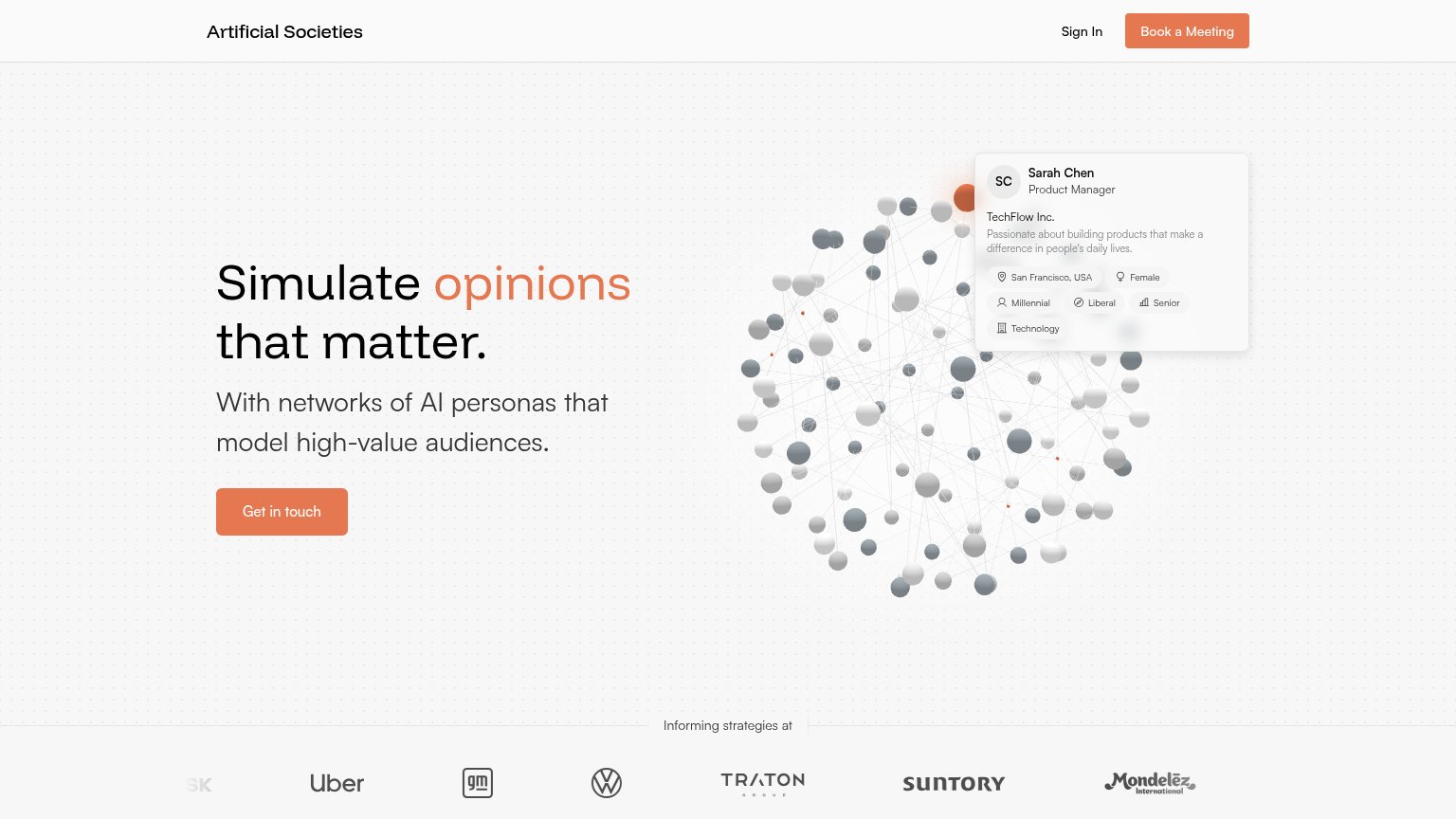
| Studio | "BACKED BY Y COMBINATOR" badge beneath the hero CTA |
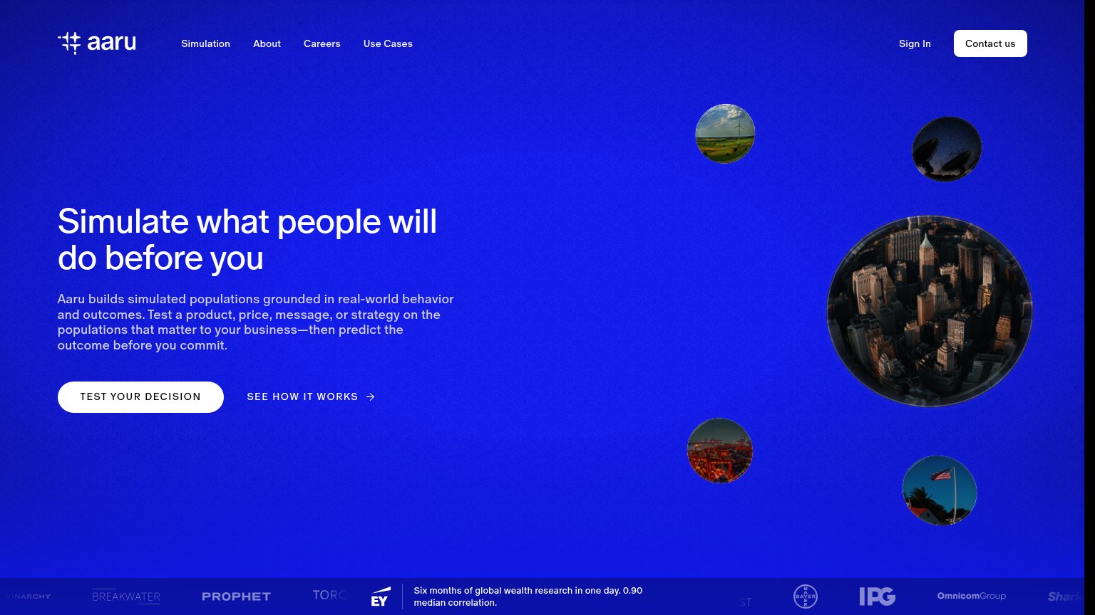
| Logo strip with EY, Bayer, IPG, Omnicom Group and claim "Six months of global wealth research in one day. 0.90 median co | |
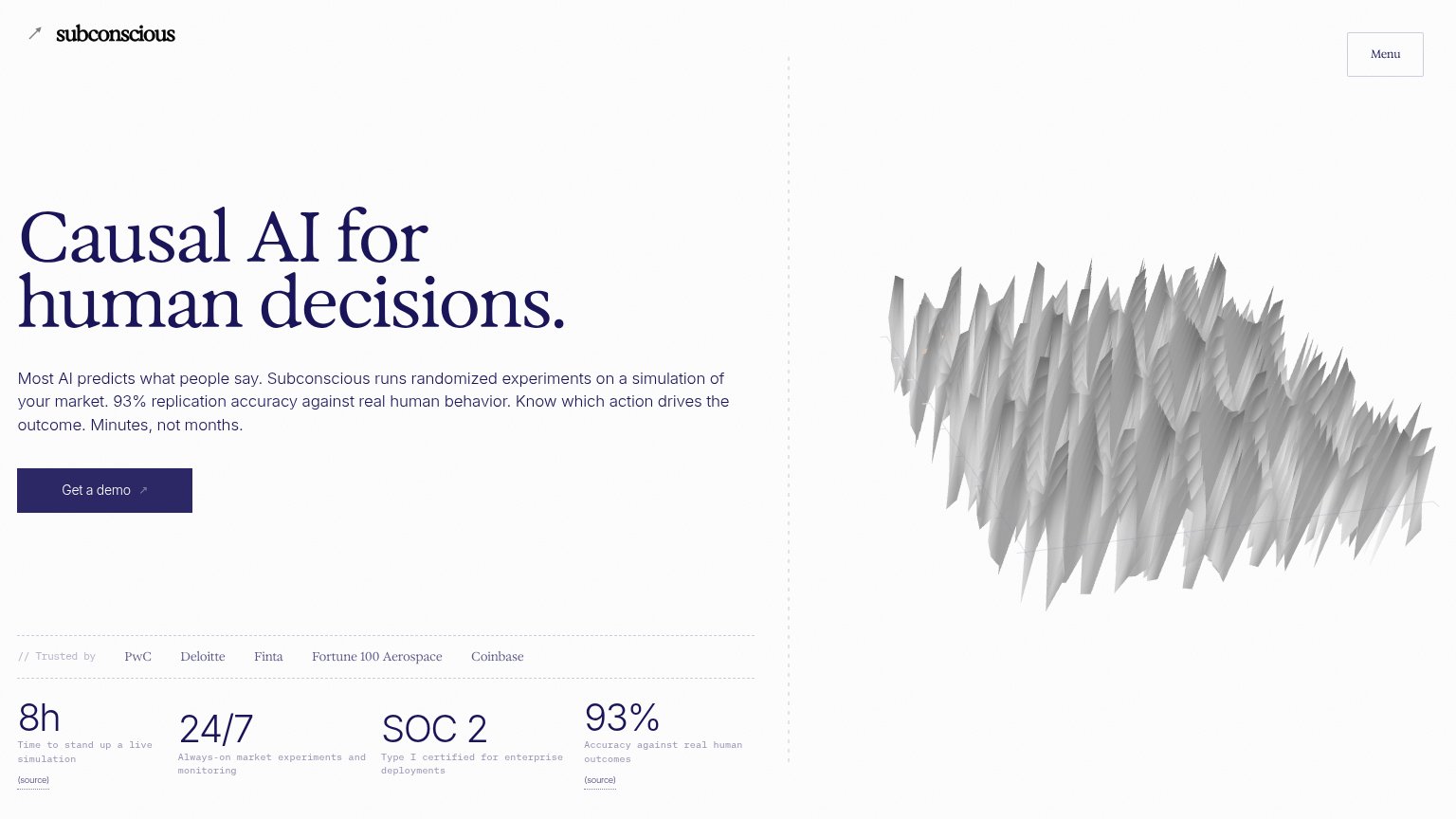
| "// Trusted by PwC Deloitte Finta Fortune 100 Aerospace Coinbase" strip | |
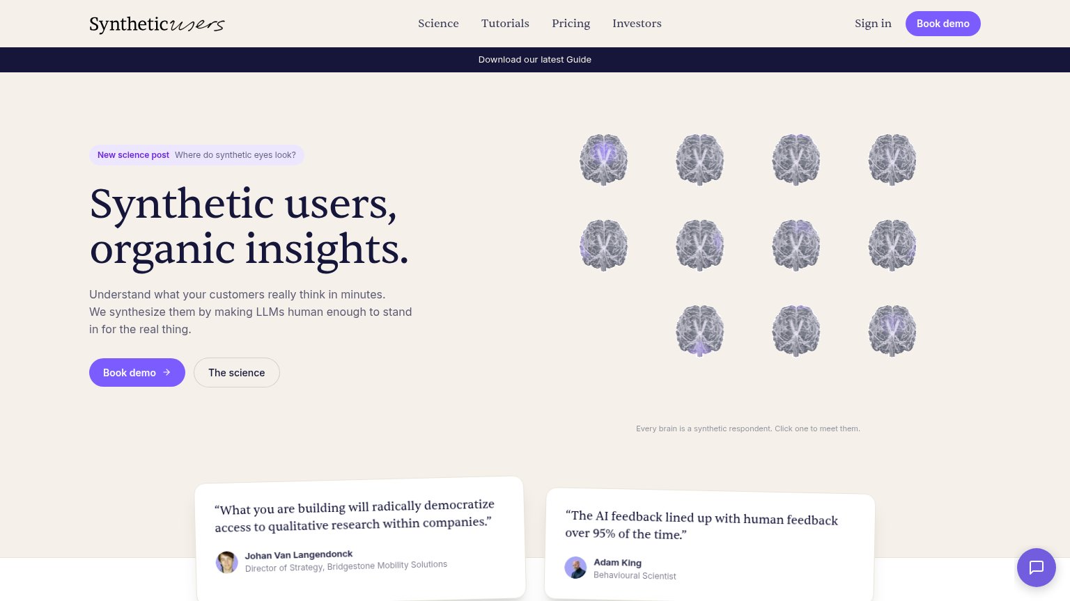
| "The AI feedback lined up with human feedback over 95% of the time." — Adam King, Behavioural Scientist | |
| Logo wall under "Informing strategies at" showing Uber, GM, Volkswagen, TRATON, Suntory, and Mondelez |
CTA
72FairCopy, size, verb, cost-feel — does the primary CTA earn the click?
Problems
- demo booking feels costly
- no low-friction alternative path
- no echo of 'simulate' promise
Value props
76FairTitle, subtitle, hero — do they sell the product's true value?
Studio’s headline sells
Simulate every future. Engineer the response you want.
Studio builds a living society of your market and plays every version of your decision through it, so you commit to the one your customers reward.
Working
- Outcome-led headline: control over uncertainty
- Subhead explains the mechanism in one line
- Hero diagram shows the product's core promise
Could improve
- No numbers or scale anywhere in the fold
- No concrete decision example (pricing, launch)
- "Living society" needs a beat of translation
Mobile web
78FairThe phone experience as a first-class citizen.
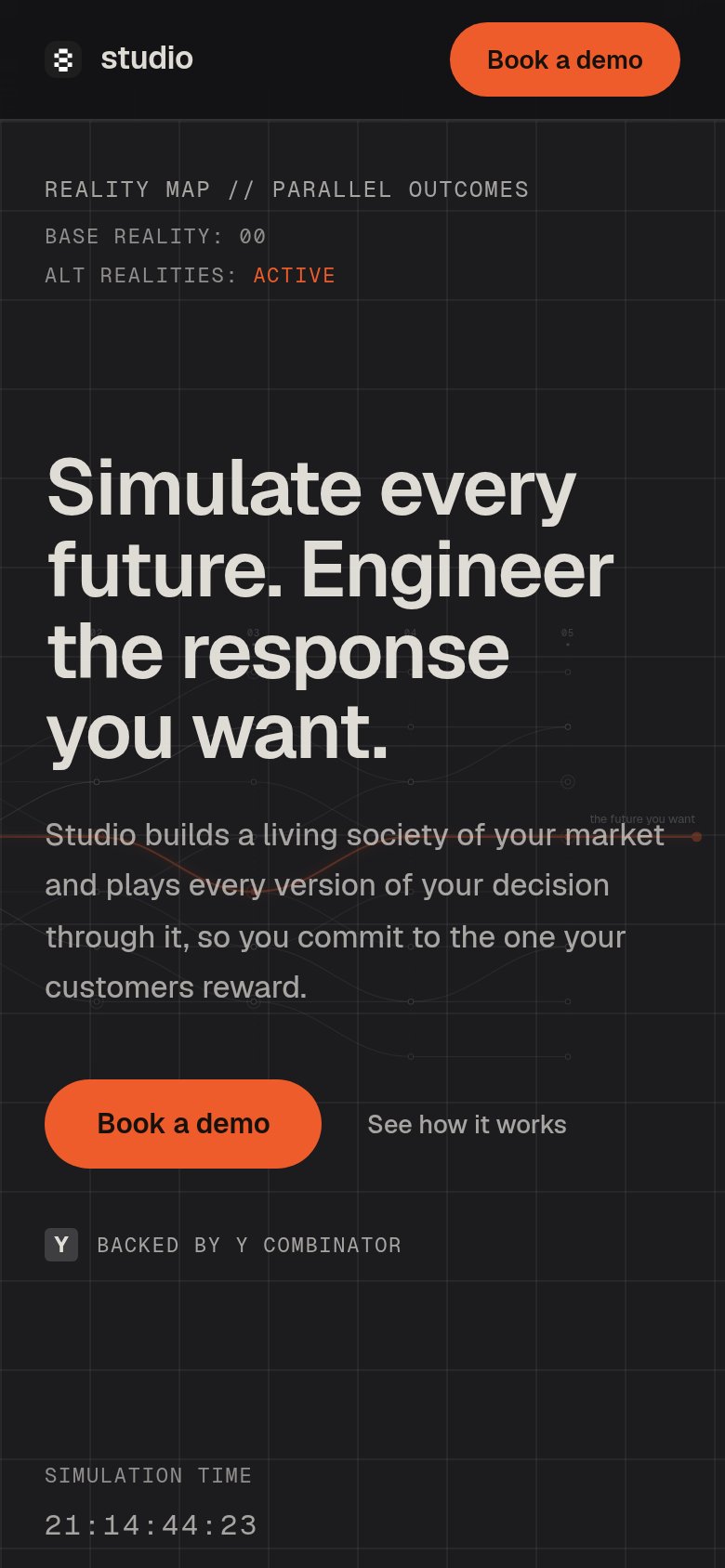 123
- Headline over graph lines — Background simulation lines and 'the future Studio want' label collide with the headline and body copy, muddying readability.
- Book a demo button — Duplicates the header CTA but stops at half width; a near-full-bleed button would be easier to thumb.
- Stray graph caption — Tiny 'the future Studio want' text overlaps the body paragraph at unreadable size, pure visual noise on mobile.
Information hierarchy
84StrongDoes the design help or inhibit what the page is trying to say?
12- See how it works — Plain-text secondary link sits at the same baseline as the primary CTA with no visual containment, slightly diluting the single-action scan path.
- the future Studio want — The diagram's key emotional label is tiny, low-contrast gray at the far right edge — the one caption that sells the visual is nearly invisible.