PrizedYC S26 landing page report.
← Back to YC S26

Your landing page’s weakest score is Trust.

Fix Trust

Score over time

9080706050Gitpod (Ona) 58 on Sep 22 (Live)GitHub Codespaces 69 on Jul 26 (Live)Coder 74 on Apr 2 (Wayback)Coder 73 on Apr 21 (Wayback)Coder 73 on May 5 (Wayback)Coder 72 on Jun 3 (Wayback)Coder 72 on Jun 13 (Wayback)Coder 70 on Sep 22 (Live)DevZero 71 on Apr 20 (Wayback)DevZero 72 on May 4 (Wayback)DevZero 70 on May 22 (Wayback)DevZero 73 on Sep 22 (Live)E2B 80 on May 10 (Wayback)E2B 80 on May 22 (Wayback)E2B 79 on Jun 4 (Wayback)E2B 79 on Jun 16 (Wayback)E2B 79 on Jul 3 (Wayback)E2B 79 on Jul 18 (Wayback)E2B 80 on Jul 31 (Live)Prized 70 on Jul 31 (Wayback)Prized 74 on Aug 10 (Wayback)Prized 76 on Sep 20 (Live)Jul 31Aug 10Sep 20
Past reportsShow past reportsHide past reports
  1. Sep 20, 202676LiveOverall +2 · Value props +6 · CTA +4Viewing
  2. Aug 10, 202674Overall +4 · Information hierarchy +6 · CTA +6View →
  3. Jul 31, 202670First tracked report — strongest Information hierarchy 76, weakest Trust 52View →

Trust

54Fair

Proof that the product is real, competent, and safe to try.

Trust read
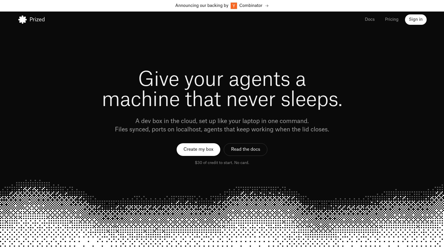
Prized"Announcing our backing by Y Combinator" banner
Gitpod (Ona)implicit context Gitpod (Ona) may benefit from pre-existing familiarity among its target audience.
GitHub CodespacesCode editor screenshot with tabs "game.ts", "characters.module.css", "bonus-level.ts"
CoderGitHub star count "127.5K" in the header
DevZeroNo visible trust signal identified.
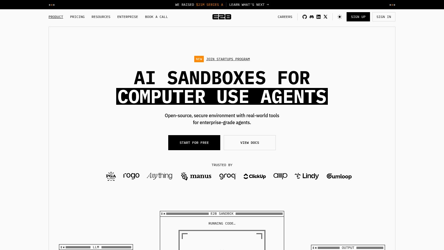
E2Bimplicit context E2B may benefit from pre-existing familiarity among its target audience.

Mobile web

78Fair

The phone experience as a first-class citizen.

Mobile web annotations on the mobile capture12
  1. Split CTA pair — "Create my box" and "Read the docs" share the row, leaving the primary CTA half-width instead of a full-bleed thumb target.
  2. Three-line headline — The hero headline wraps into three tall lines at near-desktop size, pushing the CTA pair toward the bottom of the first viewport.

CTA

82Strong

Copy, size, verb, cost-feel — does the primary CTA earn the click?

Prized
E2B

Problems

  • free offer only in caption, not label
  • same visual weight as secondary on mobile

Information hierarchy

84Strong

Does the design help or inhibit what the page is trying to say?

Information hierarchy annotations on the desktop capture123
  1. Read the docs button — Same pill shape and size as the primary CTA, splitting attention at the decision point.
  2. YC announcement banner — A linked banner above the logo pulls the first glance to an outbound exit before the value prop.
  3. Docs and Pricing links — Two more nav exits stacked beside Sign in compete with the fold's one intended action.

Value props

84Strong

Title, subtitle, hero — do they sell the product's true value?

Prized’s headline sellsGive your agents a machine that never sleeps.A dev box in the cloud, set up like your laptop in one command. Files synced, ports on localhost, agents that keep working when the lid closes.

Working

  • Names the real pain: agents die when lid closes
  • Subhead lists concrete dev outcomes
  • "$30 credit, no card" kills risk objection

Could improve

  • Hero art decorates, never shows the product
  • No setup-time or speed number
  • "Agents" assumes reader context

Competitors

inferred from product, audience, and value prop