
Your landing page’s weakest score is Trust.
How Neuron Industries ranks
- 1.
Neuron Industries65
- 2.
Software Defined Automation64
- 3.
Opto 22 (groov EPIC)49
- 4.
Beckhoff Automation38
65Growth scoreupdated
category scores
category scoresShowHide
Score over time
Trust
54FairProof that the product is real, competent, and safe to try.


| Trust read | |
|---|---|
| Neuron Industries | "Backed by Y Combinator" badge beneath the hero CTAs |
| Detailed real product shots of groov RIO and groov EPIC hardware with visible on-device login UI | |
| "Industrial leaders trust SDA" logo strip with Boehringer Ingelheim, EGGER, and Henkel (mobile capture) | |
| Hero photo of a real conveyor/roller automation installation behind the modal |
CTA
62FairCopy, size, verb, cost-feel — does the primary CTA earn the click?
Problems
- 'Learn more' promises reading, not value
- competes with nav's 'SCHEDULE A CALL'
- three buttons dilute the primary
- no header-echo or concrete payoff
Information hierarchy
64FairDoes the design help or inhibit what the page is trying to say?
1234- Three hero buttons — "Learn more", "How it works", and "For investors" split the primary action three ways while "Schedule a call" sits far away in the nav.
- Diagnostic status panel — The dense ETH0/IO BUS/PSU readout at same visual weight as the headline pulls the eye into telemetry before the value prop lands.
- Feature list fragment — The 01-03 "MULTI-TOUCH DISPLAY / AUTH CAMERA" list is cropped and low-contrast, adding a fourth competing message the fold cannot resolve.
- Vague CTA label — "Learn more" is the strongest-styled button but names no outcome, so the highest-contrast element in the scan path does the least conversion work.
Mobile web
68FairThe phone experience as a first-class citizen.
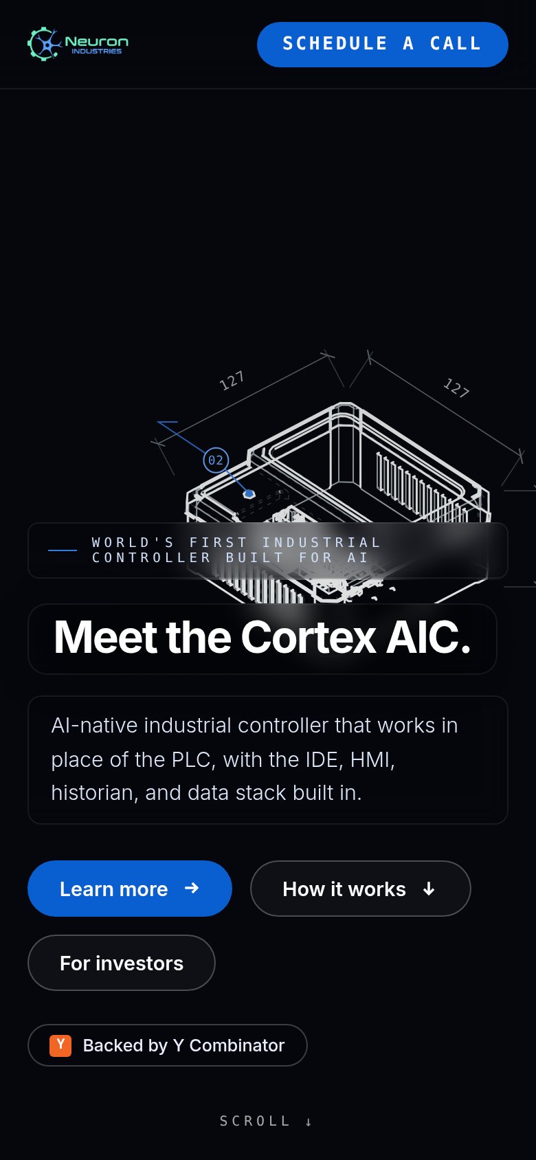 123
- Learn more button — Primary CTA is desktop-sized, buried below three-button stack near the fold edge.
- Eyebrow text overlap — "WORLD'S FIRST INDUSTRIAL CONTROLLER" strip renders on top of the wireframe, hurting legibility.
- Secondary button row — "How it works" and "For investors" crowd the fold and dilute the primary action.
Value props
76FairTitle, subtitle, hero — do they sell the product's true value?
Neuron Industries’s headline undersells
Meet the Cortex AIC.
AI-native industrial controller that works in place of the PLC, with the IDE, HMI, historian, and data stack built in.
Working
- Subhead names concrete stack: IDE, HMI, historian
- "Works in place of the PLC" is a clear outcome
- Hero shows live diagnostics, not decoration
Could improve
- H1 is a name reveal, carries no value
- No numbers proving speed or savings
- Target user never named in the fold