
Your landing page’s weakest score is Mobile web.
How Beckhoff Automation ranks
- 1.
Neuron Industries65
- 2.
Software Defined Automation64
- 3.
Opto 22 (groov EPIC)49
- 4.
Beckhoff Automation38
38Growth scoreupdated
category scores
category scoresShowHide
Mobile web
28PoorThe phone experience as a first-class citizen.
 12
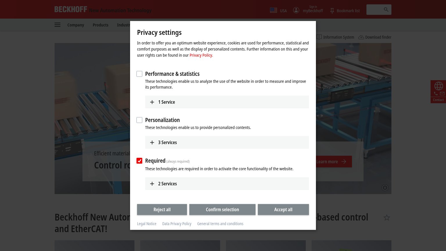
- Three gray consent buttons — "Reject all", "Confirm selection", and "Accept all" are identical gray blocks with no visual hierarchy to speed dismissal.
- Clipped services row — The "2 Services" expander is cut off mid-render behind the button bar, signaling an untested mobile layout.
Information hierarchy
34PoorDoes the design help or inhibit what the page is trying to say?
 1234
- Privacy settings modal — Cookie dialog blankets the hero, hiding the headline, hero CTA, and value proposition entirely on first load.
- Reject/Confirm/Accept buttons — Three identically weighted gray buttons give no visual cue toward the fastest dismissal path, prolonging the interruption.
- Truncated headline text — "Beckhoff New Autor... -based control and EtherCAT!" is sliced by the overlay, so the core message reads as fragments.
- Hero Learn more CTA — The only visible action button is half-obscured, low-contrast gray, and generic — invisible in a one-second scan.
Trust
42PoorProof that the product is real, competent, and safe to try.
How Beckhoff Automation compares
Trust read
CTA
44PoorCopy, size, verb, cost-feel — does the primary CTA earn the click?
How Beckhoff Automation compares
Recommended rewrites
Value props
44PoorTitle, subtitle, hero — do they sell the product's true value?
Working
Could improve