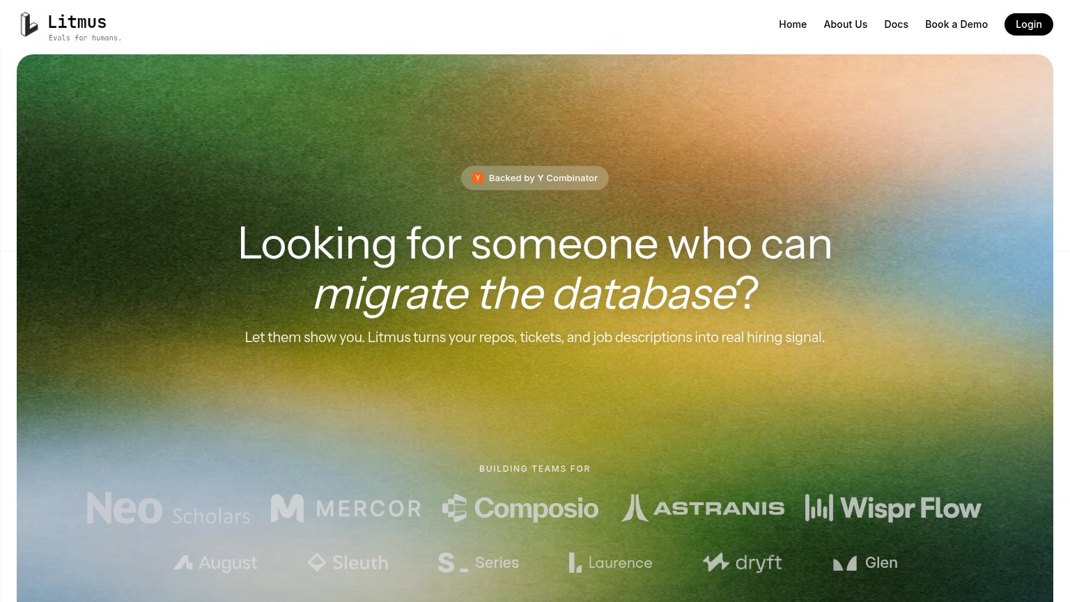
LitmusYC S26 landing page report.
← Back to YC S26

Your landing page’s weakest score is CTA.

Fix CTA

Score over time

9080706050403020Ropes AI 74 on Jun 2 (Wayback)Ropes AI 73 on Jun 23 (Wayback)Ropes AI 70 on Sep 22 (Live)Woven 68 on Apr 22 (Wayback)Woven 68 on May 10 (Wayback)Woven 68 on Jul 9 (Wayback)Woven 68 on Sep 20 (Live)CodeSignal 67 on Jun 19 (Wayback)CodeSignal 70 on Jul 9 (Wayback)CodeSignal 70 on Aug 2 (Wayback)CodeSignal 69 on Aug 12 (Wayback)CodeSignal 70 on Aug 24 (Wayback)CodeSignal 68 on Sep 10 (Wayback)CodeSignal 71 on Sep 20 (Live)CoderPad 71 on May 9 (Wayback)CoderPad 74 on Jun 16 (Wayback)CoderPad 74 on Jul 10 (Wayback)CoderPad 72 on Aug 9 (Wayback)CoderPad 73 on Aug 24 (Wayback)CoderPad 73 on Sep 3 (Wayback)CoderPad 68 on Sep 20 (Live)Hatchways 75 on Apr 20 (Wayback)Hatchways 70 on Aug 29 (Wayback)Hatchways 73 on Sep 22 (Live)Litmus 32 on May 5 (Wayback)Litmus 60 on Jun 22 (Wayback)Litmus 61 on Sep 20 (Live)May 5Jun 22Sep 20
Past reportsShow past reportsHide past reports
  1. Sep 20, 202661LiveOverall +1 · CTA −25 · Trust +20Viewing
  2. Jun 22, 202660Overall +28 · Value props +50 · Information hierarchy +32View →
  3. May 5, 202632First tracked report — strongest CTA 48, weakest Value props 22View →

CTA

45Poor

Copy, size, verb, cost-feel — does the primary CTA earn the click?

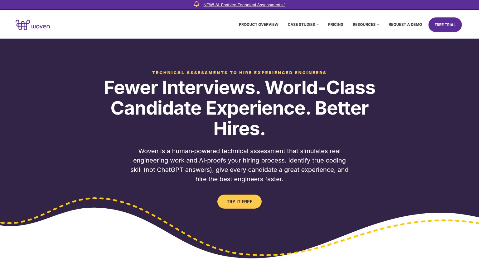
Woven
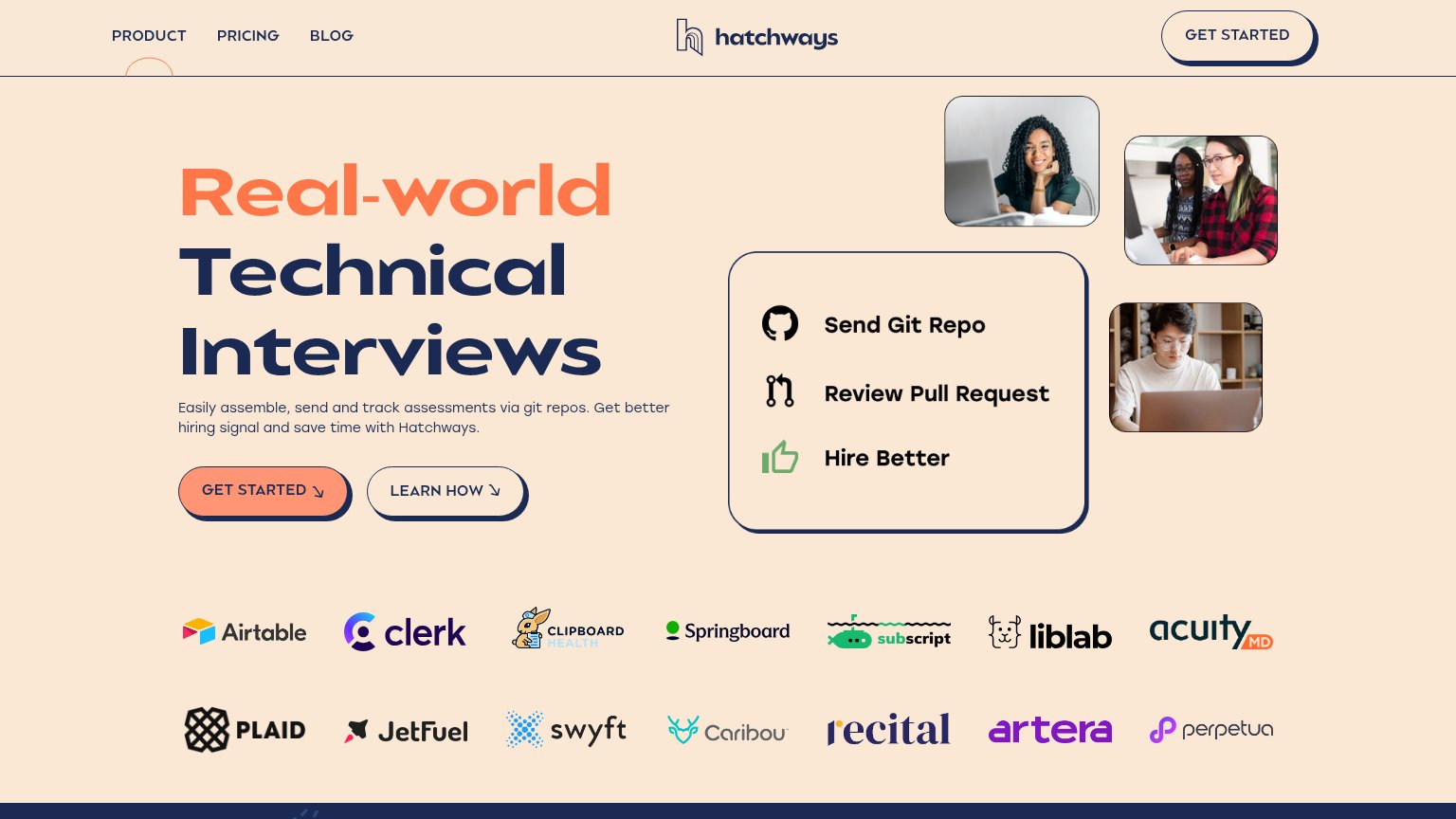
Hatchways
CodeSignal
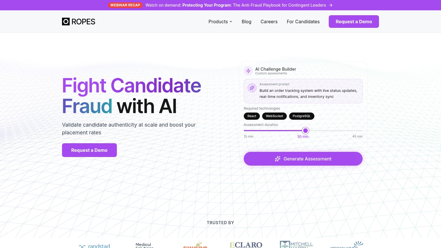
Ropes AI
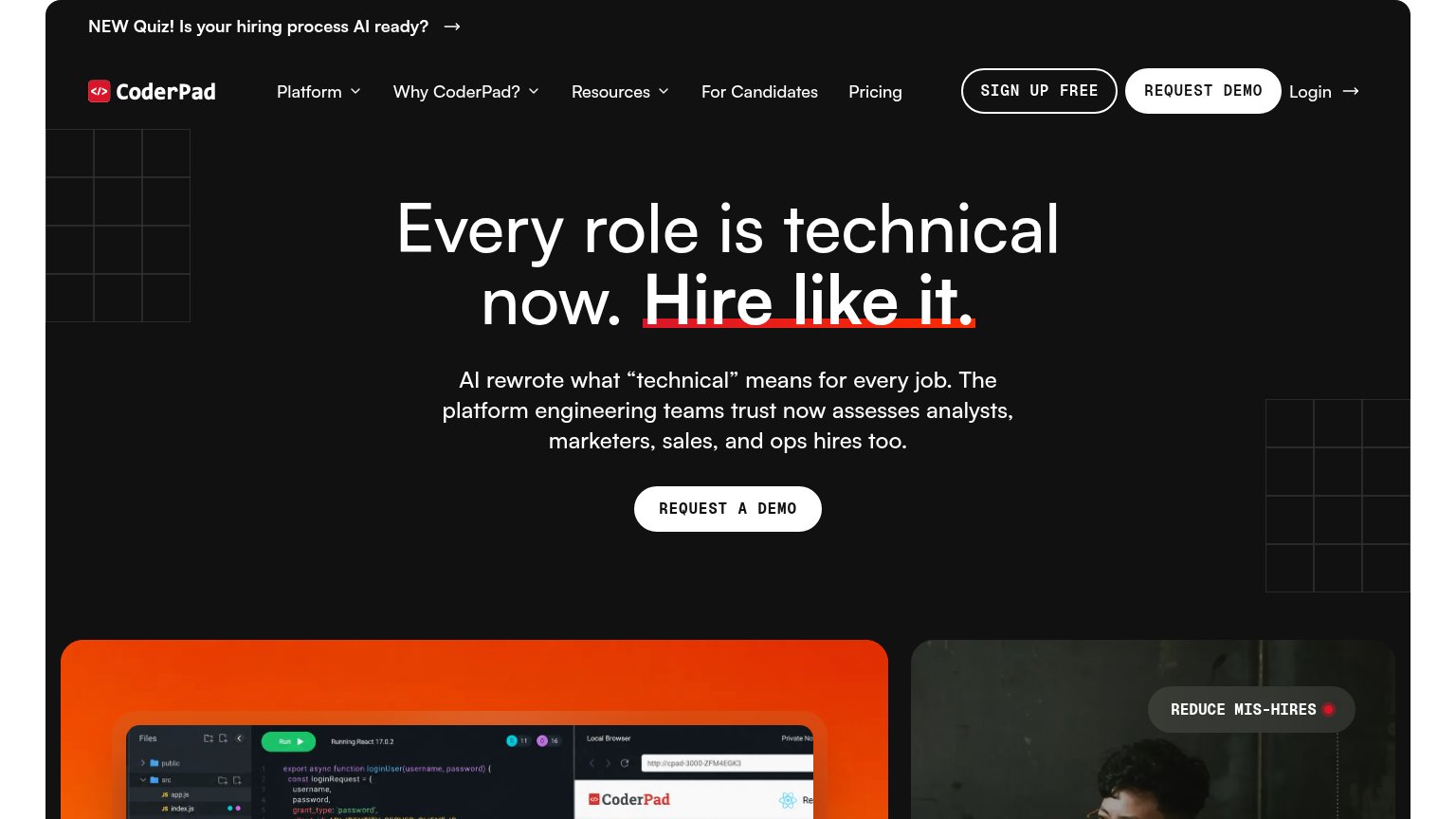
CoderPad

Problems

  • no hero CTA button or input
  • nav 'Book a Demo' feels costly
  • mobile fold shows only 'Login'
  • headline promise has no next step

Mobile web

54Fair

The phone experience as a first-class citizen.

Mobile web annotations on the mobile capture12
  1. Login-only header — The only tappable action in the fold is "Login" — the primary "Book a Demo" CTA from desktop is gone entirely on mobile.
  2. Six-line wrapped headline — The headline wraps into six cramped lines with an orphaned "?" on its own line; the desktop type did not scale down enough.

Information hierarchy

62Fair

Does the design help or inhibit what the page is trying to say?

Information hierarchy annotations on the desktop capture123
  1. Book a Demo nav link — The only conversion path is a plain text nav item, visually outranked by the black 'Login' pill beside it.
  2. Login pill button — The highest-contrast button in the fold serves existing users, stealing the primary-action slot from new visitors.
  3. Logo wall dual rows — Ten same-weight logos compete as one dense band, pulling attention down before any action exists to take.

Trust

68Fair

Proof that the product is real, competent, and safe to try.

Litmus
CodeSignal
Trust read
Litmus"BUILDING TEAMS FOR" logo wall (Neo Scholars, Mercor, Composio, Astranis, Wispr Flow, and more)
Ropes AI"TRUSTED BY" logo strip with Randstad, Medical Solutions, Eclaro, Mitchell Martin logos
WovenNo visible trust signal identified.
CodeSignalCustomer logo wall featuring Anthropic, Meta, TikTok, WGU, Zillow, and Instacart
CoderPadCoderPad-branded coding interview environment screenshot with file tree, code editor, and live React browser preview
HatchwaysCustomer logo wall (Airtable, Plaid, Clerk, Clipboard Health, Springboard, etc.)

Value props

78Fair

Title, subtitle, hero — do they sell the product's true value?

Litmus’s headline sellsLooking for someone who can migrate the database?Let them show you. Litmus turns your repos, tickets, and job descriptions into real hiring signal.

Working

  • Voices the hiring manager's exact question
  • Subhead names concrete inputs: repos, tickets
  • Rotating tasks make the use case tangible

Could improve

  • No numbers or timeframe anywhere in fold
  • Hero gradient decorates, never demonstrates
  • "Real hiring signal" stays abstract