
Your landing page’s weakest score is Value props.
How Kebra ranks
60Growth scoreupdated
category scores
category scoresShowHide
Score over time
Value props
44PoorTitle, subtitle, hero — do they sell the product's true value?
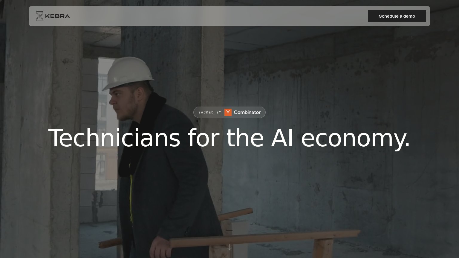
Kebra’s headline vague
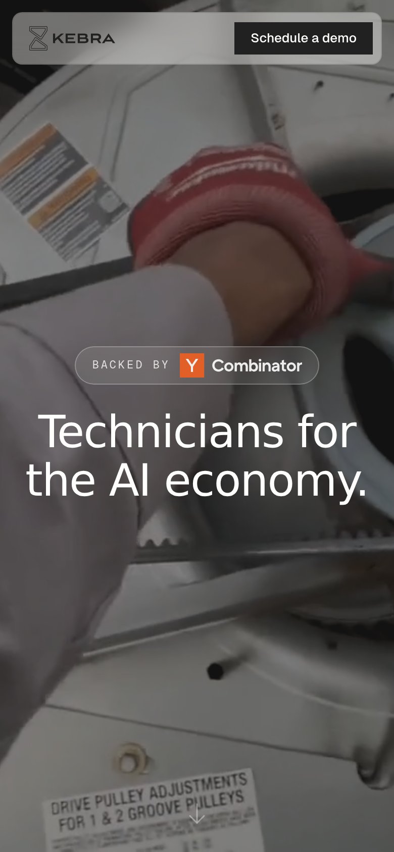
Technicians for the AI economy.
Working
- Short, memorable positioning line
- Hero video shows real trade work
- YC badge adds credibility
Could improve
- No subhead explaining what Kebra does
- Zero specifics: no buyer, outcome, or number
- 'AI economy' is an abstraction stack
Trust
48PoorProof that the product is real, competent, and safe to try.
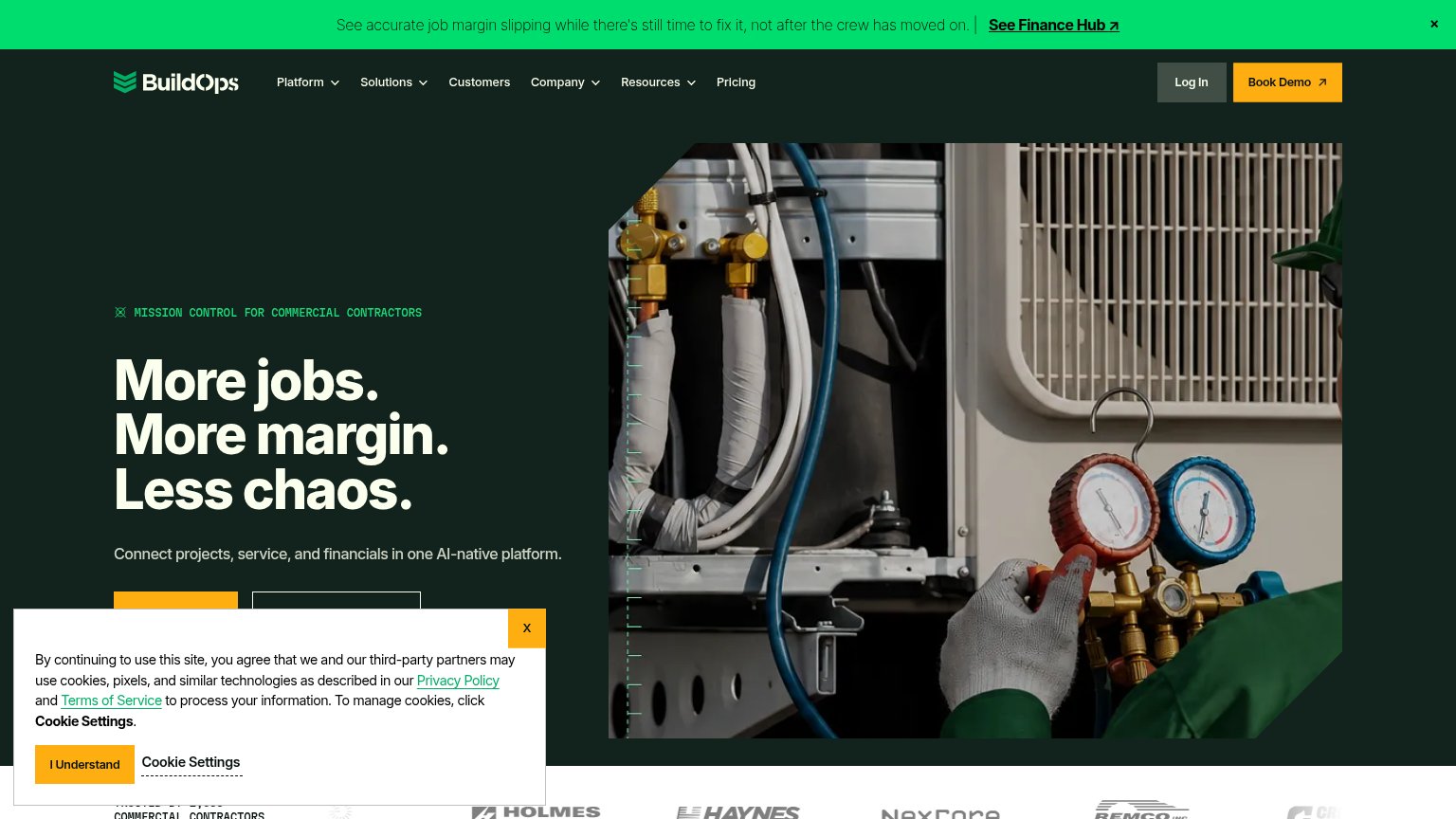
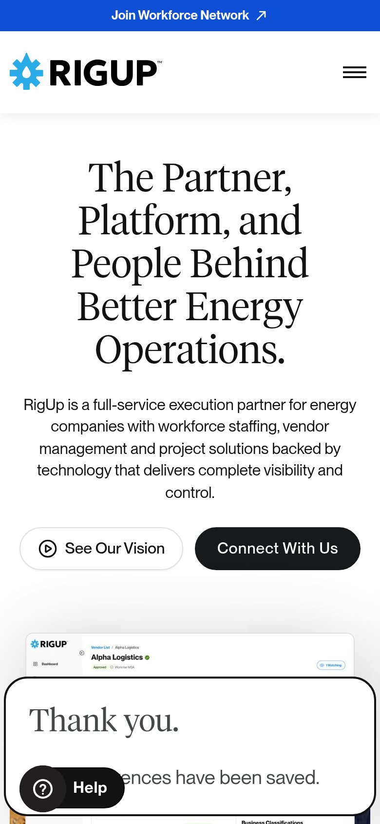
| Trust read | |
|---|---|
| Kebra | "BACKED BY Y Combinator" badge above the headline |
| Customer logo strip (Holmes, Haynes, NexCore, Remco) with a partial "TRUSTED BY... COMMERCIAL CONTRACTORS" count at the | |
| Vendor Management product screenshot showing "Alpha Logistics — Approved, Workrise MSA" record UI | |
| No visible trust signal identified. |
CTA
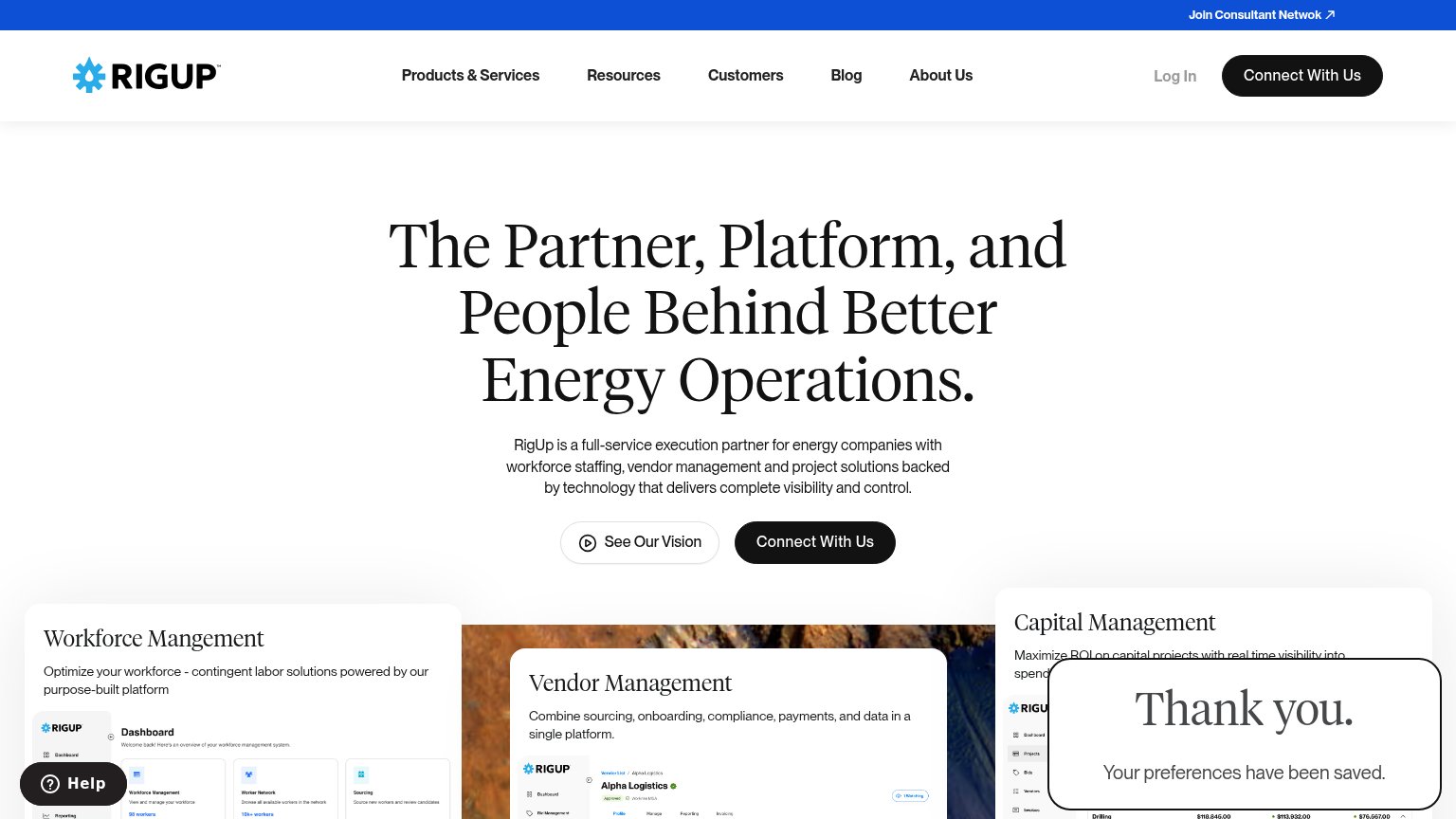
62FairCopy, size, verb, cost-feel — does the primary CTA earn the click?
Problems
- nav-only, no hero CTA
- demo click feels costly
- small vs dominant headline
- no payoff implied
Information hierarchy
72FairDoes the design help or inhibit what the page is trying to say?
12- Headline lacks subheadline — "Technicians for the AI economy." stands alone with no supporting line explaining what Kebra does or for whom.
- Schedule a demo button — Near-black button on a translucent bar blends into the dark video; the primary CTA has weak contrast at the fold's least-scanned corner.
Mobile web
72FairThe phone experience as a first-class citizen.
 12
- Schedule a demo button — Desktop-sized header button, not full-width; dark fill blends into the dark video behind it.
- Backed by badge — Transparent pill sits over a light glove/arm region, making 'BACKED BY' hard to read.