
Your landing page’s weakest score is Trust.
How Marble ranks
75Growth scoreupdated
category scores
category scoresShowHide
Score over time
Trust
62FairProof that the product is real, competent, and safe to try.
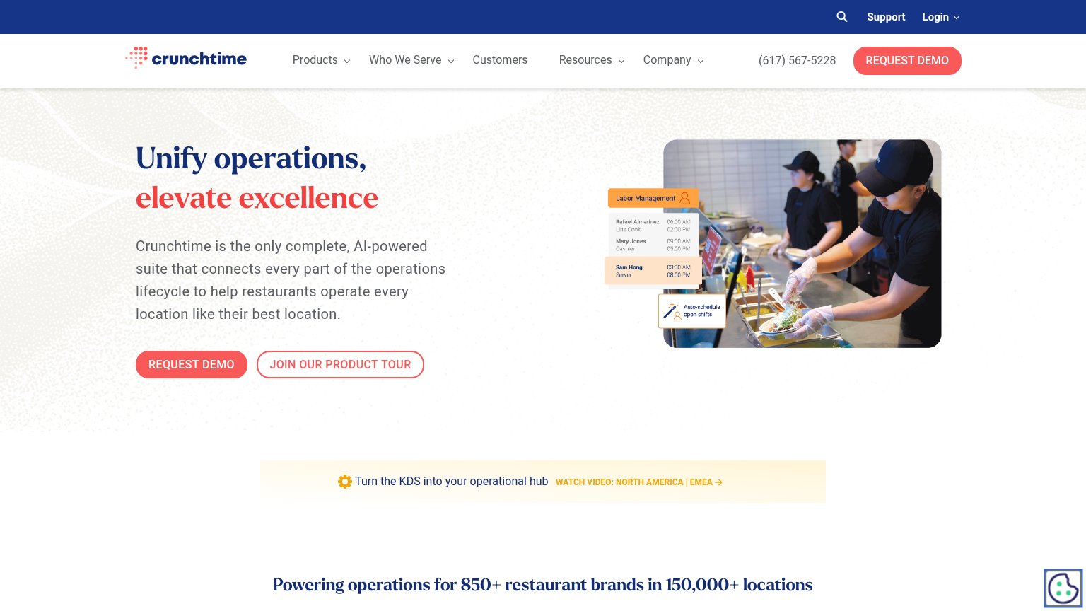
| Trust read | |
|---|---|
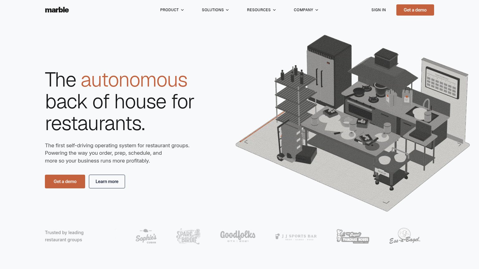
| Marble | "Trusted by leading restaurant groups" logo strip (Sophie's Cuban, Spare Birdie, Goodfolks, JJ Sports Bar, The Original |
| Hero photo captioned "Bill-E's team digitizing invoices at the click of a button" showing a real customer using the app | |
| No visible trust signal identified. | |
| "Sales Performance Overview" dashboard mockup showing real metrics ($487,200 gross sales, 29.1% labor cost) | |
| Powering operations for 850+ restaurant brands in 150,000+ locations | |
| Detailed "Galley Burger" recipe UI showing prep time, allergens, HACCP rules, and costed components |
Value props
72FairTitle, subtitle, hero — do they sell the product's true value?
Marble’s headline sells
The autonomous back of house for restaurants.
The first self-driving operating system for restaurant groups. Powering the way you order, prep, schedule, and more so your business runs more profitably.
Working
- Names the audience: restaurant groups
- Concrete jobs: order, prep, schedule
- Profitability outcome stated
Could improve
- Zero numbers or proof metrics
- "Autonomous" needs decoding
- Hero art decorates, doesn't demo
CTA
74FairCopy, size, verb, cost-feel — does the primary CTA earn the click?
Problems
- demo click feels like a sales call
- no product value in the click
- generic label, no header echo
Information hierarchy
82StrongDoes the design help or inhibit what the page is trying to say?
1234- Learn more button — Outlined button at near-equal weight sits beside the primary CTA and splits the click.
- Nav dropdown row — Four dropdowns plus Sign in offer five exit paths before the hero CTA is read.
- Duplicate header CTA — Second "Get a demo" in the header competes with the hero button for the same action.
- Grey kitchen illustration — Uniformly grey rendering lacks a focal point, so the large visual pulls the eye without paying it off.
Mobile web
86StrongThe phone experience as a first-class citizen.
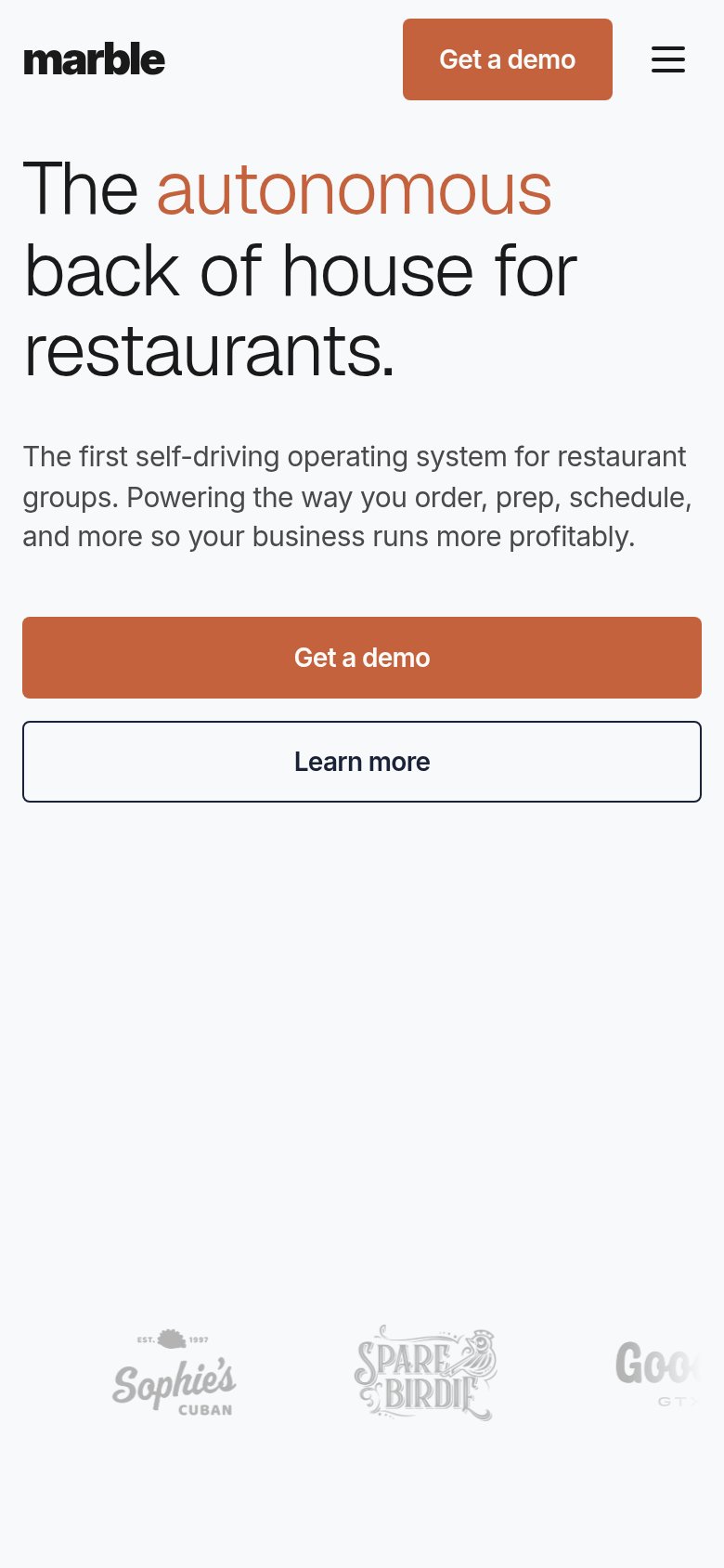 12
- Learn more button — Full-width and near-equal weight to the primary CTA, splitting tap focus.
- Header Get a demo — Duplicates the hero CTA in the same viewport, adding redundant clutter to the collapsed nav.