
Your landing page’s weakest score is Value props.
How Crunchtime ranks
68Growth scoreupdated
category scores
category scoresShowHide
Value props
62FairTitle, subtitle, hero — do they sell the product's true value?
Crunchtime’s headline undersells
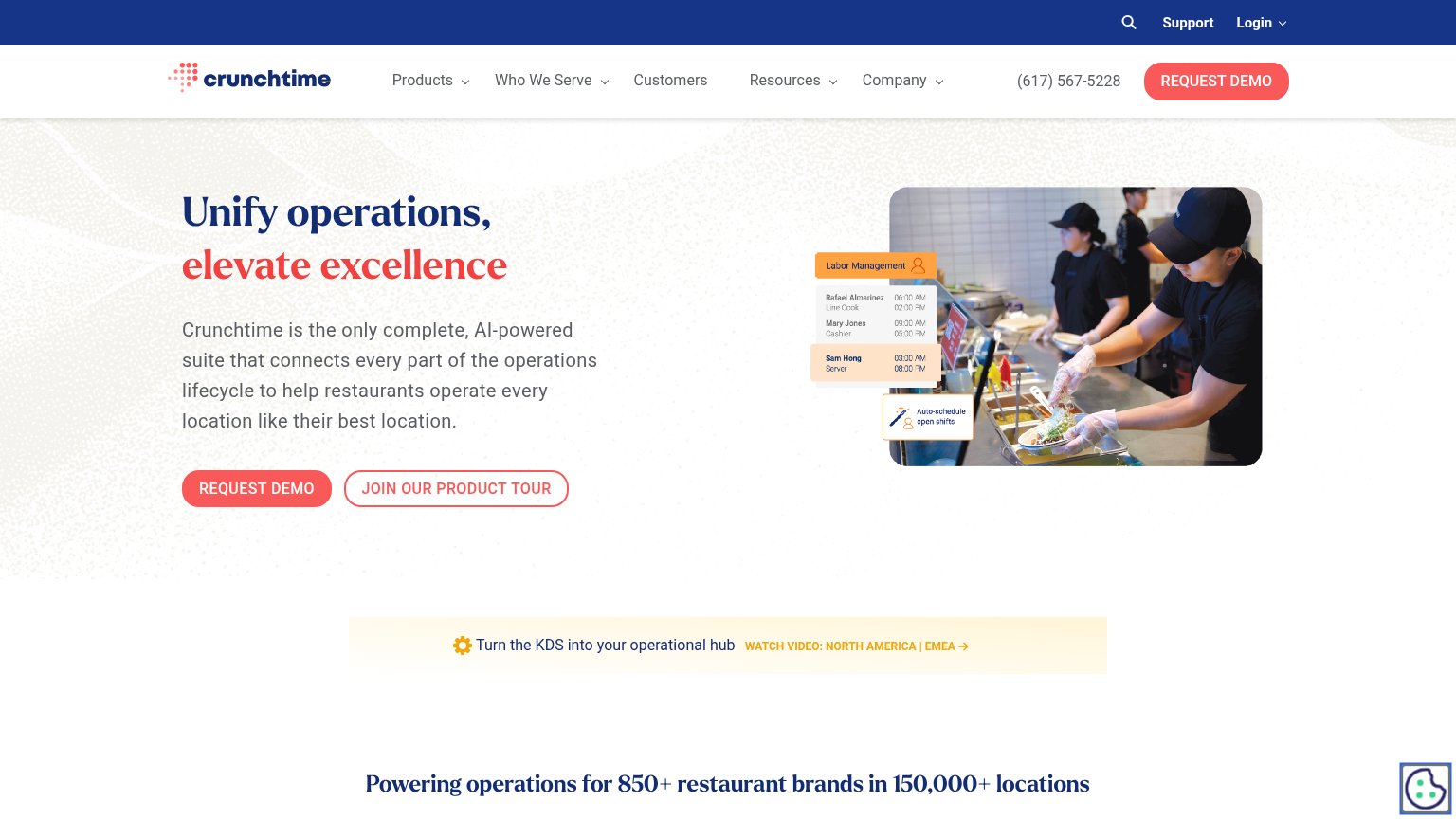
Unify operations, elevate excellence
Crunchtime is the only complete, AI-powered suite that connects every part of the operations lifecycle to help restaurants operate every location like their best location.
Working
- Subhead names restaurants explicitly
- 'Every location like their best' is vivid
- Hero image shows product UI in real kitchen
Could improve
- H1 is a generic abstraction stack
- Best outcome line buried in subhead
- Proof numbers sit below the fold on mobile
Mobile web
62FairThe phone experience as a first-class citizen.
 1234
- Headline six-line wrap — "Unify operations, elevate excellence" plus the paragraph fill the fold and push both CTAs below the first viewport.
- Oversized body paragraph — Subhead text scaled down too little — six long lines dominate the viewport before any action appears.
- KDS banner misalignment — "hub" orphans onto the link line and collides with "WATCH VIDEO", a broken wrap nobody re-checked on mobile.
- Double-decker header — Utility bar (Support/Login) stacked over logo+hamburger eats two rows of the first viewport.
Information hierarchy
71FairDoes the design help or inhibit what the page is trying to say?
What works
What to improve
CTA
72FairCopy, size, verb, cost-feel — does the primary CTA earn the click?
How Crunchtime compares
Recommended rewrites
Trust
72FairProof that the product is real, competent, and safe to try.
How Crunchtime compares
Trust read