
Your landing page’s weakest score is Trust.
How Erinys ranks
66Growth scoreupdated
category scores
category scoresShowHide
Score over time
Trust
38PoorProof that the product is real, competent, and safe to try.
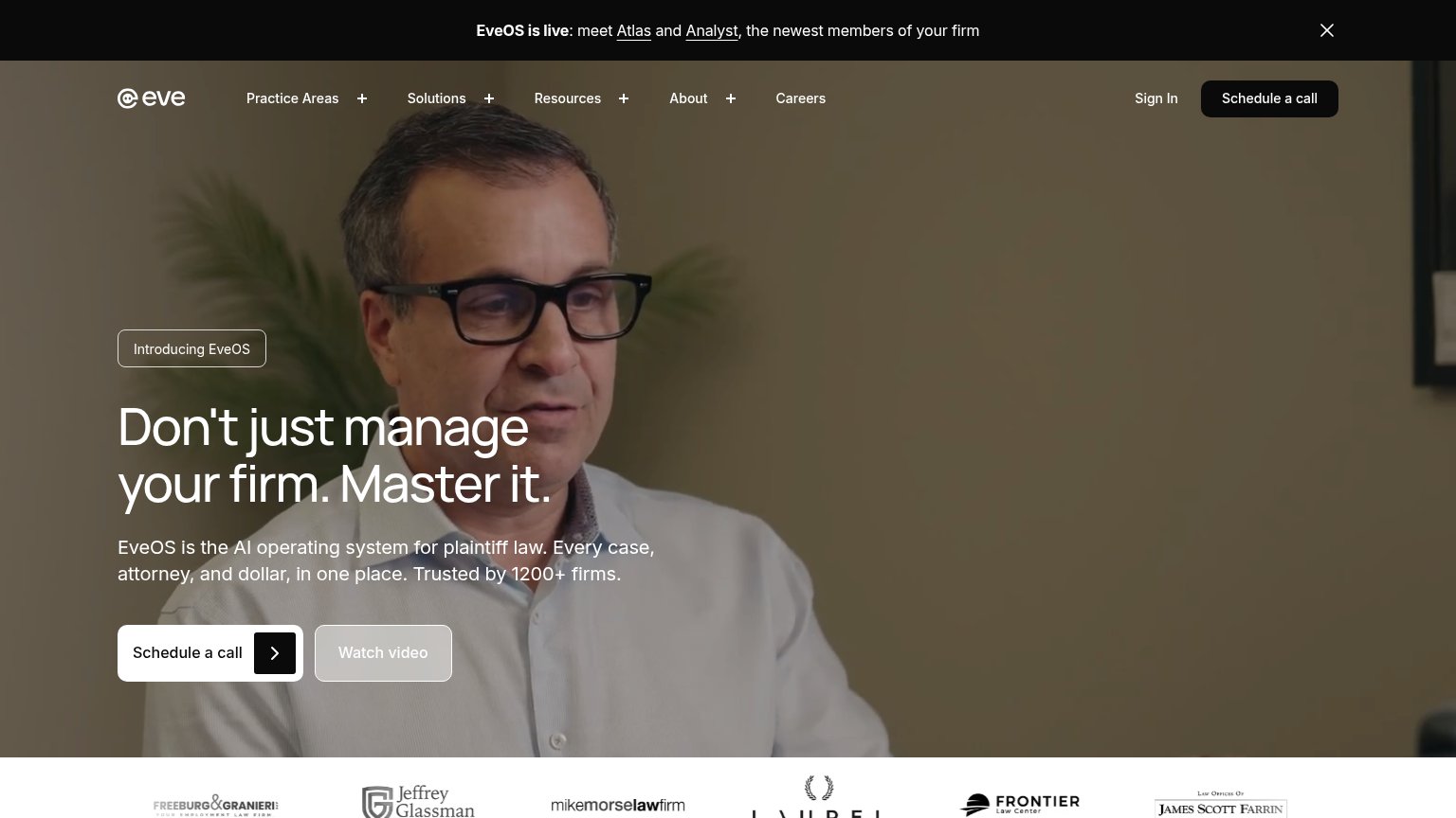
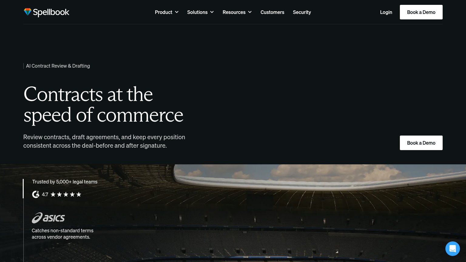
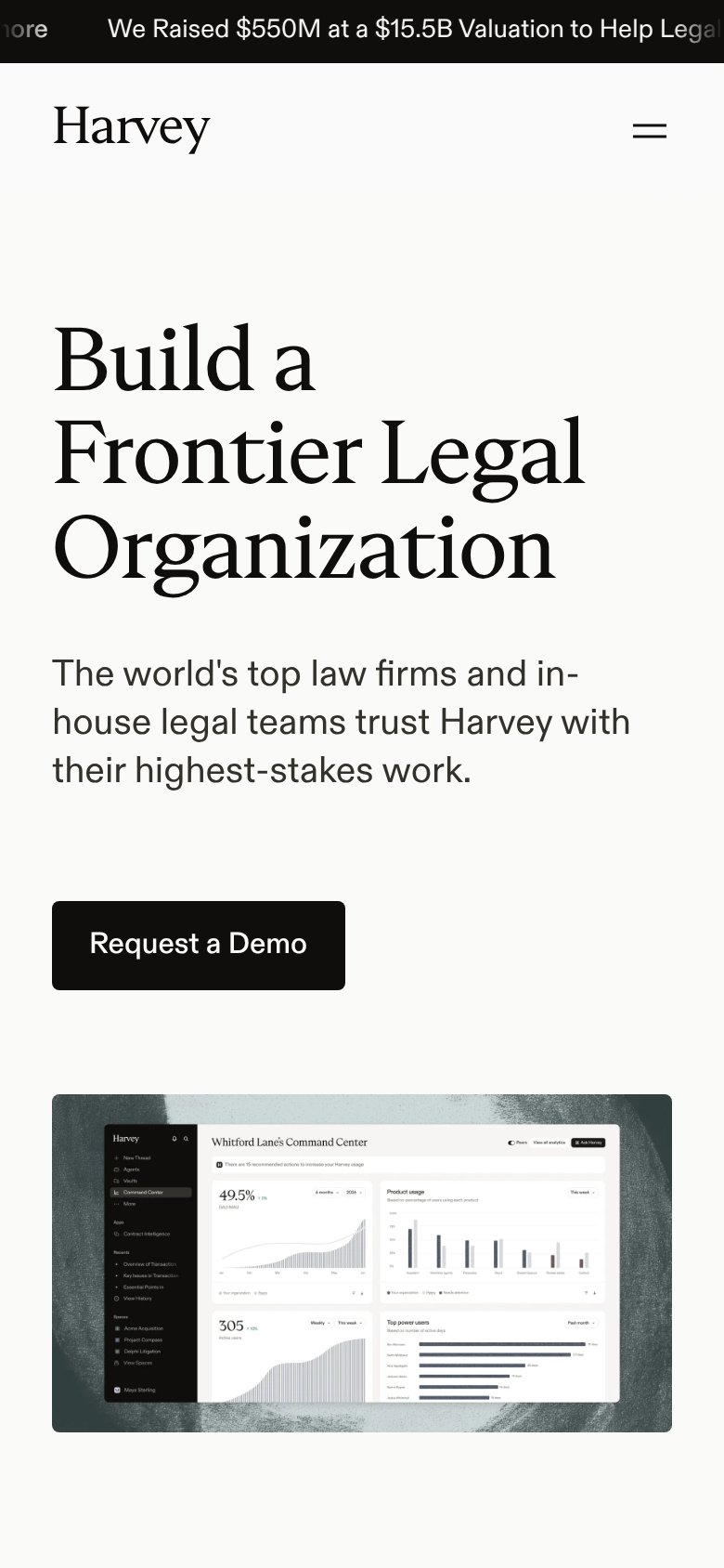
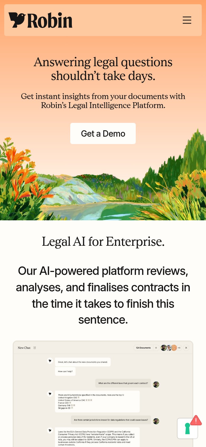
| Trust read | |
|---|---|
| Erinys | No visible trust signal identified. |
| "Trusted by 1200+ firms" plus the law-firm logo row (Mike Morse Law Firm, Jeffrey Glassman, Frontier Law Center, James S | |
| "We Raised $550M at a $15.5B Valuation" announcement banner (mobile capture) | |
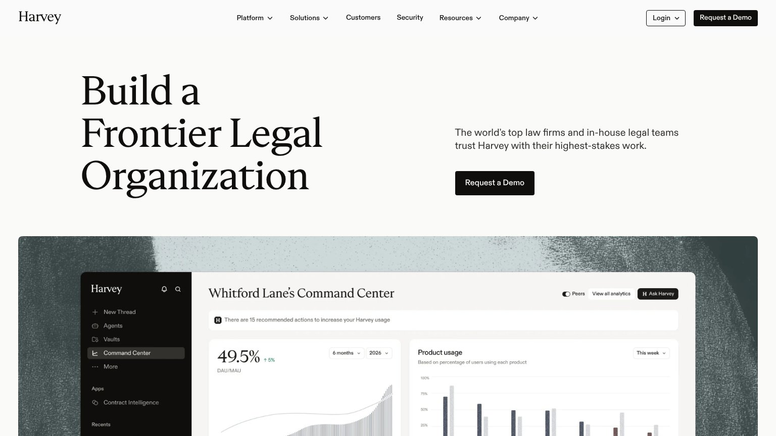
| Product chat UI screenshot answering "What are the different laws that govern each contract?" across "124 Documents" wit | |
| "Trusted by 5,000+ legal teams" with G2 4.7-star rating badge |
CTA
64FairCopy, size, verb, cost-feel — does the primary CTA earn the click?
Problems
- waitlist click yields no immediate value
- ghost outline reads as secondary
- no payoff or headline echo in copy
Value props
72FairTitle, subtitle, hero — do they sell the product's true value?
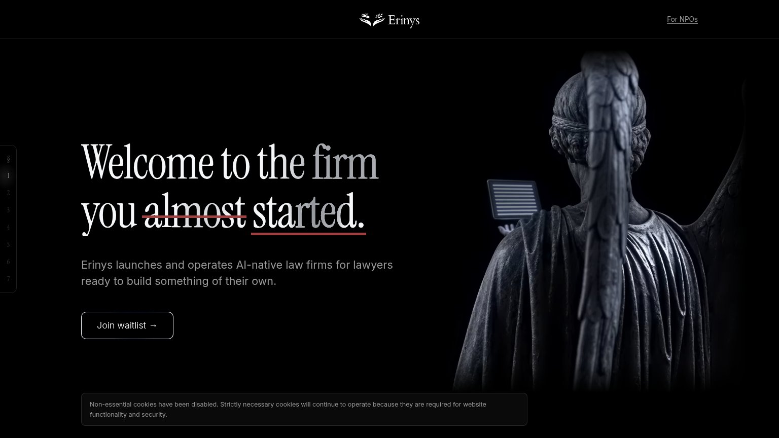
Erinys’s headline sells
Welcome to the firm you almost started.
Erinys launches and operates AI-native law firms for lawyers ready to build something of their own.
Working
- "almost started" nails the audience's regret
- Subhead states launch + operate plainly
- Distinct voice; not generic AI copy
Could improve
- Zero numbers or proof points in fold
- Hero image decorates, doesn't demo
- "Operates" left vague — operates what?
Mobile web
72FairThe phone experience as a first-class citizen.
 12
- Cookie notice banner — Dead blocker with no dismiss button and no user choice — it eats the bottom of the fold for a message that requires no action.
- Join waitlist button — Desktop-proportioned button floating narrow in the phone column; should stretch near full-width for the thumb.
Information hierarchy
82StrongDoes the design help or inhibit what the page is trying to say?
123- Cookie notice banner — The undismissable cookie block sits inside the fold and steals the last scan position from the CTA.
- Left section rail — Faint numbered rail (§, 1-7) reads as noise — too low-contrast to navigate, too visible to ignore.
- Join waitlist button — Ghost outline styling on black gives the only conversion element the least visual weight on the page.