
Your landing page’s weakest score is Trust.
How Elite ranks
70Growth scoreupdated
category scores
category scoresShowHide
Score over time
Trust
42PoorProof that the product is real, competent, and safe to try.


| Trust read | |
|---|---|
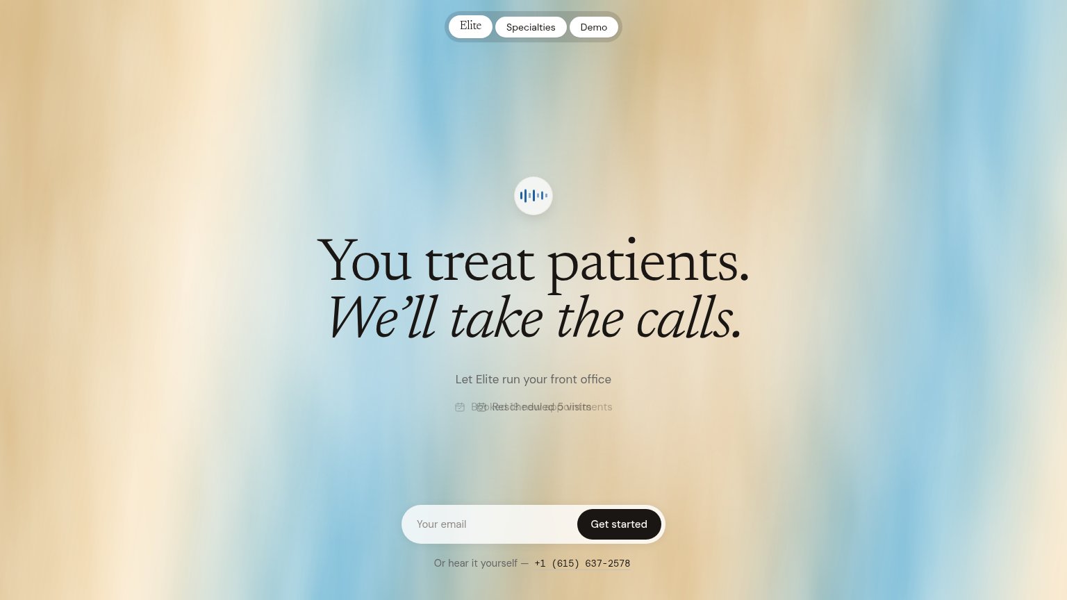
| Elite | "Or hear it yourself — +1 (615) 637-2578" live demo phone number |
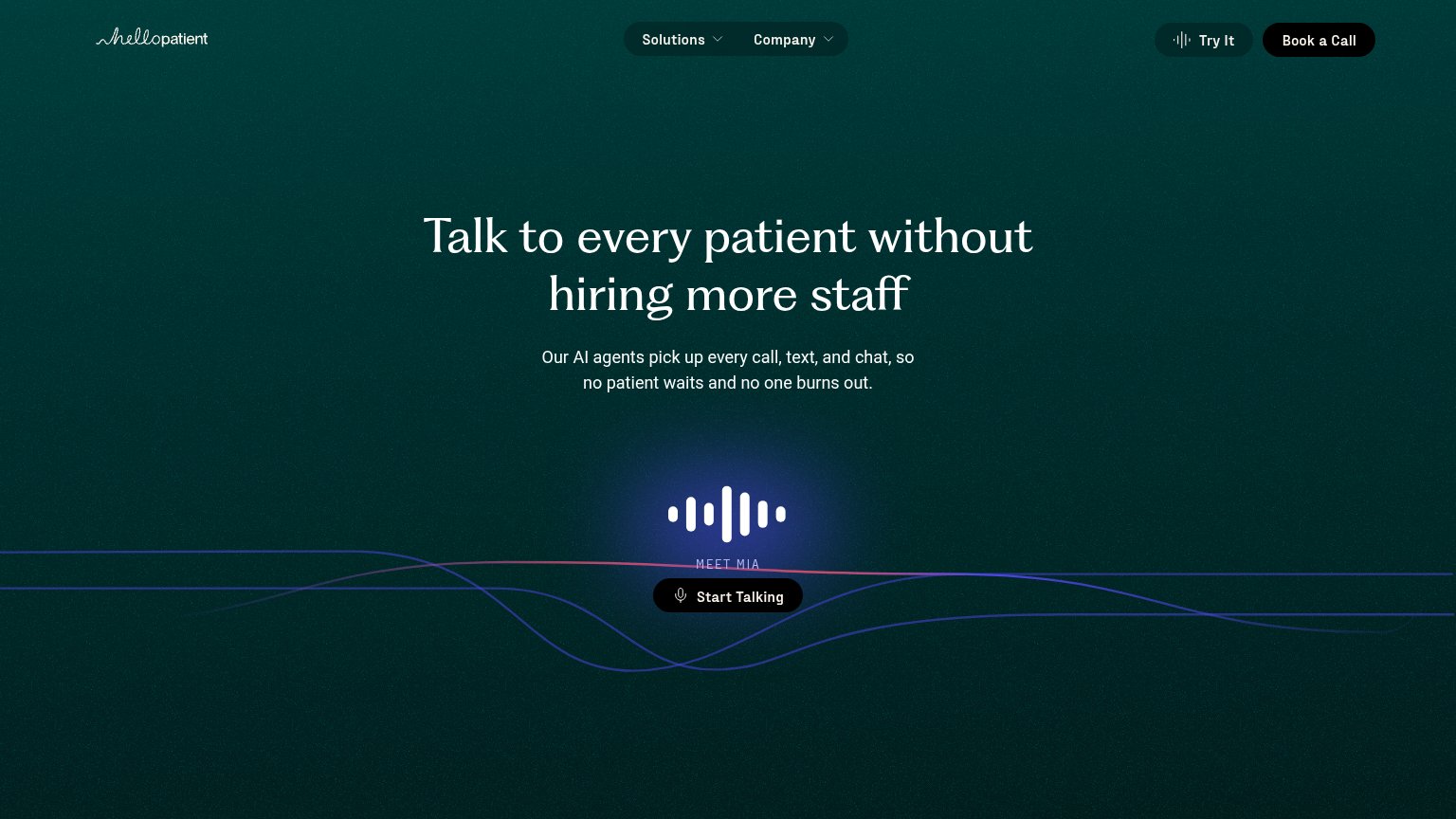
| "4.3/5 · 344K Patient Ratings" star badge above the headline | |
| "MEET MIA — Start Talking" live voice-agent demo | |
| ">90% positive ratings from patients" metric strip beneath the hero CTA | |
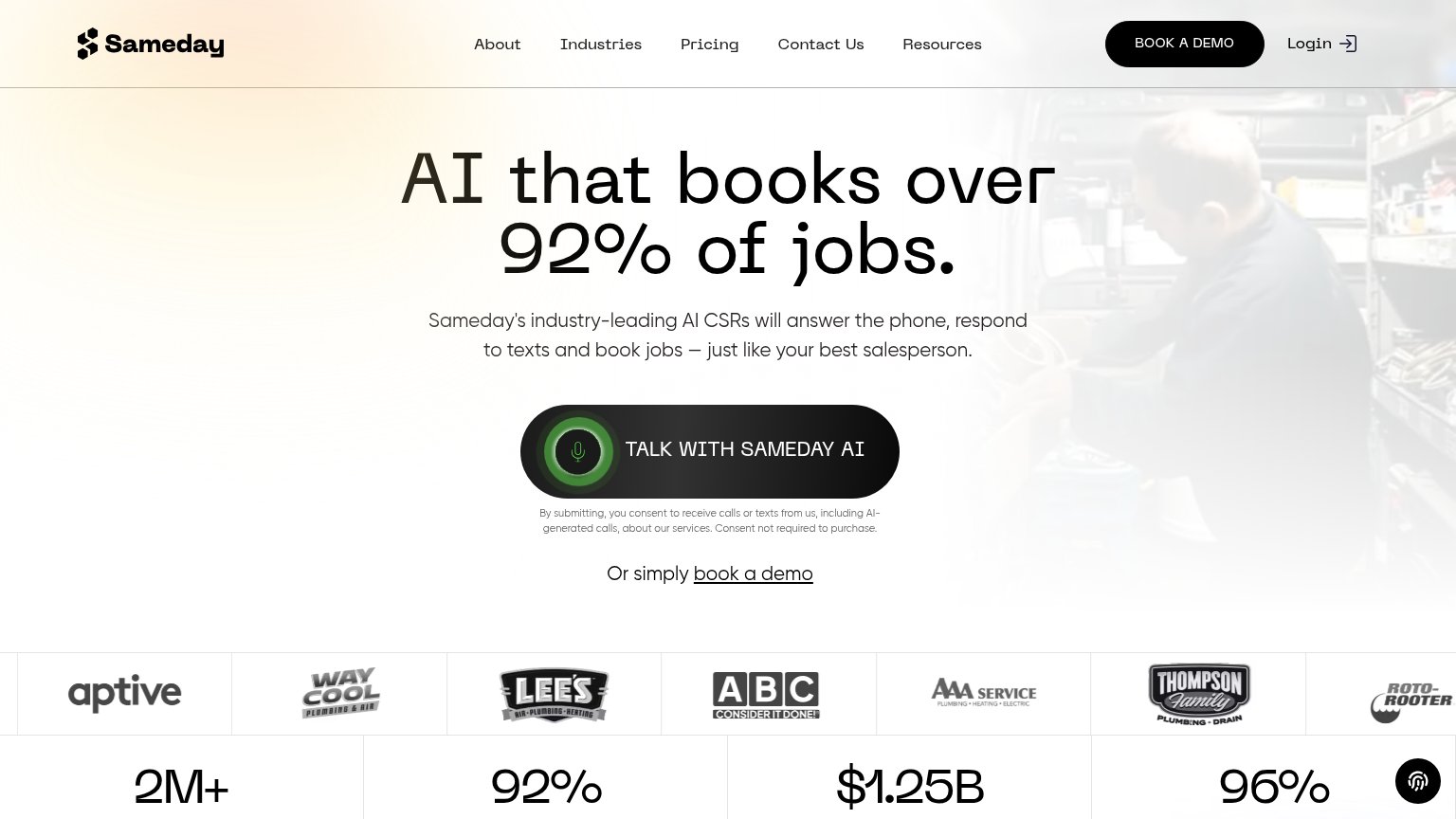
| Stats bar: "2M+ Calls answered in the trades" and "92% Booking rate in most channels" beneath the customer logo strip | |
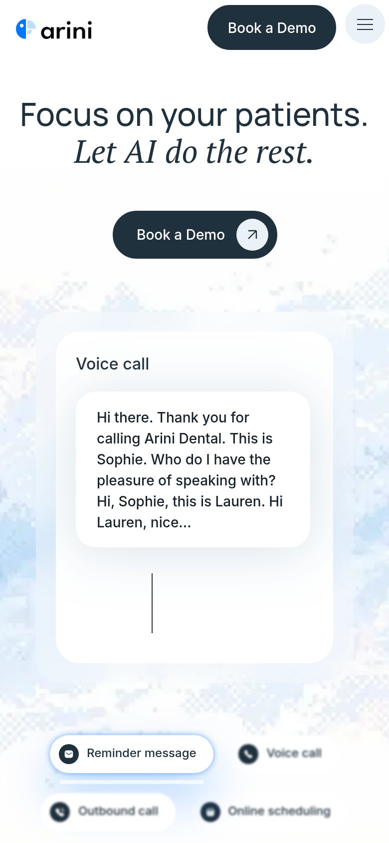
| Voice call transcript card showing the AI receptionist answering: "Hi there. Thank you for calling Arini Dental. This is |
CTA
72FairCopy, size, verb, cost-feel — does the primary CTA earn the click?
Problems
- generic label, no payoff named
- email asked before value shown
- phone demo buried as footnote
- no header echo
Value props
72FairTitle, subtitle, hero — do they sell the product's true value?
Elite’s headline sells
You treat patients. We'll take the calls.
Let Elite run your front office
Working
- Clear division of labor in one line
- Speaks to clinician relief
- Live phone number demos the product
Could improve
- Subhead adds no specifics
- Proof ticker overlaps on desktop
- No numbers or outcomes quantified
Information hierarchy
78FairDoes the design help or inhibit what the page is trying to say?
12- Garbled status ticker — Two rotating proof lines render overlapped mid-transition, producing unreadable text at the fold's proof moment.
- Small gray subtitle — "Let Elite run Elite's front office" is undersized and low-contrast against the wash, weakening the explanatory beat under the headline.
Mobile web
88StrongThe phone experience as a first-class citizen.
 1
- Rotating proof ticker — Cross-fading status line ('Rescheduled 5 visits') animates mid-hero; desktop capture shows frames overlapping into unreadable text, a risk on mobile too.