
Your landing page’s weakest score is Trust.
How Hello Patient ranks
73Growth scoreupdated
category scores
category scoresShowHide
Trust
52FairProof that the product is real, competent, and safe to try.
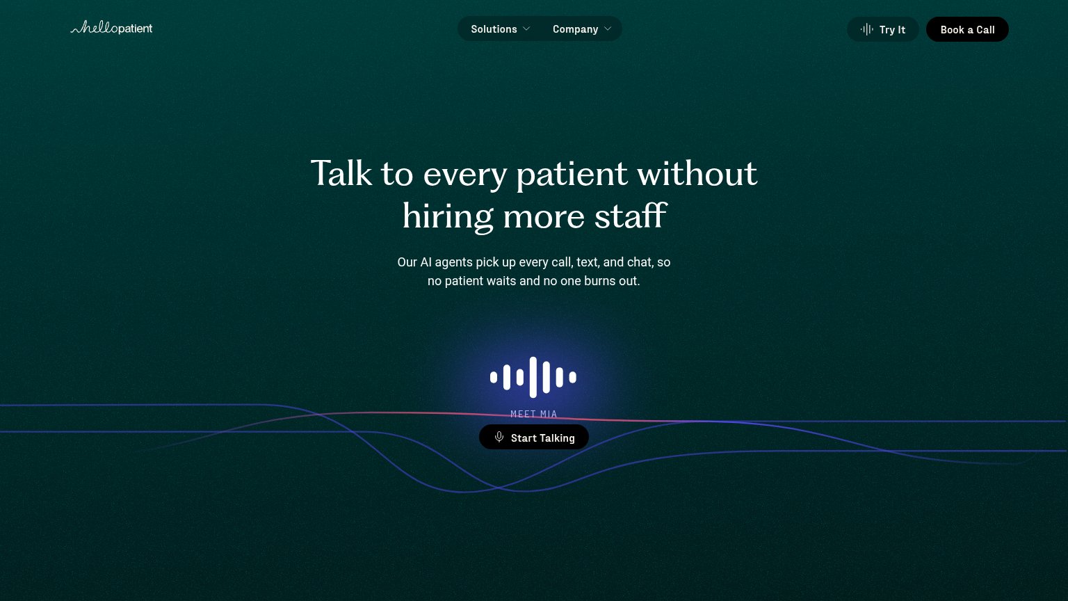
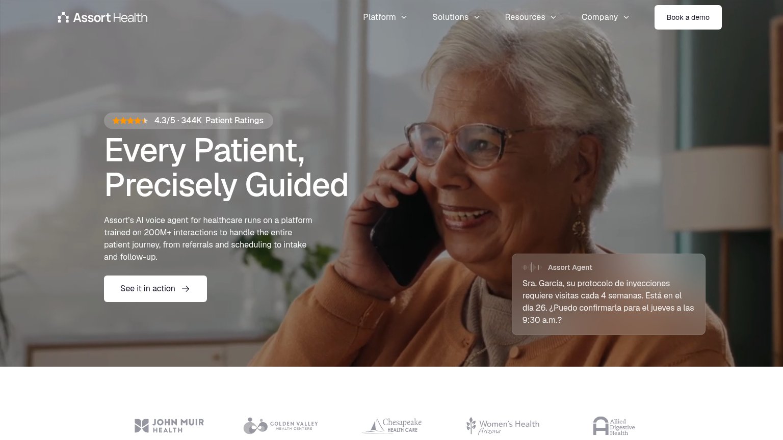

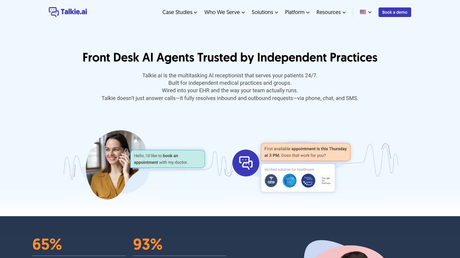
| Trust read | |
|---|---|
| Hello Patient | "MEET MIA — Start Talking" live voice-agent demo |
| No visible trust signal identified. | |
| "4.3/5 · 344K Patient Ratings" star badge above the headline | |
| "Verified solution for healthcare" badge strip with HIPAA Compliant, AICPA SOC, and Google for Startups marks | |
| Voice call transcript card showing the AI receptionist answering: "Hi there. Thank you for calling Arini Dental. This is | |
| ">90% positive ratings from patients" metric strip beneath the hero CTA |
Information hierarchy
72FairDoes the design help or inhibit what the page is trying to say?
123- Three equal-weight CTAs — "Try It", "Book a Call", and "Start Talking" split the fold into three competing actions with no clear primary.
- Start Talking button — Dark button on a dark teal background nearly disappears; the fold's most interactive element has the weakest contrast.
- Meet Mia label — Tiny, low-contrast caption fails to explain what the waveform is or why the visitor should press Start Talking.
Mobile web
76FairThe phone experience as a first-class citizen.
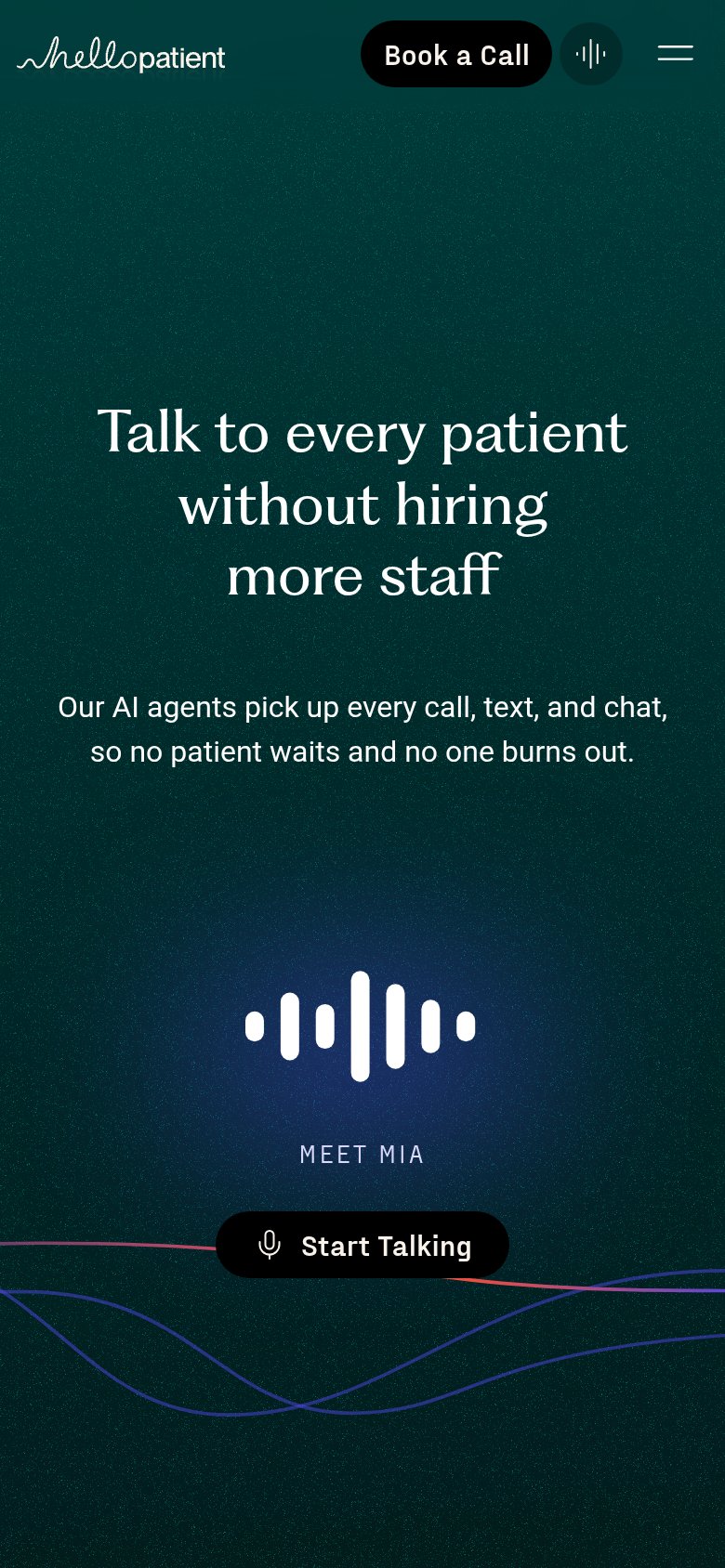
What works
What to improve
Value props
82StrongTitle, subtitle, hero — do they sell the product's true value?
Hello Patient’s headline
Talk to every patient without hiring more staff
Our AI agents pick up every call, text, and chat, so no patient waits and no one burns out.
Working
Could improve
CTA
84StrongCopy, size, verb, cost-feel — does the primary CTA earn the click?
How Hello Patient compares
Recommended rewrites