
Your landing page’s weakest score is Trust.
How Ekpa ranks
74Growth scoreupdated
category scores
category scoresShowHide
Score over time
Trust
62FairProof that the product is real, competent, and safe to try.
| Trust read | |
|---|---|
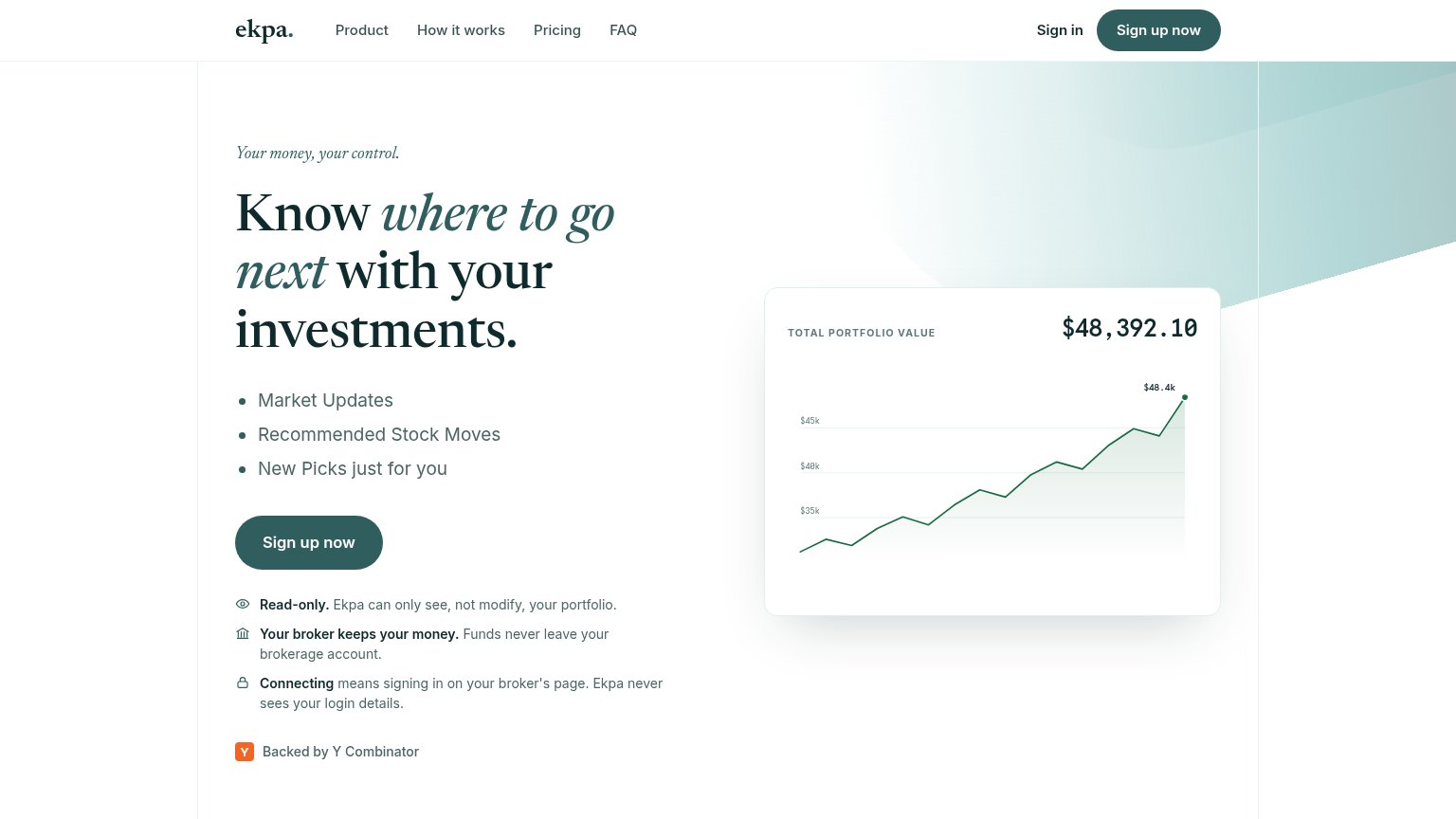
| Ekpa | "Read-only. Ekpa can only see, not modify, your portfolio." safety block with "Backed by Y Combinator" badge |
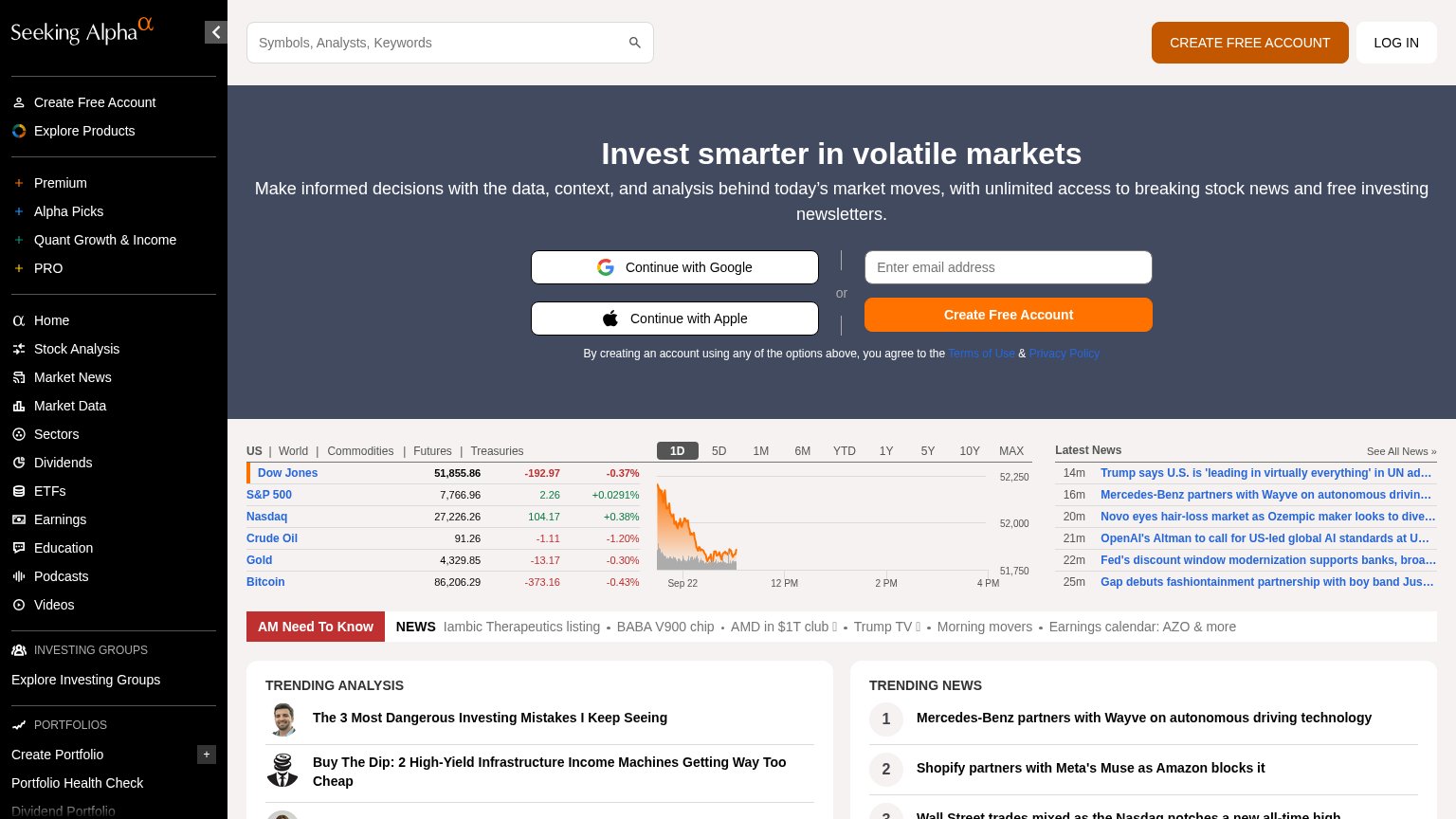
| Live Market Summary widget with DOW, NASDAQ and S&P 500 quotes and intraday chart | |
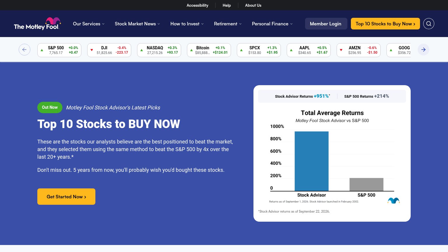
| "Total Average Returns" chart showing Stock Advisor +951% vs S&P 500 +214%, dated September 22, 2026 | |
| Live market data ticker with real-time index quotes (Dow Jones 51,855.86, S&P 500 7,766.96) and timestamped Latest News | |
| Live market data sidebar with real-time index quotes (S&P 500 7,767.00, Dow Jones 51,843.96) and a Top Gainers table wit |
CTA
68FairCopy, size, verb, cost-feel — does the primary CTA earn the click?

Problems
- 'Sign up' feels like form-filling
- no value promise in the label
- doesn't echo headline payoff
Value props
68FairTitle, subtitle, hero — do they sell the product's true value?
Ekpa’s headline sells
Know where to go next with your investments.
Your money, your control.
Working
- Outcome-led headline, not feature list
- Trust bullets defuse the top objection
- "Ekpa's money, Ekpa's control" hits the fear
Could improve
- Bullets are generic category labels
- No numbers or specifics anywhere
- Hero chart shows tracking, not picks
Information hierarchy
84StrongDoes the design help or inhibit what the page is trying to say?
1234- Header Sign up duplicate — Second pill-styled 'Sign up now' at equal weight competes with the hero CTA one scan below.
- Five-link nav row — 'Product', 'How it works', 'Pricing', 'FAQ', 'Sign in' give five exit paths before the primary action.
- Stacked trust lines — Three bolded assurances at similar weight sit right under the CTA and blur the beat after the action.
- Chart axis labels — Tiny monospace '$45k/$40k/$35k' labels are near-illegible at this size, weakening the proof card.
Mobile web
86StrongThe phone experience as a first-class citizen.
 123
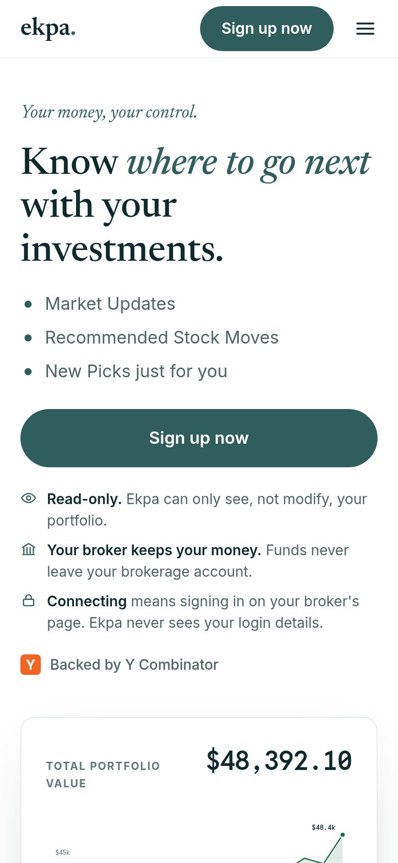
- Trust copy block — Three long assurance lines stack into a dense text wall that pushes the proof card below the fold.
- Cut-off portfolio card — The $48,392.10 chart card is truncated mid-viewport, so the strongest visual proof renders half-visible.
- Duplicate header CTA — The header 'Sign up now' pill repeats the full-width hero button, adding redundancy in a narrow header.