
Your landing page’s weakest score is Mobile web.
How Edviro ranks
70Growth scoreupdated
category scores
category scoresShowHide
Score over time
Mobile web
62FairThe phone experience as a first-class citizen.
 1234
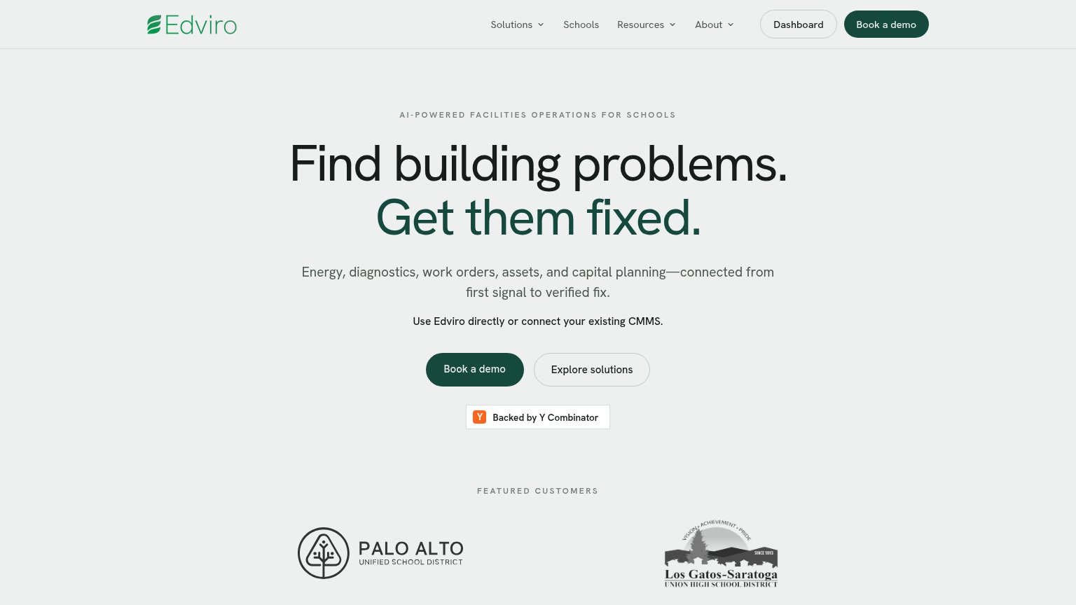
- Primary CTA below fold — Long stacked headline and two body paragraphs push 'Book a demo' out of the first mobile viewport.
- Oversized eyebrow text — AI-POWERED FACILITIES OPERATIONS FOR SCHOOLS wraps to two loud tracked-out lines, eating hero space before the headline.
- Two stacked body paragraphs — The four-line subhead plus the CMMS line stack six lines of copy between headline and CTA, delaying the tap.
- Book a demo width — Button sits at roughly 40% column width instead of a full-bleed thumb target.
CTA
68FairCopy, size, verb, cost-feel — does the primary CTA earn the click?

Problems
- 'Book' feels costly — implies sales call
- no value payoff in the label
- doesn't echo headline promise
Trust
68FairProof that the product is real, competent, and safe to try.
| Trust read | |
|---|---|
| Edviro | "Featured Customers" logos: Palo Alto Unified School District and Los Gatos-Saratoga Union High School District |
| SIEMENS logo in the site masthead | |
| Stylized product UI mockup showing a maintenance calendar with work orders and a mobile "New Task" request form | |
| Award badge row: Software Advice FrontRunners 2026, Vision Awards 2025 Winner, CE Top Tech 2024, Capterra Shortlist 2026 | |
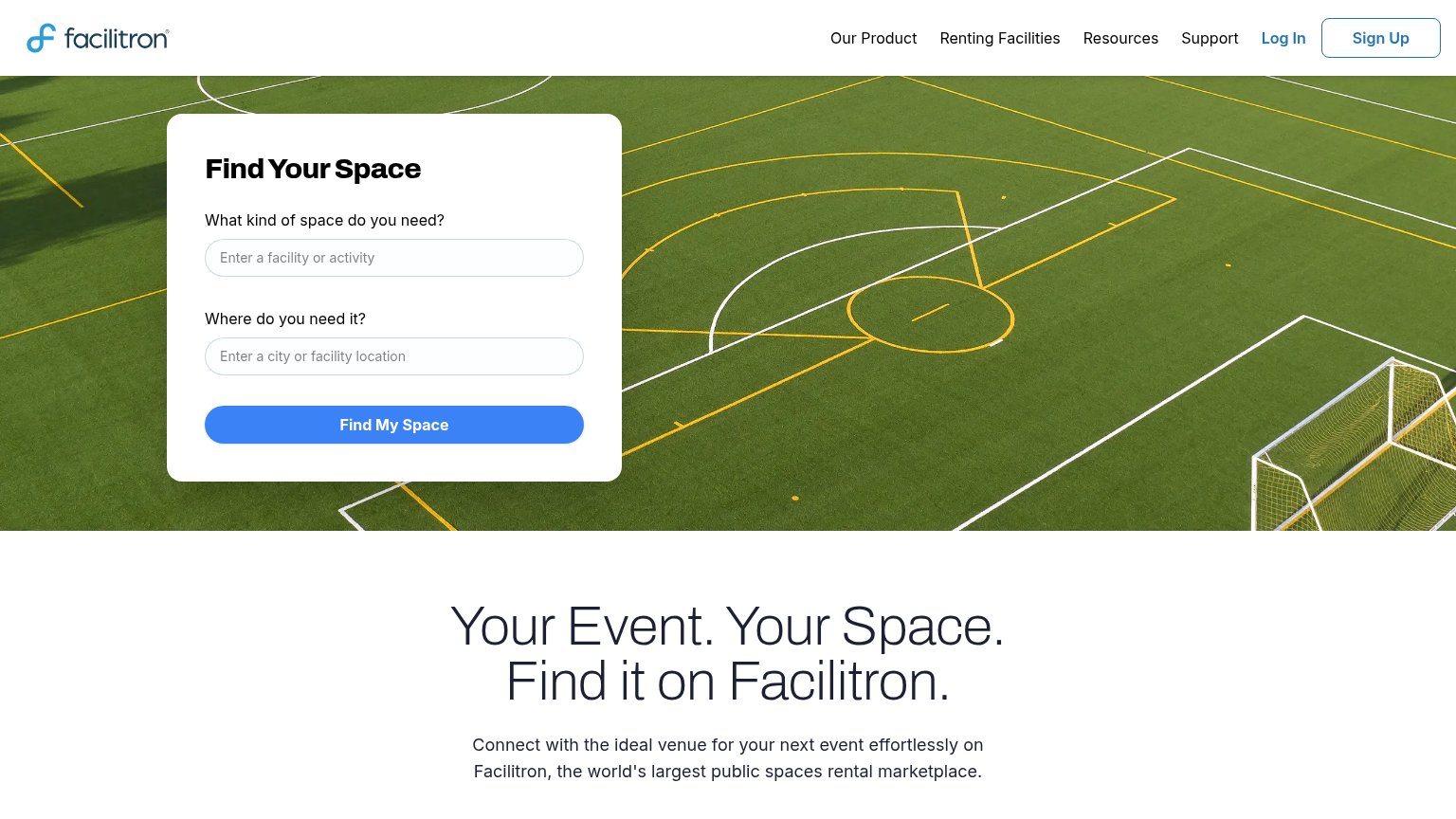
| Functional "Find Your Space" search form with facility and location inputs |
Value props
76FairTitle, subtitle, hero — do they sell the product's true value?
Edviro’s headline sells
Find building problems. Get them fixed.
Energy, diagnostics, work orders, assets, and capital planning—connected from first signal to verified fix.
Working
- Outcome-first headline, plain language
- Subhead lists the real workflow scope
- CMMS line kills the rip-and-replace fear
Could improve
- No numbers anywhere in the fold
- No product visual demonstrating value
- Emotion of the pain left untouched
Information hierarchy
78FairDoes the design help or inhibit what the page is trying to say?
1234- Explore solutions button — Same size and adjacency as Book a demo, splitting the primary action's click share.
- Dashboard nav button — A bordered login-style button beside Book a demo pulls existing-user traffic into the conversion zone.
- Nav dropdown links — Solutions, Schools, Resources, and About offer four equal-weight exits before the headline lands.
- CMMS caveat line — Bolded at similar weight to the subheadline, adding a second competing message above the CTA.