
Your landing page’s weakest score is Trust.
How Datoric ranks
68Growth scoreupdated
category scores
category scoresShowHide
Score over time
Trust
48PoorProof that the product is real, competent, and safe to try.
| Trust read | |
|---|---|
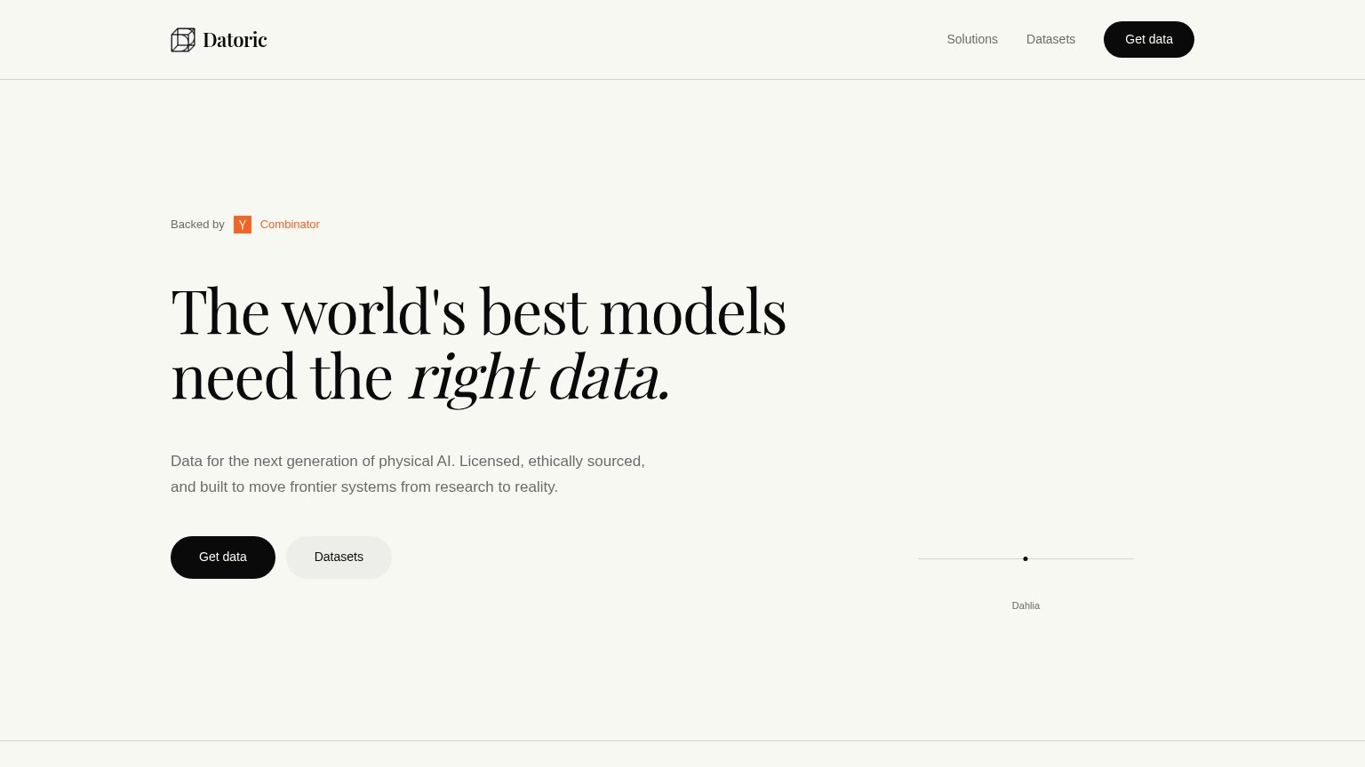
| Datoric | "Backed by Y Combinator" badge above the hero headline |
| implicit context Scale AI may benefit from pre-existing familiarity among its target audience. | |
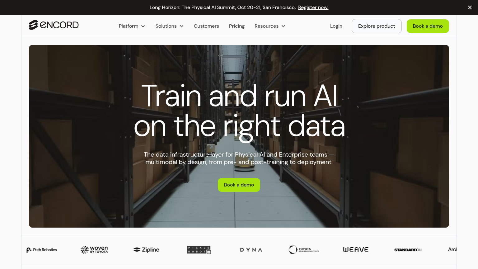
| "New Frontier data and RL environments, off the shelf" announcement banner | |
| Customer logo strip below the hero: Path Robotics, Woven by Toyota, Zipline, Pickle Robot, Toyota Research Institute, We | |
| implicit context Protex AI may benefit from pre-existing familiarity among its target audience. |
Value props
62FairTitle, subtitle, hero — do they sell the product's true value?
Datoric’s headline undersells
The world's best models need the right data.
Data for the next generation of physical AI. Licensed, ethically sourced, and built to move frontier systems from research to reality.
Working
- Names the niche: physical AI data
- Licensed, ethically sourced = trust
- Research-to-reality outcome framing
Could improve
- H1 states problem, not Datoric's offer
- Zero numbers or proof points in fold
- Hero visual decorates, shows no data
CTA
68FairCopy, size, verb, cost-feel — does the primary CTA earn the click?

Problems
- vague — unclear what click delivers
- likely hides a sales/contact flow
- no payoff or value word in copy
Mobile web
78FairThe phone experience as a first-class citizen.
 123
- Get data button — Desktop-proportioned pill splitting the row with 'Datasets'; should be full-width for thumb reach.
- Datasets secondary button — Styled nearly identically to the primary pill, competing for the tap instead of deferring to 'Get data'.
- ASCII flower graphic — Renders as illegible red character noise at phone size, adding clutter without communicating anything.
Information hierarchy
82StrongDoes the design help or inhibit what the page is trying to say?
123- Dahlia dot graphic — The hero visual collapses to a barely visible dot and line on desktop, wasting the fold's brand moment that works on mobile.
- Datasets secondary button — Pill-styled at near-equal size beside Get data, it splits the click at the decision point; also duplicated in the nav.
- Nav Get data button — A second black Get data CTA duplicates the hero button and adds a competing target in the scan path.