Past reportsShow past reportsHide past reports
- Sep 20, 202673LiveOverall +2 · Trust +10 · Information hierarchy −6Viewing
- Sep 15, 202671First tracked report — strongest CTA 82, weakest Trust 48View →

Your landing page’s weakest score is Trust.
How Context.dev ranks
category scores
Proof that the product is real, competent, and safe to try.



| Trust read | |
|---|---|
| Context.dev | "Backed by Y Combinator" badge above the hero headline |
| GitHub star count "182.3K" in the desktop navigation | |
| Customer logo wall showing AWS, Databricks, Groq, Gamma, and monday.com | |
| Interactive query demo widget: "What are the latest updates with Nvidia?" with search / extract / crawl / research tabs | |
| Elastic logo co-branded with the Jina logo in the header | |
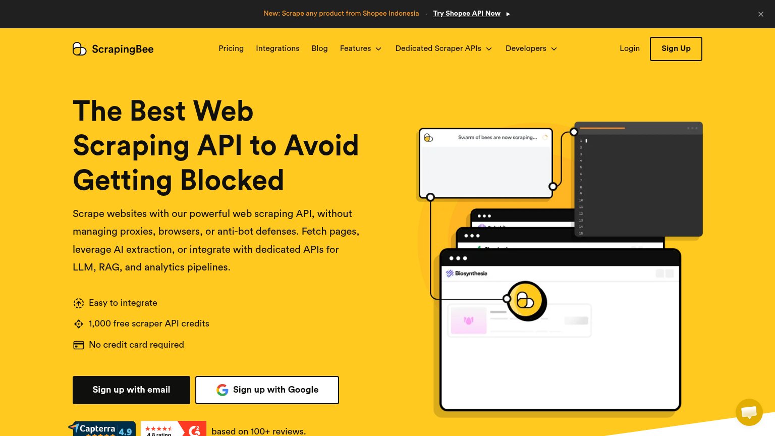
| Capterra 4.9 and G2 4.8 rating badges "based on 100+ reviews." under the signup CTAs |
Does the design help or inhibit what the page is trying to say?
1234Copy, size, verb, cost-feel — does the primary CTA earn the click?

Problems
Title, subtitle, hero — do they sell the product's true value?
Web data {API} for AI agents
Web scraping, data, and search infrastructure for AI products.
Working
Could improve
The phone experience as a first-class citizen.
 123
You need a lazyweb account to add your product, do a growth audit, create backlog and more
Sign me in to my Lazyweb report hub. Fetch https://www.lazyweb.com/hub/agent/sign-in.md and follow its instructions exactly. If you can't fetch URLs, tell me and I'll paste the instructions instead.
Lazyweb MCP
Step 1 of 2 · your login
Where should we send your reports? This email becomes your login on lazyweb.com — everything your agent makes lands in your workspace.
That doesn't look like an email — check it and try again.
No password, no spam — one workspace link now, then your agent command.
Step 2 of 2 · your agent
Paste this into your agent. Claude Code, Codex, Cursor, or another MCP-capable agent opens the link and sets itself up. Data access is plan-dependent.
Generating your agent command...
Free account
We’ll add Context.dev as your product and bring this score into your workspace. You can change it later in Settings.