CautionYC S26 landing page report.
← Back to YC S26

Your landing page’s weakest score is Trust.

Fix Trust

Score over time

757065605550Anjuna Security 62 on Mar 30 (Wayback)Anjuna Security 64 on Apr 26 (Wayback)Anjuna Security 58 on Jul 10 (Wayback)Anjuna Security 62 on Jul 18 (Wayback)Anjuna Security 64 on Sep 10 (Wayback)Anjuna Security 62 on Sep 20 (Live)Edgeless Systems 60 on Jul 31 (Wayback)Edgeless Systems 63 on Sep 20 (Live)Fortanix 54 on Mar 27 (Wayback)Fortanix 64 on Sep 20 (Live)Evervault 66 on May 18 (Wayback)Evervault 69 on Sep 20 (Live)Tinfoil 58 on Jul 15 (Wayback)Tinfoil 57 on Jul 24 (Wayback)Tinfoil 56 on Sep 20 (Live)Caution 67 on Apr 12 (Wayback)Caution 66 on May 13 (Wayback)Caution 60 on Jun 12 (Wayback)Caution 68 on Jul 28 (Wayback)Caution 71 on Sep 4 (Wayback)Caution 70 on Sep 20 (Live)Apr 12May 13Jun 12Jul 28Sep 4Sep 20
Past reportsShow past reportsHide past reports
  1. Sep 20, 202670LiveOverall −1 · Mobile web −6 · CTA +2Viewing
  2. Sep 4, 202671Overall +3 · Trust +8 · CTA +4View →
  3. Jul 28, 202668Overall +8 · Mobile web +24 · Information hierarchy +10View →
  4. Jun 12, 202660Overall −6 · Mobile web −29 · Information hierarchy −6View →
  5. May 13, 202666Overall −1 · Information hierarchy −4 · Mobile web +1View →
  6. Apr 12, 202667First tracked report — strongest Information hierarchy 82, weakest Trust 38View →

Trust

52Fair

Proof that the product is real, competent, and safe to try.

Caution
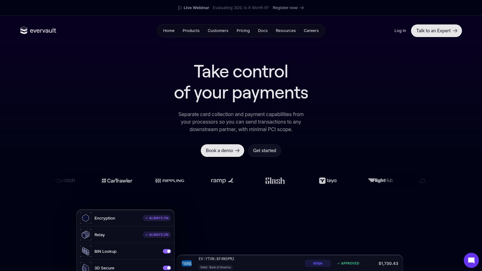
Evervault
Fortanix
Trust read
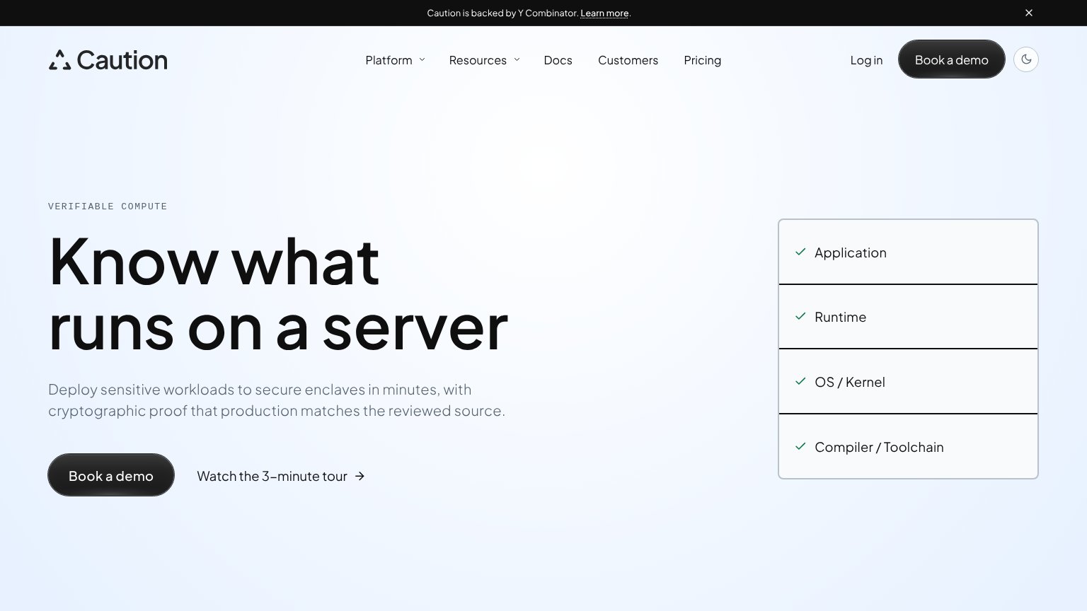
Caution"Caution is backed by Y Combinator." banner
Anjuna SecurityNo visible trust signal identified.
Edgeless Systems"Start on GitHub" link implying inspectable open-source code
Fortanix"Fortanix | NVIDIA" co-branding lockup above the hero illustration
EvervaultCustomer logo strip beneath the hero CTAs: CarTrawler, Rippling, Ramp, Slash, Teya, FlightHub, Stitch
TinfoilNo visible trust signal identified.

CTA

68Fair

Copy, size, verb, cost-feel — does the primary CTA earn the click?

Caution

Problems

  • click feels costly — sales call
  • no self-serve path visible
  • generic label, no value promised

Mobile web

72Fair

The phone experience as a first-class citizen.

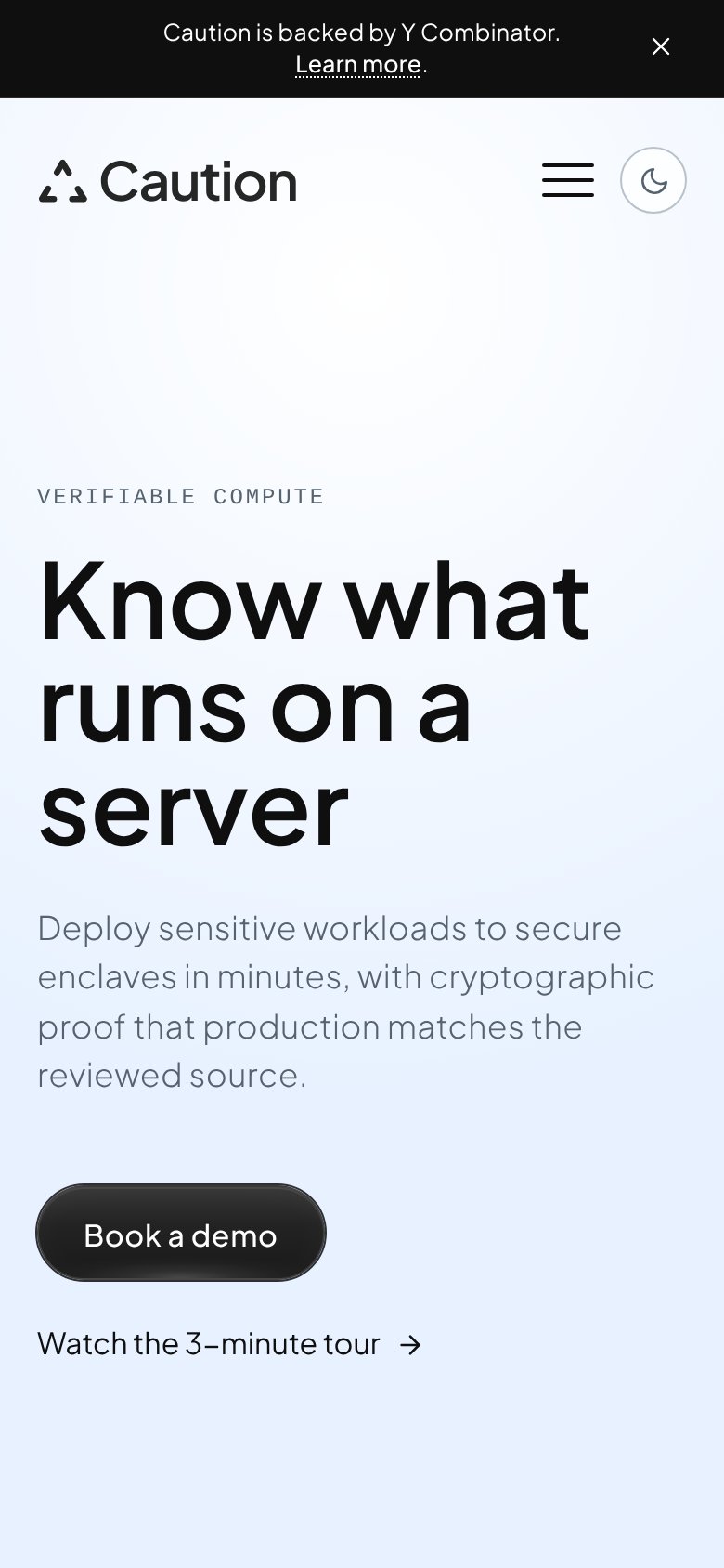
Mobile web annotations on the mobile capture123
  1. Book a demo button — Desktop-proportioned pill at half column width; should be near-full-bleed for the thumb.
  2. YC announcement bar — Wraps to two lines and consumes ~100px of the first viewport before the logo appears.
  3. Wrapped hero headline — Headline breaks into three tall lines, pushing the subhead and CTA to the fold's edge.

Value props

76Fair

Title, subtitle, hero — do they sell the product's true value?

Caution’s headline sellsKnow what runs on a serverDeploy sensitive workloads to secure enclaves in minutes, with cryptographic proof that production matches the reviewed source.

Working

  • Outcome-first headline, zero buzzwords
  • Subhead names mechanism: enclaves, crypto proof
  • Stack graphic shows verified layers, not decor

Could improve

  • "In minutes" is the only number — vague
  • No customer proof or logo in the fold
  • Headline alone doesn't say who it's for

Information hierarchy

82Strong

Does the design help or inhibit what the page is trying to say?

Information hierarchy annotations on the desktop capture1234
  1. Watch the tour link — Secondary CTA sits on the primary CTA's scan line and siphons demo clicks toward passive video-watching.
  2. YC announcement banner — First element in the scan path is an outbound 'Learn more' exit that outranks Caution's own message.
  3. Nav with dropdowns — Five links plus two dropdowns and 'Log in' create most of the fold's nine exit paths before the hero is read.
  4. Stack checklist panel — Same-weight grey rows read as a static list, not proof — the verification story deserves stronger visual emphasis.