
Your landing page’s weakest score is Mobile web.
How Evervault ranks
Mobile web
62FairThe phone experience as a first-class citizen.
 123
- Side-by-side CTA pair — Desktop-proportioned buttons split the tap target near the fold's bottom edge instead of one full-bleed CTA.
- Chat bubble — Floating widget occupies the thumb zone next to the CTAs, adding friction with no conversion value.
- Clipped logo strip — RIPPLING logo is cut off at the left edge, making the social-proof row look broken.
CTA
66FairCopy, size, verb, cost-feel — does the primary CTA earn the click?
Problems
- demo click feels sales-y, costly
- three competing labels in fold
- self-serve path demoted to secondary
Information hierarchy
72FairDoes the design help or inhibit what the page is trying to say?
What works
What to improve
Value props
72FairTitle, subtitle, hero — do they sell the product's true value?
Evervault’s headline
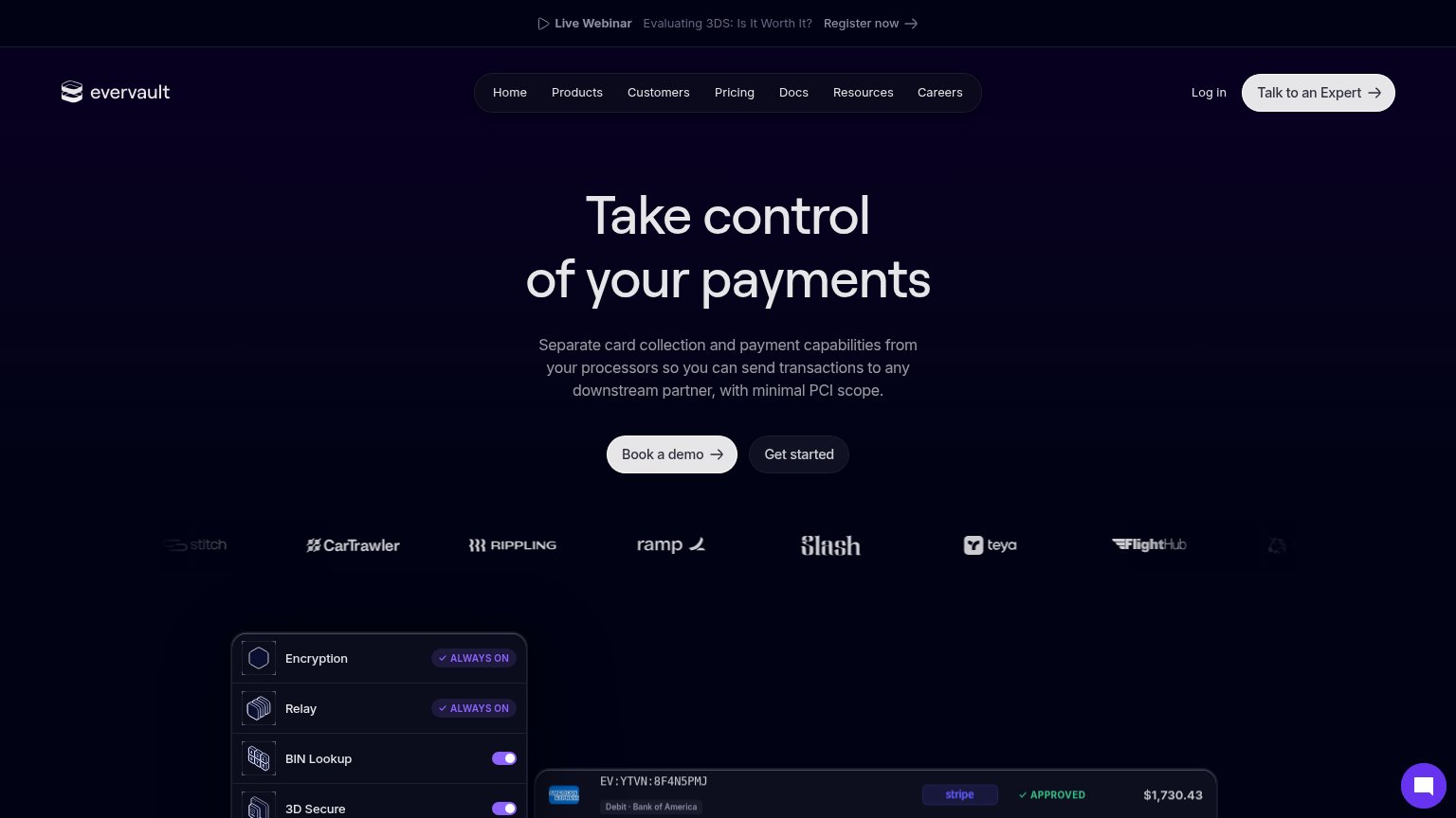
Take control of your payments
Separate card collection and payment capabilities from your processors so you can send transactions to any downstream partner, with minimal PCI scope.
Working
Could improve
Trust
74FairProof that the product is real, competent, and safe to try.
How Evervault compares
Trust read