
Your landing page’s weakest score is Trust.
How Tinfoil ranks
Trust
42PoorProof that the product is real, competent, and safe to try.
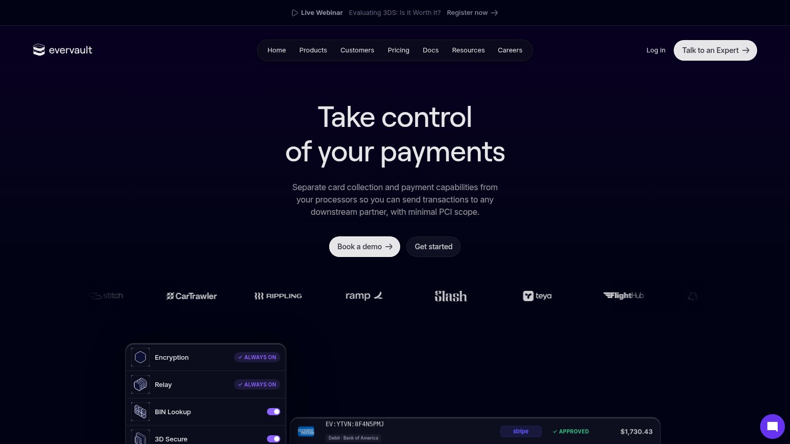
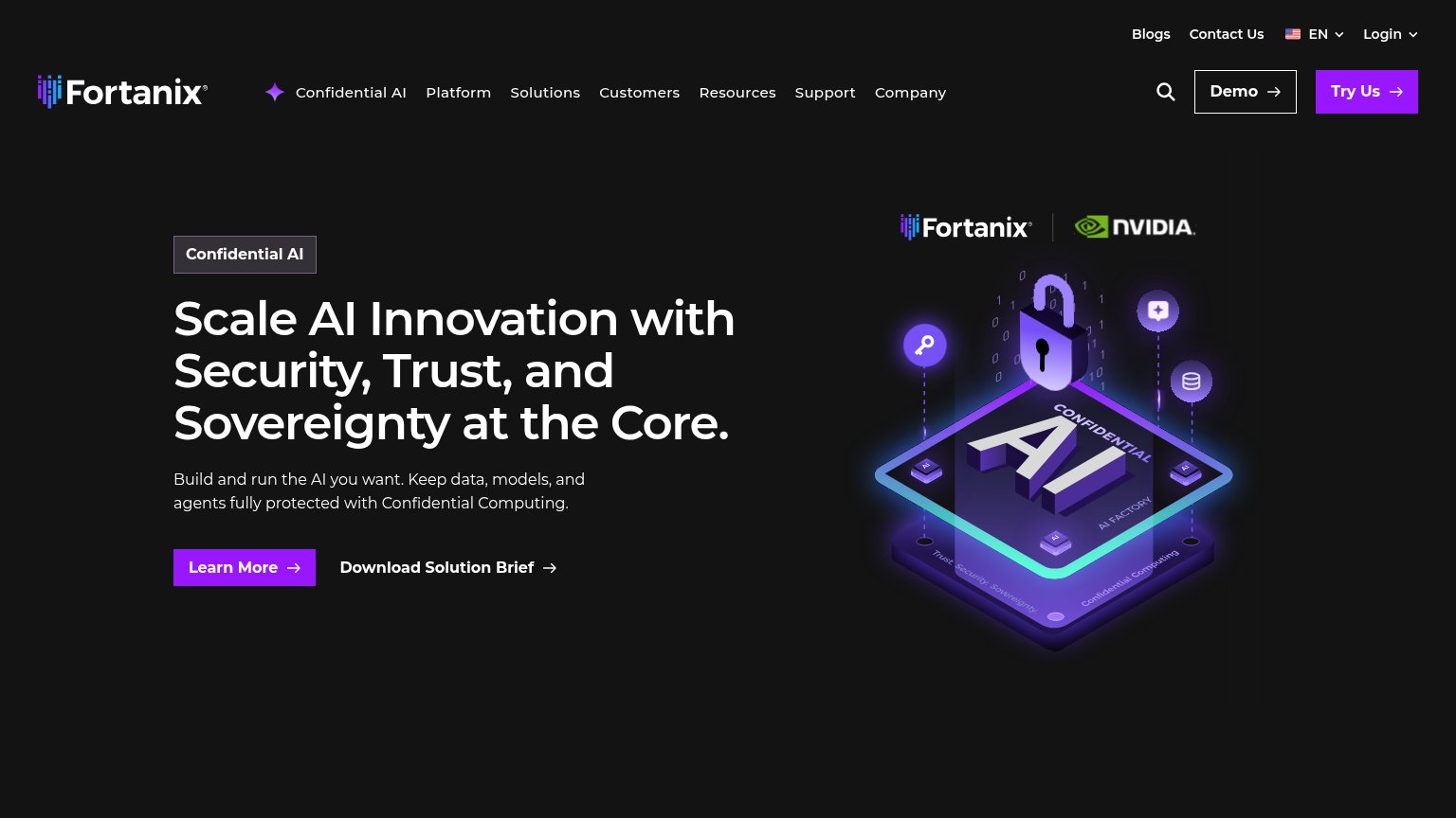
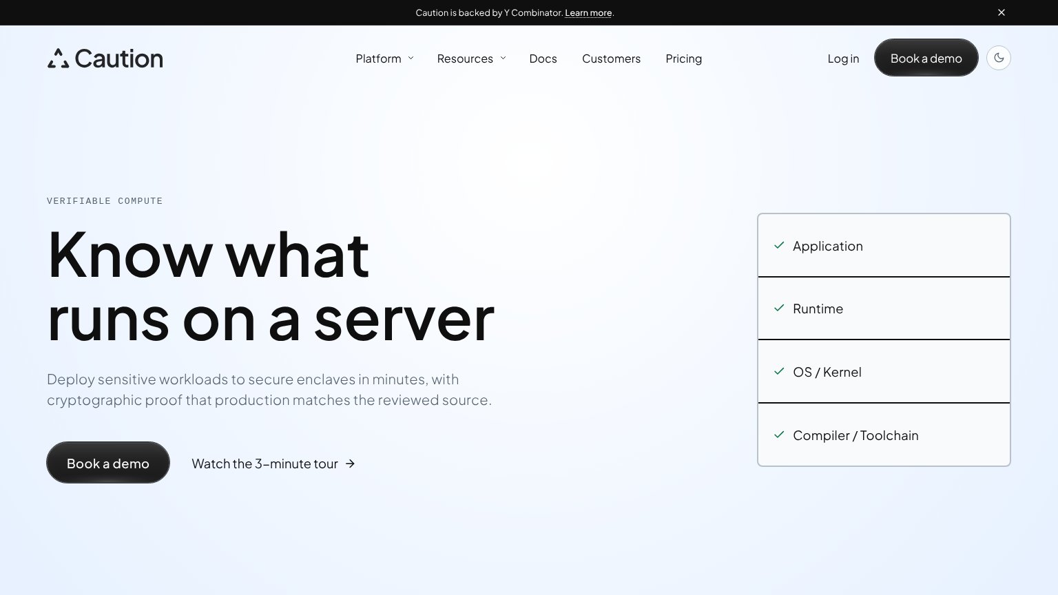
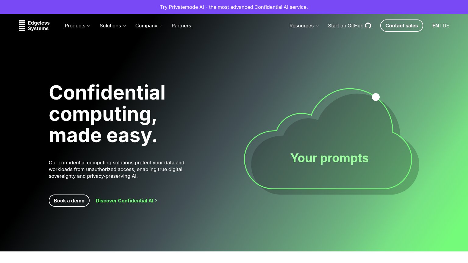
| Trust read | |
|---|---|
| Tinfoil | No visible trust signal identified. |
| "Caution is backed by Y Combinator." banner | |
| No visible trust signal identified. | |
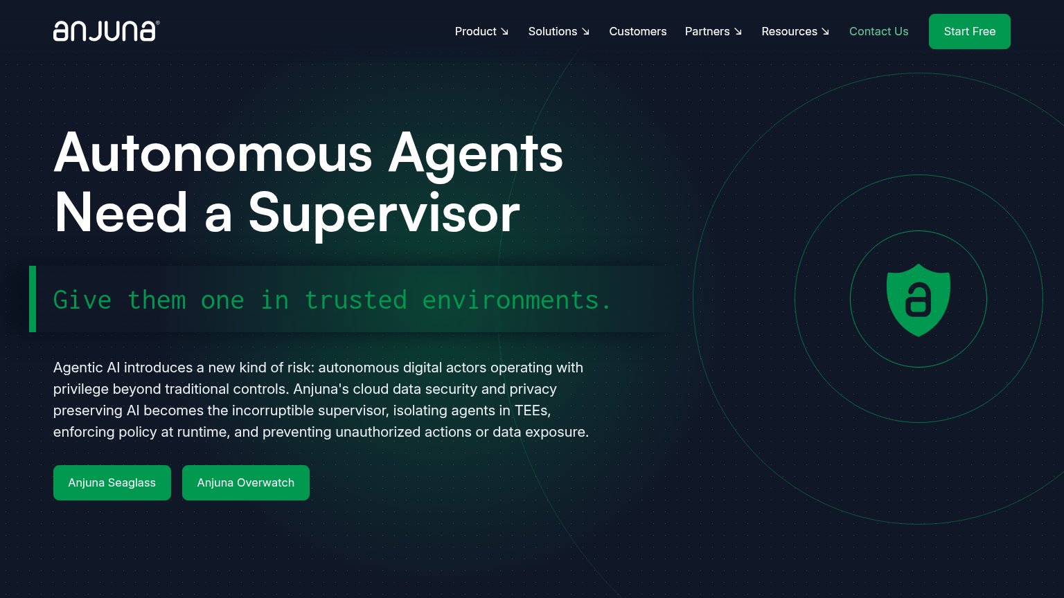
| "Start on GitHub" link implying inspectable open-source code | |
| "Fortanix | NVIDIA" co-branding lockup above the hero illustration | |
| Customer logo strip beneath the hero CTAs: CarTrawler, Rippling, Ramp, Slash, Teya, FlightHub, Stitch |
CTA
58FairCopy, size, verb, cost-feel — does the primary CTA earn the click?
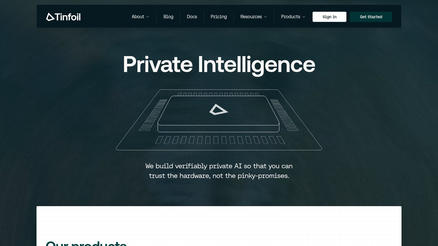
Problems
- no CTA in the hero itself
- hidden behind hamburger on mobile
- nav-sized, competes with 6 nav items
- generic label, no payoff named
Mobile web
58FairThe phone experience as a first-class citizen.
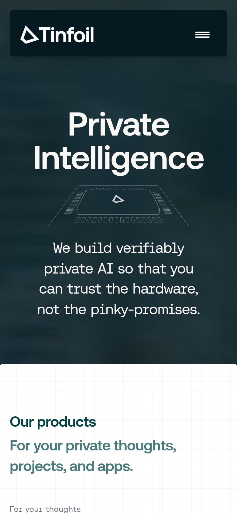
What works
What to improve
Information hierarchy
62FairDoes the design help or inhibit what the page is trying to say?
What works
What to improve
Value props
62FairTitle, subtitle, hero — do they sell the product's true value?
Tinfoil’s headline
Private Intelligence
We build verifiably private AI so that you can trust the hardware, not the pinky-promises.
Working
Could improve