ArbitalYC S26 landing page report.
← Back to YC S26

Your landing page’s weakest score is Trust.

Fix Trust

Score over time

90807060504030Ostium 53 on Sep 20 (Live)Gains Network (gTrade) 75 on Apr 21 (Wayback)Gains Network (gTrade) 44 on Jun 6 (Wayback)Gains Network (gTrade) 78 on Sep 2 (Wayback)Gains Network (gTrade) 77 on Sep 20 (Live)Hyperliquid 76 on Aug 29 (Live)Helix 64 on Apr 4 (Wayback)Helix 63 on Apr 20 (Wayback)Helix 62 on May 19 (Wayback)Helix 60 on Jul 22 (Wayback)Helix 62 on Aug 29 (Wayback)Helix 62 on Sep 6 (Wayback)Helix 63 on Sep 22 (Live)Arbital 63 on Apr 8 (Wayback)Arbital 66 on May 2 (Wayback)Arbital 72 on Jul 8 (Wayback)Arbital 75 on Sep 20 (Live)Apr 8May 2Jul 8Sep 20
Past reportsShow past reportsHide past reports
  1. Sep 20, 202675LiveOverall +3 · CTA +10 · Trust +8Viewing
  2. Jul 8, 202672Overall +6 · Trust +14 · Information hierarchy +6View →
  3. May 2, 202666Overall +3 · Trust +12 · Information hierarchy +4View →
  4. Apr 8, 202663First tracked report — strongest Mobile web 74, weakest Trust 30View →

Trust

64Fair

Proof that the product is real, competent, and safe to try.

Arbital
Hyperliquid
Trust read
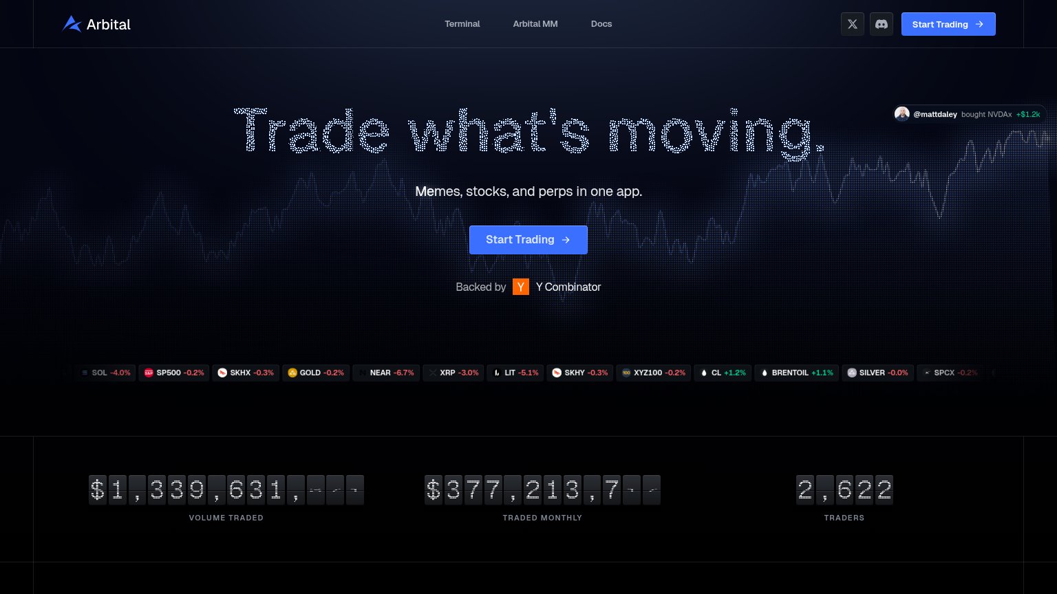
Arbital"Backed by Y Combinator" badge under the Start Trading CTA
OstiumNo visible trust signal identified.
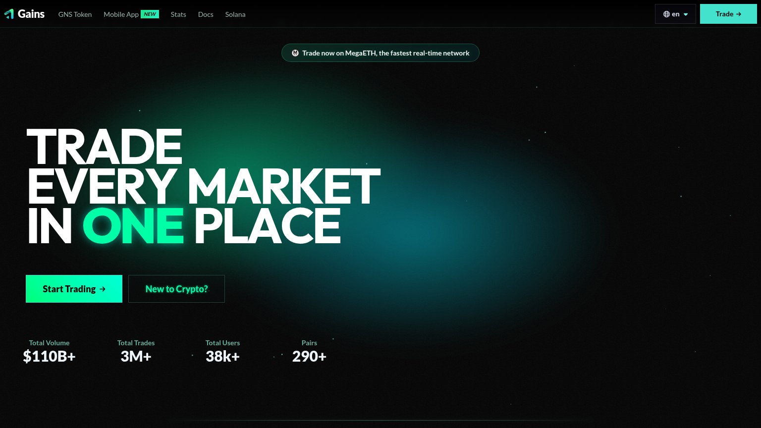
Gains Network (gTrade)Stats bar: "Total Volume $110B+ · Total Trades 3M+ · Total Users 38k+ · Pairs 290+"
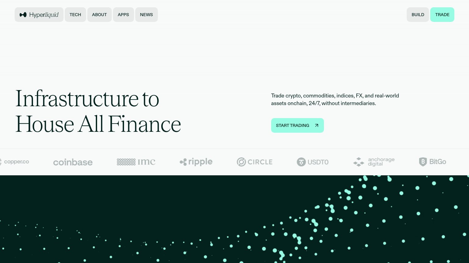
HyperliquidPartner/backer logo strip: Coinbase, Ripple, Circle, USDT0, Anchorage Digital, BitGo, IMC, Copper.co
Helix"Operational" status indicator with "Version 2.0" in the desktop footer strip

Value props

72Fair

Title, subtitle, hero — do they sell the product's true value?

Arbital’s headline sellsTrade what's moving.Memes, stocks, and perps in one app.

Working

  • Subhead names three concrete asset classes
  • Live tickers and trade toast add urgency
  • Real volume counters back the claim

Could improve

  • Headline fits any brokerage
  • Hero art decorates, doesn't demo product
  • 2,622 traders reads small next to volume

Mobile web

78Fair

The phone experience as a first-class citizen.

Mobile web annotations on the mobile capture123
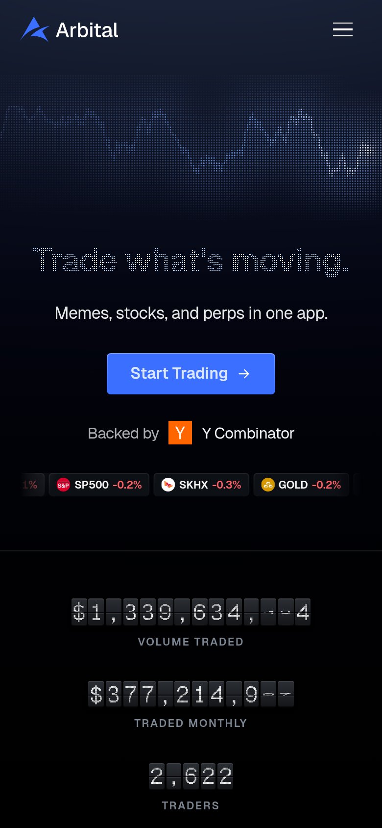
  1. Dot-matrix headline — Faint dotted lettering makes "Trade what's moving." low-contrast and hard to read on a phone.
  2. Start Trading button — Desktop-proportioned width; should be near full-bleed for an easy thumb tap.
  3. Clipped ticker chip — Ticker chip cut off mid-label ("1%") at the left edge, looking broken rather than scrolling.

CTA

80Strong

Copy, size, verb, cost-feel — does the primary CTA earn the click?

Arbital
Gains Network (gTrade)

Problems

  • small footprint vs. huge headline
  • no free/no-deposit signal visible

Information hierarchy

82Strong

Does the design help or inhibit what the page is trying to say?

Information hierarchy annotations on the desktop capture1234
  1. Trade notification toast — Overlaps the headline's final word, colliding with the page's single most important message.
  2. X and Discord icons — Two outbound social exits sit directly beside the primary CTA at nav level.
  3. Scrolling ticker strip — Fourteen same-weight ticker chips add motion and reading load across the full fold width.
  4. Nav Start Trading button — Duplicates the hero CTA at equal blue weight, splitting the single action into two targets.

Competitors

inferred from product, audience, and value prop