
Your landing page’s weakest score is Value props.
How Ostium ranks
53Growth scoreupdated
category scores
category scoresShowHide
Value props
35PoorTitle, subtitle, hero — do they sell the product's true value?
Ostium’s headline vague
US500/USD
Working
- Live terminal proves the product is real
- Concrete data: 0.01% fees, live prices
- Clear Trade / Sign up actions
Could improve
- No headline states what Ostium is
- Restricted-jurisdiction banner dominates
- No RWA/leverage differentiator named
Information hierarchy
48PoorDoes the design help or inhibit what the page is trying to say?
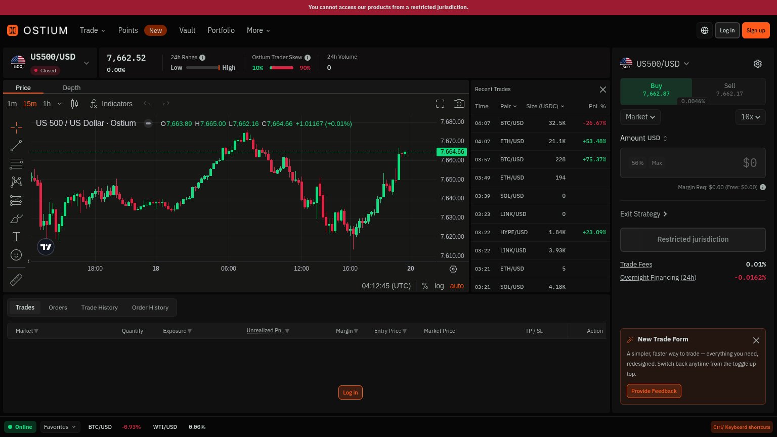 1234
- Restricted jurisdiction block — The primary trade action is replaced by a dead 'Restricted jurisdiction' button, leaving the fold with no working conversion path.
- Restricted jurisdiction banner — A red full-width error banner is the first thing read, framing the entire page as inaccessible before any value lands.
- New Trade Form popup — A feedback popup with its own orange 'Provide Feedback' button competes in weight with Sign up and clutters the trade panel.
- Sign up button — The only real conversion CTA is a small top-right button dwarfed by the dense chart, order panel, and trades feed around it.
Trust
58FairProof that the product is real, competent, and safe to try.
How Ostium compares
Trust read
CTA
62FairCopy, size, verb, cost-feel — does the primary CTA earn the click?
How Ostium compares
Recommended rewrites
Mobile web
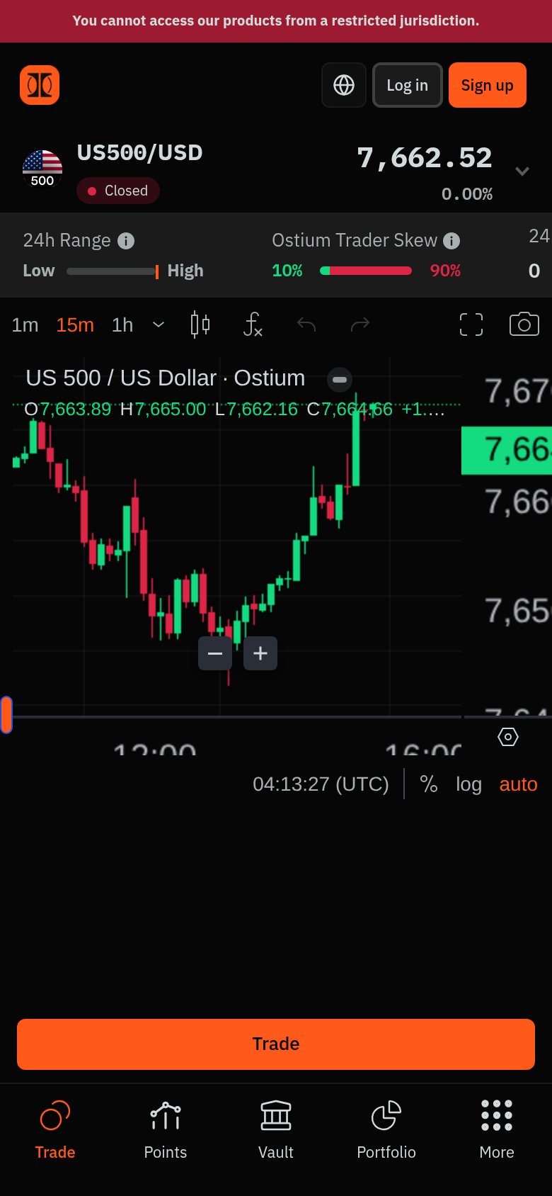
64FairThe phone experience as a first-class citizen.
What works
What to improve