
Your landing page’s weakest score is Trust.
How Aerogen Systems ranks
65Growth scoreupdated
category scores
category scoresShowHide
Score over time
Trust
32PoorProof that the product is real, competent, and safe to try.

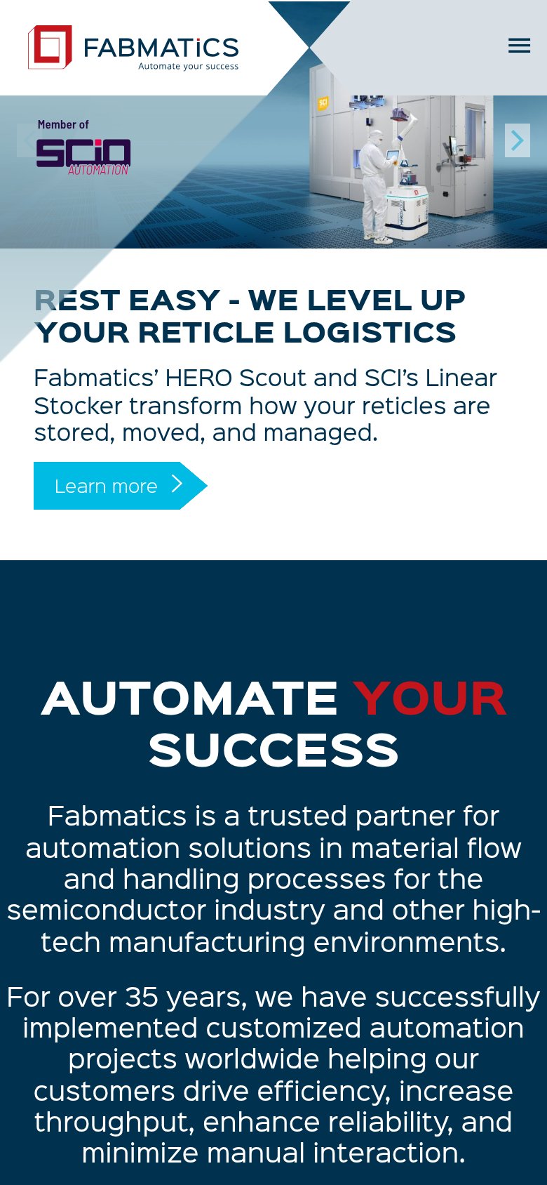
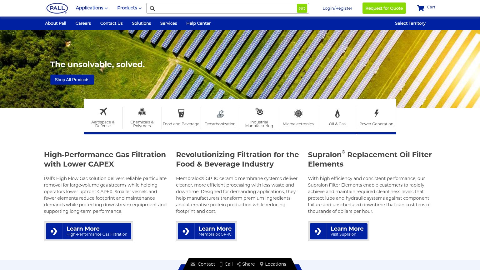

| Trust read | |
|---|---|
| Aerogen Systems | No visible trust signal identified. |
| Membralox® GP-IC ceramic membrane systems deliver cleaner, more efficient processing with less waste and downtime. | |
| "For more than 60 years and across multiple industries worldwide, Mott Corporation has solved highly complex filtration | |
| implicit context Brooks Automation may benefit from pre-existing familiarity among its target audience. | |
| Real cleanroom product photo of the HERO Scout robot and Linear Stocker with a gowned operator | |
| "An ITW Company" tagline under the Simco-Ion logo, plus the specific heritage claim "providing solutions to electrostati |
Value props
62FairTitle, subtitle, hero — do they sell the product's true value?
Aerogen Systems’s headline undersells
Fabs of the future.
Eliminating the need for cleanrooms in semiconductor manufacturing.
Working
- Subhead names a bold, concrete outcome
- Eyebrow states the category clearly
- "See the Problem" CTA invites the pain
Could improve
- H1 is a vague abstraction
- No numbers or proof points in fold
- Hero image decorates, not demonstrates
CTA
68FairCopy, size, verb, cost-feel — does the primary CTA earn the click?

Problems
- 4 words — over 3-word ideal
- 'Join' a pilot feels committal
- nav label differs: 'Pilot Program'
Mobile web
80StrongThe phone experience as a first-class citizen.
 123
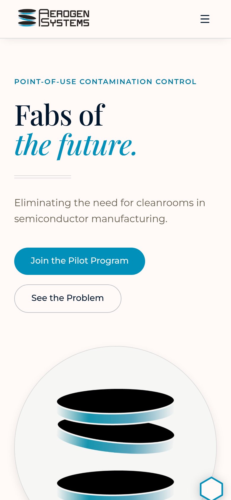
- See the Problem button — Secondary CTA stacks directly under the primary at near-equal weight, competing for the first tap.
- Fabs of headline — Two-line serif headline scales down cleanly but says nothing concrete; the value statement only arrives in the smaller paragraph below.
- Chat/hexagon bubble — Floating hexagon widget overlaps the product illustration at the bottom edge with no clear purpose.
Information hierarchy
82StrongDoes the design help or inhibit what the page is trying to say?
12- See the Problem button — Styled at near-equal weight and size beside the primary CTA, splitting the click decision.
- Nav link row — Four same-weight links plus a duplicate Pilot Program button offer five exits before the hero CTA.
Competitors
inferred from product, audience, and value prop#1 Aerogen Systems65
#2