
Your landing page’s weakest score is Trust.
How 6thSense ranks
53Growth scoreupdated
category scores
category scoresShowHide
Score over time
Trust
32PoorProof that the product is real, competent, and safe to try.


| Trust read | |
|---|---|
| 6thSense | Hero product photo of the sensor-equipped tactile glove |
| Popup showing real GelSight Modulus 3D surface captures with third-party mention "Steve Mould uses GelSight® Modulus™" | |
| No visible trust signal identified. | |
| Real product photos of tactile sensing hardware (HAND SENSING glove, HEAD SENSING rig, R&D sensor material, robotics gri |
CTA
44PoorCopy, size, verb, cost-feel — does the primary CTA earn the click?
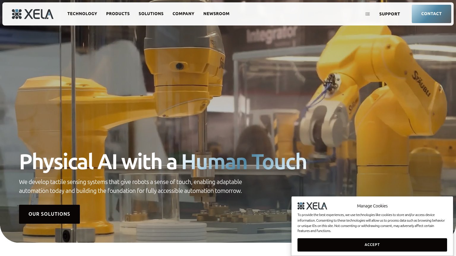
Problems
- no CTA anywhere in either fold
- nav 'Partner login' only gated action
- headline question has no next step
Mobile web
58FairThe phone experience as a first-class citizen.
 12
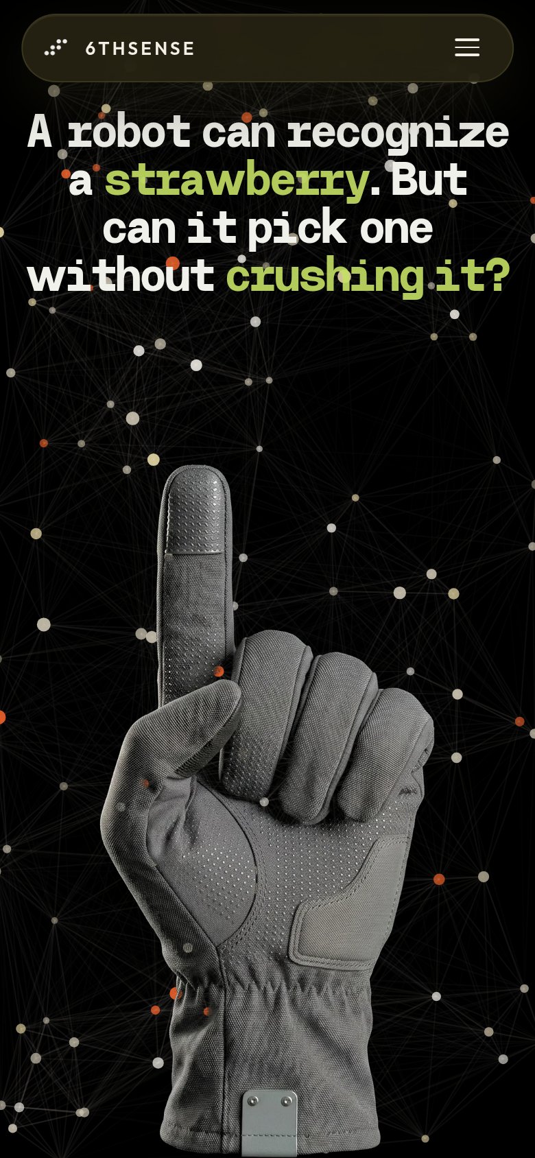
- Hero glove image — Fills two-thirds of the fold with no CTA anywhere in the first viewport.
- Hamburger-only nav pill — Menu icon is the only tappable element on the fold; no conversion action surfaces.
Information hierarchy
62FairDoes the design help or inhibit what the page is trying to say?
12- Truncated animated headline — The type-on effect cuts off at 'cru', so a static capture (and slow readers) see an incomplete promise.
- Three equal nav pills — 'Products', 'People', and 'Partner login' share identical weight, making the only clickable paths ambiguous exits.
Value props
68FairTitle, subtitle, hero — do they sell the product's true value?
6thSense’s headline undersells
A robot can recognize a strawberry. But can it pick one without crushing it?
Working
- Concrete, visceral problem framing
- Strawberry image is memorable and specific
- Hero glove hints at tactile sensing
Could improve
- No subhead answering the question
- Product's actual offer never stated
- Typewriter animation hides copy on load