
Your landing page’s weakest score is Trust.
How Verne Robotics ranks
58Growth scoreupdated
category scores
category scoresShowHide
Score over time
Trust
44PoorProof that the product is real, competent, and safe to try.


| Trust read | |
|---|---|
| Verne Robotics | No visible trust signal identified. |
| implicit context Figure may benefit from pre-existing familiarity among its target audience. | |
| "Digit is a humanoid robot with 65,000 hours of real production experience" (mobile fold) | |
| Hero photo of the Apollo robot performing real warehouse pick-and-pack work | |
| Hero photography of the NEO robot in three colorways | |
| No visible trust signal identified. |
Value props
54FairTitle, subtitle, hero — do they sell the product's true value?
Verne Robotics’s headline vague
Your new hardest worker
Verne in action.
Working
- Memorable, emotional labor framing
- Short and confident
- Implies tireless 24/7 output
Could improve
- Never says what the product is
- Subhead is a caption, adds nothing
- Hero video too abstract to demonstrate
CTA
58FairCopy, size, verb, cost-feel — does the primary CTA earn the click?


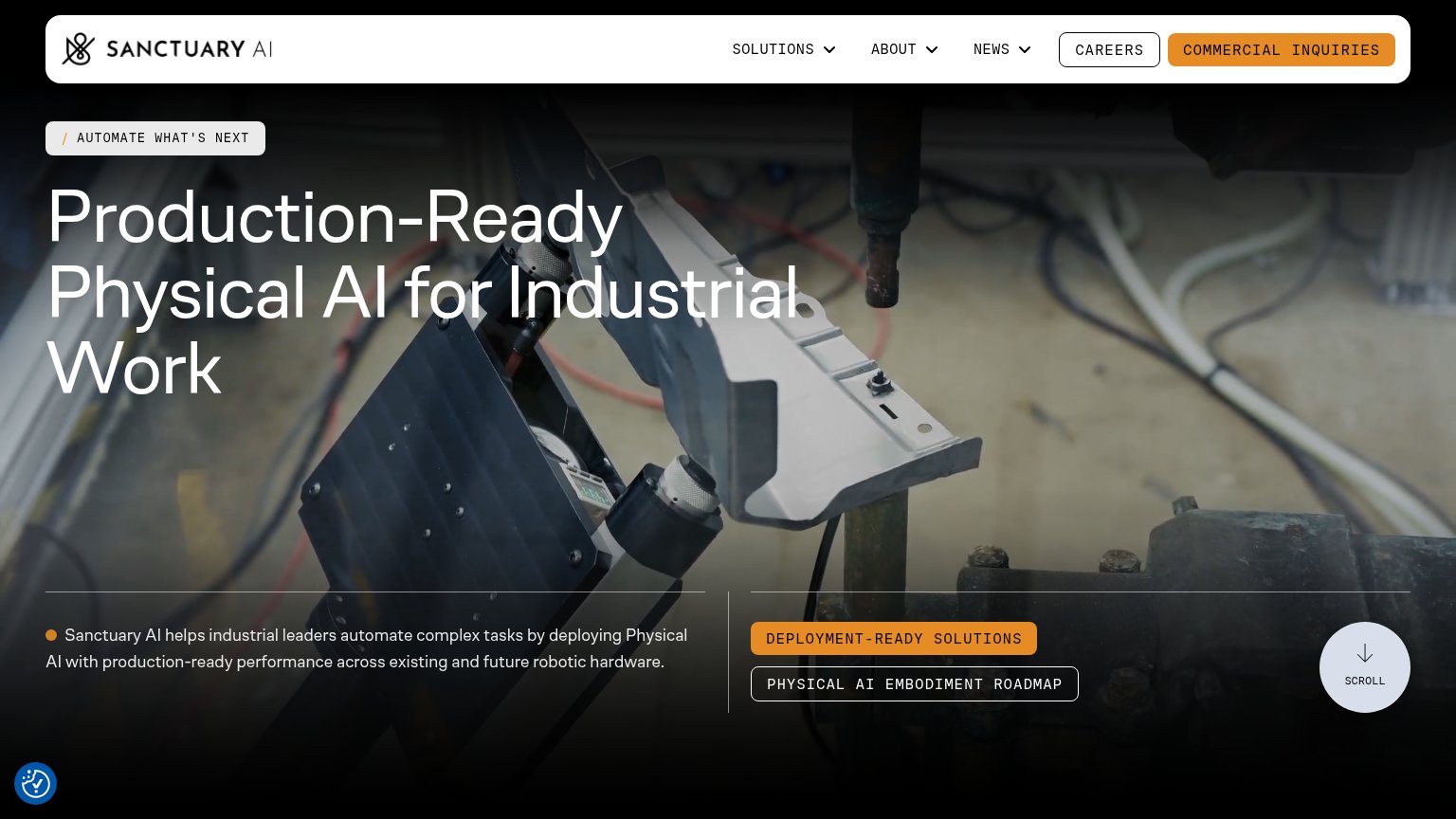
Problems
- demo booking feels costly
- no CTA in hero, nav only
- hidden behind mobile hamburger
- small vs headline footprint
Mobile web
58FairThe phone experience as a first-class citizen.
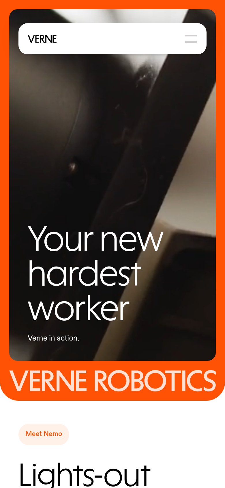 12
- Three-line hero headline — 'Verne Robotics's new hardest worker' wraps into three oversized lines that consume the middle third of the screen.
- Clipped wordmark banner — 'VERNE ROBOTICS' text runs off both edges of the orange banner, reading as a rendering error.
Information hierarchy
74FairDoes the design help or inhibit what the page is trying to say?
12- Hero headline contrast — White 'Verne Robotics's new hardest worker' sits over light textured footage, weakening the value prop at a glance.
- Verne in action caption — Tiny low-contrast caption is the only context for the video and is nearly invisible.